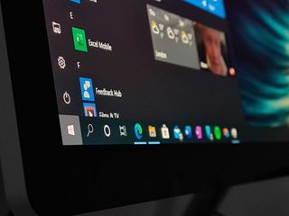
Hidden changes spotted in the most recent Windows 10 preview build point to Microsoft 365 upsells in Start (and other odd changes.)
What you need to know
- The latest Windows 10 preview build includes some hidden changes to the Start menu and Settings app.
- Microsoft looks to be toying with the position of the user tile in Start, and adding Microsoft 365 upsells to it, backported from Windows 11.
- The company is also toying with an updated Settings app design with more colorful icons and sign-in buttons.
Last year, Microsoft announced a recommitment to delivering new features and experiences to Windows 10 users after originally leaving the platform behind when Windows 11 launched. Since November, Microsoft has backported a handful of Windows 11 features to Windows 10 customers, including Windows Copilot and MSN widgets on the lock screen.
This week, Microsoft rolled out a new Windows 10 preview build to Insiders in the Beta and Release Preview Channels which appears to include some hidden changes, first spotted by @phantomofearth on X. These changes include updates to the Start menu and Settings app, which seem to be designed to better promote Microsoft Accounts and Services.
First, Microsoft looks to be toying with the position of the user icon in the Start menu, and changing the menu that appears when you click on it. Currently, the user icon in Start is positioned above the power and settings icons in the hamburger menu, and clicking it opens a menu that lets you sign out and change account settings.
This latest Windows 10 preview build changes this position to be at the very top of the hamburger menu, and clicking it will now show a menu that gives you a brief overview of your Microsoft Account and subscription status. If you aren't subscribed to Microsoft 365, it will let you know. This is the same menu that was recently added to Windows 11.
Microsoft is also toying with the appearance of the Start menu, with some hidden variants including a hamburger menu that's slightly more visually distinguished from the rest of the Start menu. It's a curious change for an OS that's supposed to be reaching end of support in just over a year.
That's not the only curious change, either. Microsoft is also working on updates to the Windows 10 Settings app, swapping out monochrome icons for colorful ones in the top banner area when you first open the app. These changes are likely to encourage users to interact with those buttons, which usually recommend updating Windows, setting up OneDrive, or signing in with a Microsoft Account.
It's clear that many of the changes Microsoft is making to Windows 10 are designed to encourage users to link to a Microsoft Account and subscribe to a Microsoft service, whether that be Microsoft 365, OneDrive, Xbox Game Pass, or Copilot Pro. These changes are all about upsells, and less about user satisfaction or interface improvements.
- Fowler
-

 1
1


3175x175(CURRENT).thumb.jpg.b05acc060982b36f5891ba728e6d953c.jpg)
Recommended Comments
There are no comments to display.
Join the conversation
You can post now and register later. If you have an account, sign in now to post with your account.
Note: Your post will require moderator approval before it will be visible.