A new report published by Windows Central has revealed several interesting ideas Microsoft considered implementing in Windows 10's Start menu. Although users warmly received the operating system upon its launch eight years ago, Microsoft's data showed that very few bothered to customize the new Start menu and its Live Tiles. That got the company thinking about improving engagement and making the Start menu easier to use.
Some of the ideas the software giant considered implementing had their roots coming from the canceled Lumia smartphones and their unconventional technology that never saw the light of day.
Windows 10's Start menu was a significant departure from the radically misfired Windows 8 and its touch-centric interfaces. While users were happy to see the return of the traditional Start menu, many found personalizing it a cumbersome process. Clicking back and forth to pin and unpin tiles, repositioning them, figuring out their perfect size—just to name a few "problems" users experienced.
Here is how Microsoft wanted to resolve the situation.
Pin in Place
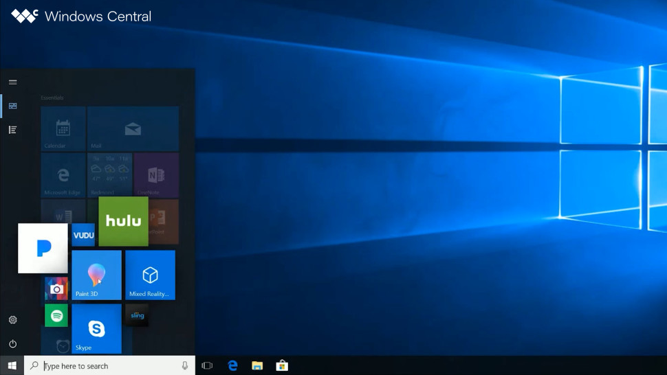
Microsoft considered using the MixView UI to fix the inconvenience of long cursor travels when editing tiles. MixView would have first appeared on the canceled Lumia "McLaren" with its 3D Touch display. Hovering a finger over an app would reveal a set of smaller tiles with extra actions and shortcuts.

Microsoft wanted to use MixView to suggest installed apps, programs from the Microsoft Store, and websites when editing the Start menu on Windows 10. The operating system would place a "+" button next to a tile, allowing you to add more apps without having to go to the list of all apps.

Start Places
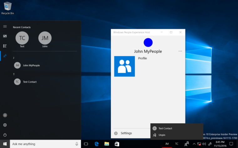
The idea of Start Places was to help users declutter the taskbar and turn it into a launchpad for various features, not only applications. Start Places would let customers switch between the tiles area, all apps, My People, Documents, Timeline, and other Windows features. The company also wanted to allow dragging separate places to the taskbar for faster access.

In addition to "large" features, Windows 10 developers tested smaller tweaks and changes, such as the "My Stuff" section on the Start menu with a list of frequently accessed folders, an accented hamburger button, and more.

There is no information why Microsoft ditched Pin in Place, Start Places, and other ideas. Perhaps, surveys and internal testing revealed that those features would not make the Start menu that much better or make users want to personalize it.
What do you think about Pin in Place and Start Place? Share your thoughts in the comments.
Here are several cancelled Windows 10 Start menu prototypes and ideas


3175x175(CURRENT).thumb.jpg.b05acc060982b36f5891ba728e6d953c.jpg)
Recommended Comments
There are no comments to display.
Join the conversation
You can post now and register later. If you have an account, sign in now to post with your account.
Note: Your post will require moderator approval before it will be visible.