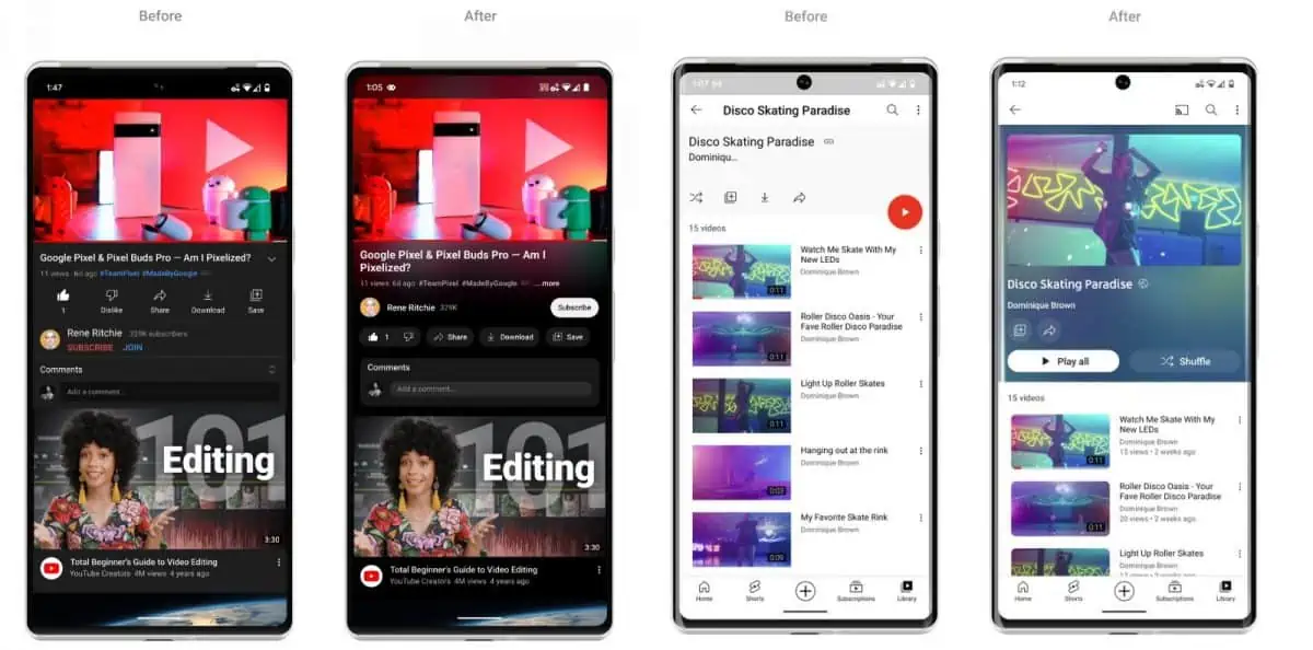
Google announced the rollout of a new design on its YouTube website today. After gathering input from "thousands of viewers around the world", Google decided to give YouTube a "cleaner, more lively design".

One of the main changes is a new ambient mode, which displays a glow around the video area that adapts the background color of that area to the main color of the video. Ambient mode is activated automatically in dark mode. Google notes that it has updated the dark mode design "so that the colors truly pop" on user screens.
The feature, which is rolling out to desktop and mobile versions of YouTube, looks to become a controversial one. Google claims that it received "overwhelmingly positive reactions from users during testing", but first reactions on sites such as Twitter or Reddit paint a different picture. Some like ambient mode, others dislike it. Some find it distracting, others don't want it to change dark mode's color scheme while playing videos.
Good news is that it is easy to turn off the glow of YouTube's new ambient mode. Here is how that is done:
On desktop and mobile devices:
- While playing a video, select the Settings button.
- Locate the Ambient Mode setting in the list of preferences.
- Toggle it to off to disable Ambient Mode for all videos on YouTube (in that browser).
Other options are provided by userscripts. The script YouTube watch page update reverter, for instance, reverts the watch page to the classic one. Note that it has not been updated yet to reflect the changes announced today. Keep an eye on other userscripts as well.
Another alternative is to use third-party apps or services to watch YouTube videos. NewPipe is an excellent YouTube client for Android, but there are other YouTube client alternatives as well. Desktop users may want to check out extensions such as LibRedirect, which redirect YouTube to mirror sites powered by Invidious and others.
Other YouTube design changes
There is more. Playlists show more details now and have received the same color treatment according to Google. To reduce distractions, Google decided to change links in video descriptions to buttons. Frequent actions, such as sharing or downloading, are "formatted to minimize distractions".
There is also a new pinch to zoom feature and precise seeking feature available that is being rolled out to all users on Android or iOS. Pinch to zoom allows users to zoom in and out of videos while they are playing. The zoom level stays once the action is ended on behalf of the user.
Precise seeking is designed to improve going to a specific part of the video. It works by dragging or swiping while seeking. YouTube displays a row of thumbnails of the video in that case that assists users in going to a specific part of the video.
Now You: what is your take on the design changes on YouTube?


3175x175(CURRENT).thumb.jpg.b05acc060982b36f5891ba728e6d953c.jpg)
Recommended Comments
There are no comments to display.
Join the conversation
You can post now and register later. If you have an account, sign in now to post with your account.
Note: Your post will require moderator approval before it will be visible.