
3175x175(CURRENT).thumb.jpg.b05acc060982b36f5891ba728e6d953c.jpg)
Check out this totally wild Google homepage experiment spotted by 9to5Google: the search page suddenly has a row of cards at the bottom. If this design is widely adopted, it would easily be the biggest google.com design change ever.
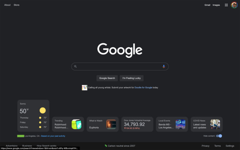
In the experiment, Google.com has a row of six cards at the bottom of the page. There's weather, trending searches, "what to watch," a stock card, local events, and COVID news. Clicking on a card will either expand it or load a search-results page. There's also a "hide content" switch, which will turn the cards off. All of this seems very similar to the Google.com app, which has a scrollable list of "discover" cards.
One of the reasons Google Search initially became popular was because the search page was plain and easy to use. The competition at the time included search engines like Yahoo and Alta Vista, which presented users with a massive wall of ads and content. Google's starkness was a major differentiator in the early days, and it's interesting to see the company toy with moving a little closer to the days of Yahoo, even if it's presenting a more modern take on the idea.
You have to wonder how many people actually still use the Google.com search page. If you have Google's browser, Chrome, you basically never see it. The Chrome "new tab" page looks similar to Google.com, but it's not the same, and the prevalence of address bars that double as search bars makes a search homepage rather obsolete. So far, there are no indications that Google plans to release the design change as a permanent feature, but the company has seemed willing to make big changes to search lately. Dark mode (shown in the screenshot) rolled out just five months ago.
Listing image by NurPhoto/Getty Images

Recommended Comments
Join the conversation
You can post now and register later. If you have an account, sign in now to post with your account.
Note: Your post will require moderator approval before it will be visible.