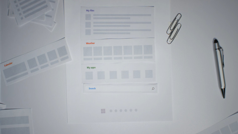
Earlier today, Microsoft sent an email to all Windows Insiders with the subject line "How we built Start" under the heading "Learn what's coming next". You'd be forgiven for thinking it was new information on some changes happening to Start ahead of Windows 11 version 22H2 release, but no, it linked to a short video originally posted on June 2021, that's before most people in the world had even experienced Windows 11 for themselves.
In the video, we see several Microsoft employees talking about how they decided the new Start would work in Windows 11, while Ashley, one of the User Researchers says:
"It's really easy to design something that you [meaning herself] like, but that doesn't necessarily mean that it will work well for everyone".
It would seem to me, being a User Researcher, your job should be to design for the majority. Well, you can view the video for yourself below.
In the video we see several mockups for the Start menu that include a Calendar and Weather placement, but as the video draws to a conclusion, Ryan, a "Design Lead", says that "we always saw Search, Files and Applications together" to which Eric, the Program Manager for Start, agreed with. This was supposedly a decision made by a limited user focus group, or as Microsoft's likes to claim, "based on their telemetry readings of usage".
In any case, yes, those are three things used a lot by Windows users, you know, to launch apps in the operating system. But why dismiss years of incremental improvements made to the desktop experience to come to the conclusion that "most people" used Start to launch apps or search for apps and files? It's nothing less than tunnel vision; where's the "How can we make it better" attitude?

What could have been.
It also goes against many things posted in the Feedback Hub about the crippled Start and how useless it has become. This will at least be improved somewhat in version 22H2 where it will be possible to create Groups for pinned apps, something that received over 7,000 upvotes on the Feedback Hub while ignoring other Feedback. In fact, the video, showing off features that would have made the Start menu so much better than what we ended up with, just feels like a tease.
One has to wonder why Microsoft decided to toot its own horn over a year old video on the design of the Start menu when there was so much pushback over it. It just goes to show that the company is tone-deaf when it comes to listening to some of its most ardent users. And it's not like we're just learning about this problem, Microsoft has shown contempt for Windows Insiders before, dismissing the idea that the Taskbar should be able to be moved, or that their design team prefers to focus on desktop stickers rather than of fix the many UI inconsistencies in Windows.


The video has gained some ... choice comments on YouTube since the email dropped around nine hours ago, I included a couple of the main pain points for most people above. But, for now I guess we'll have to stick with Start menu replacements like Start11 or others, at least in 3rd party offerings you can position the taskbar to the top or bottom and add back useful items to the Start menu.
Tone-deaf: Microsoft reminds people of the great job it did of building Start in Windows 11


3175x175(CURRENT).thumb.jpg.b05acc060982b36f5891ba728e6d953c.jpg)
Recommended Comments
Join the conversation
You can post now and register later. If you have an account, sign in now to post with your account.
Note: Your post will require moderator approval before it will be visible.