Jump to content
  • The Windows 11 Start menu is getting a big update with a dedicated widget panel


    Karlston

    • 3 comments
    • 969 views
    • 1 minutes
     Share


    • 3 comments
    • 969 views
    • 1 minutes

    1715279967_start_menu_companions.jpg


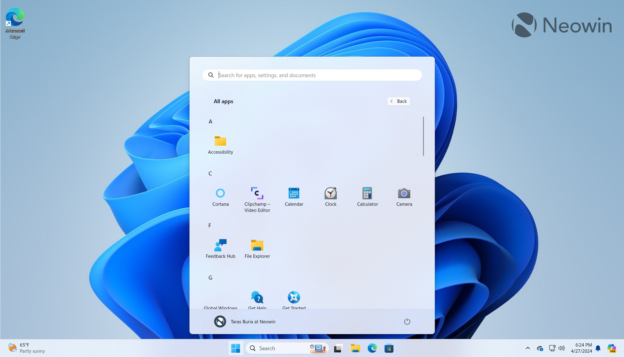
    The recently released Windows 11 Canary build 26212 quietly introduced support for so-called "Start Menu Companions"—widget-like apps for the Start menu to show up next to your pins or the All apps list to display glanceable information, such as weather, stocks, etc.


    Microsoft has not mentioned Start Menu Companions in the official release notes for build 26212. They were discovered by Albacore (@thebookisclosed on X), and here is a sneak peek of what may soon be available for testing in the Windows Insider Program:


    There is not much information about the new Start Menu Companions, considering the feature has not been announced by Microsoft yet. Still, Albacore shared more details about the thing:


    Start Menu Companions look and feel like the resurrection of live tiles, which Microsoft killed in late 2021 when announcing Windows 11 and its, let's be honest, lackluster Start menu.


    It will be interesting to see if developers will pick the idea up. Meanwhile, we have to wait for Microsoft to announce all the details and let users test Start Menu Companions first.


    What do you think about Start Menu Companions in Windows 11?


    Source


    User Feedback

    Recommended Comments

    After using Win11 since launch, I could never set the Start Menu and Quick Launch pins to be aligned to the left. It looks fugly and is counter productive to having them in the middle. And not hiding the search box in the taskbar is sacrilege. lol. Those pictures make me 🤮.

    Edited by spudboy
    Link to comment
    Share on other sites


    3 hours ago, Karlston said:

    @spudboy Fortunately there are Start Menu alternatives and some of them like Stardock's Start11 can also fix Microsoft's Windows 11 Task Bar crazyness. See here.

    I don't use an alternative. I like the Win11 Start Menu with just some registry tweaks like hiding the "recommended" section. Also removing the search box and keeping the start menu centered instead of moving it to the left. Center alignment improves workflow for me personally. I could never go back to having the Start Menu on the left. :) 

    Link to comment
    Share on other sites


    Join the conversation

    You can post now and register later. If you have an account, sign in now to post with your account.
    Note: Your post will require moderator approval before it will be visible.

    Guest
    Add a comment...

    ×   Pasted as rich text.   Paste as plain text instead

      Only 75 emoji are allowed.

    ×   Your link has been automatically embedded.   Display as a link instead

    ×   Your previous content has been restored.   Clear editor

    ×   You cannot paste images directly. Upload or insert images from URL.


  • Recently Browsing   0 members

    • No registered users viewing this page.
×
×
  • Create New...