Microsoft started to experiment with search and the search field of its Windows 11 operating system some time ago. One of Microsoft's latest addition was the display of icons in the search field that depicted a special event that Microsoft picked for the day. Microsoft calls the feature Search Highlights.
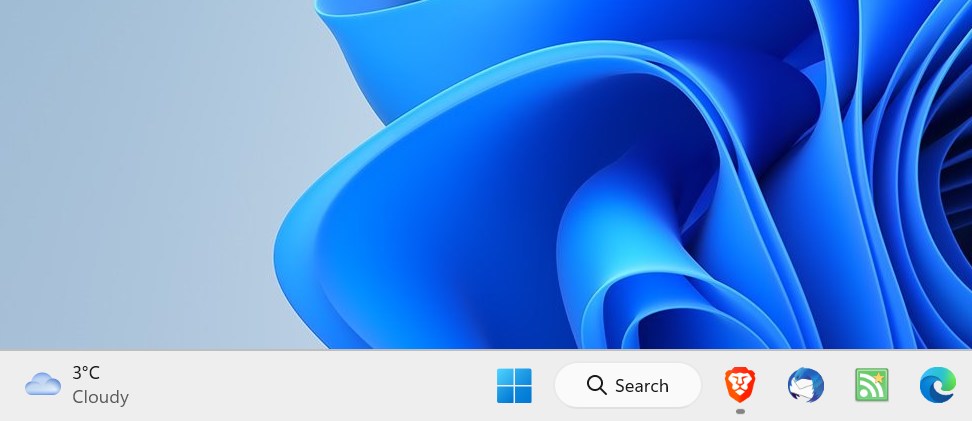
Now, more and more Windows 11 users are seeing a bigger search field on the Windows 11 taskbar. Microsoft placed it next to the Start icon and before any pinned icons. Windows 11 users who configured the taskbar alignment to be left, have the widgets icon placed on the right side of the search field.

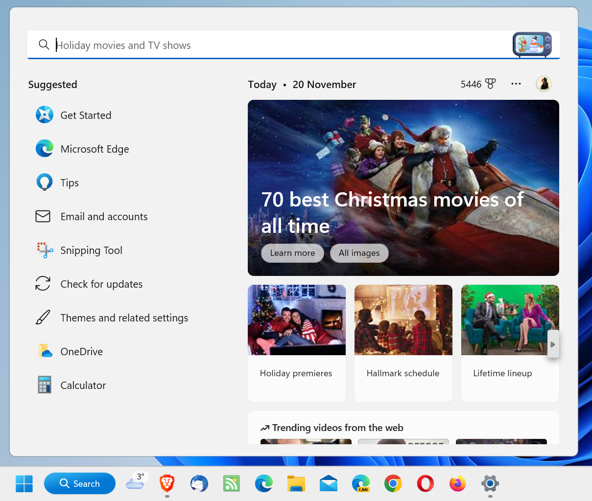
Activation of search opens the main search interface. It is divided in two main columns: the left displays suggestions, e.g., apps to start, tips or suggestions, and the right content from the Web.
While that may be useful to some Windows 11 users, most may dislike it.

In contrast, opening Start displays pinned programs and, if still enabled, recommendations. Start includes search functionality as well, and the results window is actually using the Search interface.
In other words: it does not matter if a user searches from Start or the Search field, the resulting page is identical.
Why then keep the Search field enabled? Suggestions are basic and not useful to the majority of users. Some users may appreciate web results, but opening any browser displays similar content. Windows 11 users who like it can open the MSN website to get similar content.
It is easy enough to remove search. One additional advantage of doing so is that there is more space for icons on the taskbar.
Here is how you remove the Search field from Windows 11's taskbar:
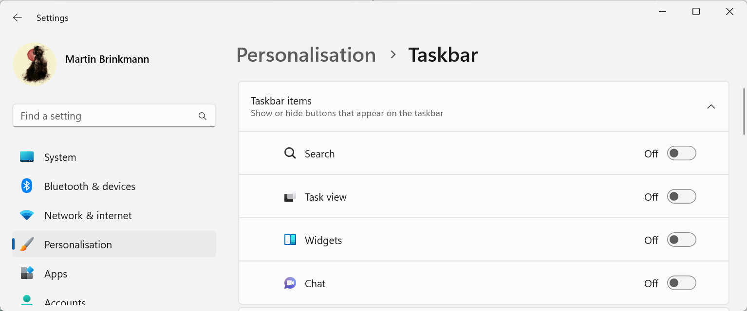
- Right-click on a blank spot on the Windows 11 taskbar and select Taskbar Settings. Alternatively, if there is no blank space left, open Start > Settings > Personalization > Taskbar to get there.
- The Taskbar Items group at the top of the page that opens lists Search as one of the elements that users may display or hide. Just toggle it to off, and search is no longer displayed.

A click on Start, or a tap on the Windows-key opens the search options of the Start Menu. Just tap Windows and start to write to run a search on the system.
Closing Words
Microsoft pushes search on Windows for a specific reason, and it is not for the benefit of the user. Third party tools like the excellent Everything search or a Start replacement app, like Start11, are good options to skip the default Windows 11 search options entirely.
Now You: do you use the built-in search on Windows, or an alternative?
- pintas
-

 1
1


3175x175(CURRENT).thumb.jpg.b05acc060982b36f5891ba728e6d953c.jpg)
Recommended Comments
Join the conversation
You can post now and register later. If you have an account, sign in now to post with your account.
Note: Your post will require moderator approval before it will be visible.