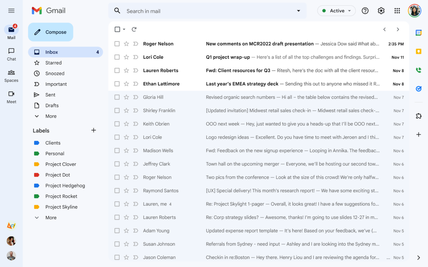
The new desktop Gmail design started rolling out this weekend. If you use the default theme, you'll know it has arrived when your entire Gmail interface turns blue. Gmail's new design first entered an opt-in preview in February, and after gathering feedback and fixing a few things, Google is pushing the design out to everyone. Everyone dislikes Gmail changes, so let's talk about what's different and how to turn it back.
A few things have changed between now and the February preview. The most striking change is the all-blue color scheme. Google's blog post says: "You’ll notice the new navigation now features Material You, our updated, fresh look and feel for your Google apps." "Material You" launched with Android 12 as a color-coordinated theming system that matched your OS color scheme with your wallpaper. There's no color-matching with Gmail's "Material You," though, just the blue color scheme.
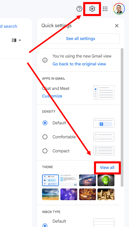
Gmail still has a theme system, so you can change the color to whatever you want. Click on the settings gear in the top right and then under the "theme" section, click "view all." The background closest to the old Gmail is the solid "soft gray" background option. To truly match the Old Gmail background, you would want "white," but that's not an option. (You can also pick from your Google Photos collection via a "my photos" link at the bottom, and I tried uploading a solid-white background, but trying to apply it only brings up an error message). This "theme" screen is also where you can apply Gmail's weirdly hidden dark mode: Just pick the black background option, and everything will switch over to light text on a dark background.
The other change you might want to make involves fixing our biggest complaint with the new Gmail: that new, giant sidebar. Google has long had the strategy of shoving whatever new products it wants to promote into Gmail, and the new Gmail design comes with a big, full-height sidebar featuring only four icons: one for Gmail, two for Google Chat (Google's latest messaging app), and one for Google Meet (Google's version of Zoom meetings). Gmail already has a sidebar, but this new design adds a second sidebar, which feels like a big banner ad for Google's other communication apps. Thankfully, in between the February preview and this on-by-default rollout, Google apparently listened to feedback and added the option to turn off the sidebar.
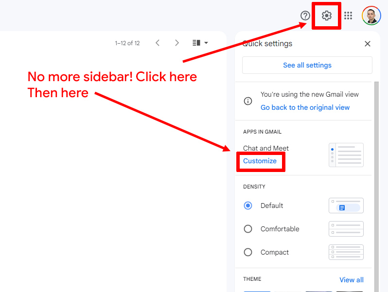
It's not obvious, but you can turn off the second sidebar by clicking on the gear and then "customizing" Google Chat and Meet.
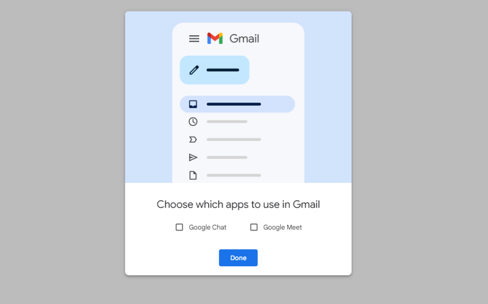
Then, this box will pop up. Turn off Google Chat and Google Meet.
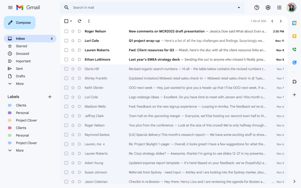
Now, Gmail will look like this. No more second sidebar!
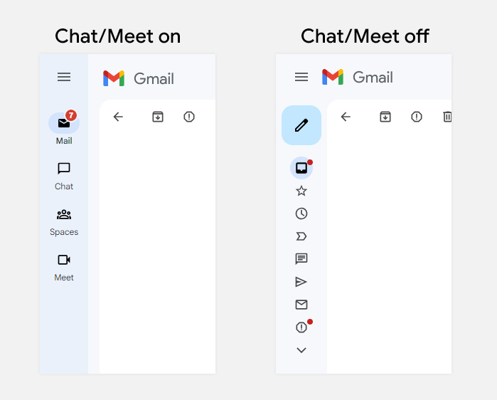
Removing the second sidebar makes the Gmail sidebar collapse the way it used to, with visible Gmail sections.
This new "no-sidebar" option isn't very obvious, but you can kill the Gmail sidebar by turning off Google Chat and Google Meet. Just head to the settings gear, then the "Customize" link under "Chat and Meet." Un-tick both checkboxes, and the sidebar will disappear, allowing you to reclaim a lot of screen real estate. It's strange that New Gmail works this way when Old Gmail put Gmail controls, Google Chat, and Google Meet all in a single, adjustable sidebar, but that's what Google chose to do.
Turning off the two-sidebar layout not only makes new Gmail look a lot more like old Gmail—it also makes the regular Gmail sidebar work the way it used to. With the two-sidebar layout, clicking the hamburger button to collapse the sidebar only shows the app switcher and not any of the Gmail controls—you see links for Google Chat and Google Meet instead of "Inbox," "Stars," "Spam," etc. When you turn off Google Chat and Meet, though, collapsing the Gmail sidebar once again shows Gmail controls inside Gmail. Huzzah.
If you really don't like the new Gmail, you still can, for at least a little while longer, opt out of the new design. Click the settings gear, and you should still see a "Go back to the original view" option. This won't last forever, though, and you'll have to get used to the new Gmail eventually. The original version was rough, but Google seems to have listened to the complaints about the second sidebar. If you tick the right settings boxes, you'll see that there is no longer much difference between the newer and older versions of Gmail.
Listing image by Google


:format(webp)/cdn.vox-cdn.com/uploads/chorus_image/image/68491189/newgmaillogo.0.jpg)
3175x175(CURRENT).thumb.jpg.b05acc060982b36f5891ba728e6d953c.jpg)


Recommended Comments
There are no comments to display.
Join the conversation
You can post now and register later. If you have an account, sign in now to post with your account.
Note: Your post will require moderator approval before it will be visible.