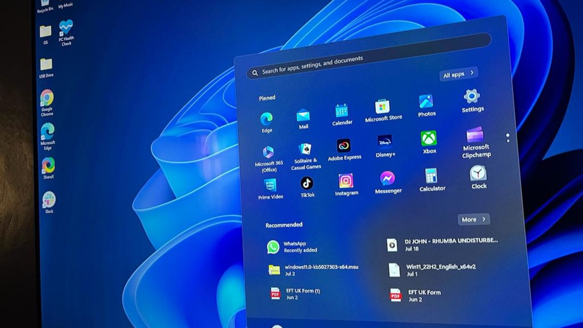
A former Microsoft employee narrates how he wrote the Windows 95 Start menu.
What you need to know
- A former Microsoft employee narrates how he wrote the Start menu for Windows 95.
- Windows 11's Start menu has received considerable backlash from users due to its flawed design and redundancy.
- Microsoft's recent move to bring ads to the Start menu in Windows 11 isn't popular among avid users.
Avid Windows users are in a love-hate relationship with the Start menu in Windows 11. But how did the app come into existence in the first place? Microsoft veteran Dave W. Plummer, aka Dave's Garage, known for his contributions across the Windows ecosystem, including adding ZIP file support to Windows over 30 years ago, recently narrated how he wrote the Start menu for Windows 95.
In the 6-minute long YouTube video, Plummer admits that developing the Start menu was a team effort. While the former Microsoft employee says the Windows 95 team should take the "lion's share of credit" for developing the Start menu, his efforts are consistent across the app. "I wrote the stuff that paints the stuff that you see in the beginning, and that actually runs the program that you run at the end," added Plummer.
It's worth noting that Windows 95 already had a Start menu but was riddled with critical issues. And though it worked well enough, it said Windows 95. Plummer highlighted Microsoft's plans for the product wouldn't support that moniker.
According to Plummer:
"We couldn't just change it to Windows NT because that was not going to be the name of the product long term it was Windows NT 4 Professional or Workstation or Advanced server, depending on what product skew you have. And so we needed to put that in the Start menu. And if we had that for all the different languages that Windows NT supported, that would be a huge Matrix of these Bitmaps we would have to create in advance and, hopefully, dynamically load on the fly when you went to render the Start menu, and not take up memory and cash it."
To avoid these issues, Plummer wanted to render the platform live using Graphics Device Interface (GDI) and painted the blue and black gradient on the Start menu. The software engineer indicated that the system would automatically dither the gradient if your PC didn't have all the colors.
Plummer also pointed out that rendering text was also an issue since, at the time, you couldn't draw sideways text. While it was impossible on Windows 95, Windows NT shipped with a neat feature dubbed coordinate transformations that served as a workaround. It allowed Plummer to render the text at a 90-degree angle, allowing it to fit in the bar. And the rest is history.
- EnglishLionheart
-

 1
1


3175x175(CURRENT).thumb.jpg.b05acc060982b36f5891ba728e6d953c.jpg)

Recommended Comments
There are no comments to display.
Join the conversation
You can post now and register later. If you have an account, sign in now to post with your account.
Note: Your post will require moderator approval before it will be visible.