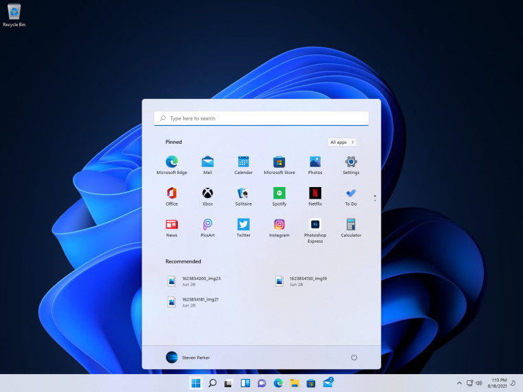
The changes implemented with the Windows 11 Start menu have been quite a hot topic since the first builds became available for Windows Insiders. The fact that it has been dumbed down quite a bit into a glorified 'Recents' jumplist has people already looking for alternatives and solutions. Just over a week ago, Stardock launched Start11 to bring back the Start menus of previous Windows versions, however the Windows 10 style with its Live Tiles was notably absent from the Beta.

A Neowin reader, Dot Matrix, decided to share his own vision of what the Start menu could look like in Windows 11, and even went so far as to submit it as a suggestion on the Feedback Hub.
As you can see above, the Start Menu returns to a Windows 10 layout with 'All apps' on the left and groups of pinned apps on the right. Instead of Live Tiles, we see the icons of the apps. Dot Matrix goes on to say "there's no more "recommended" section. That can go to hell." I can see where he's coming from. It's cool and all, but it is not very privacy orientated. In many ways, it's worse than Jumplist suggestions, which can be turned off in previous Windows versions. It can also be turned off in Windows 11 but it is a global setting, so if you disable it, you will get a half-empty Start menu and no Jumplist or File Explorer recommendations. (Why not split off those options, Microsoft?).

Here we can see a full screen version of the Start menu which could be invoked through a tablet mode. All in all, it is already more useful than what is currently shipping with Windows 11, even if all the whitespace gives me a bit of a headache.

And finally, as is shown above, what about moving the entire Widget pane and the spiritual successor to Live Tiles back into the Start menu instead of a flyout pane?

Personally, I think the widgets pane in Windows 11 is not well thought-out. Microsoft is saying that to get 'at a glance info' for weather and news, open the pane from the taskbar, completely missing out on an opportunity to pin these widgets on the desktop itself. As our screens get larger and wider (I have a 5180x1440 Ultrawide screen), it makes sense to be able to place widgets directly on the desktop. A news alert? Unless you purposely decide to check the widgets pane, you aren't going to see it, you have far more chance of seeing it if it is pinned on the desktop. Microsoft took a great idea with Live Tiles and implemented it poorly in Windows 10, insofar that they are now discontinued altogether.
Anyway, I am rambling. If you like these Start menu concepts and think Microsoft should expand on it, all you can do is upvote it on the Feedback Hub right here. You can also give some feedback on these concepts in the comments below or directly in the forum thread.


3175x175(CURRENT).thumb.jpg.b05acc060982b36f5891ba728e6d953c.jpg)

Recommended Comments
There are no comments to display.
Join the conversation
You can post now and register later. If you have an account, sign in now to post with your account.
Note: Your post will require moderator approval before it will be visible.