
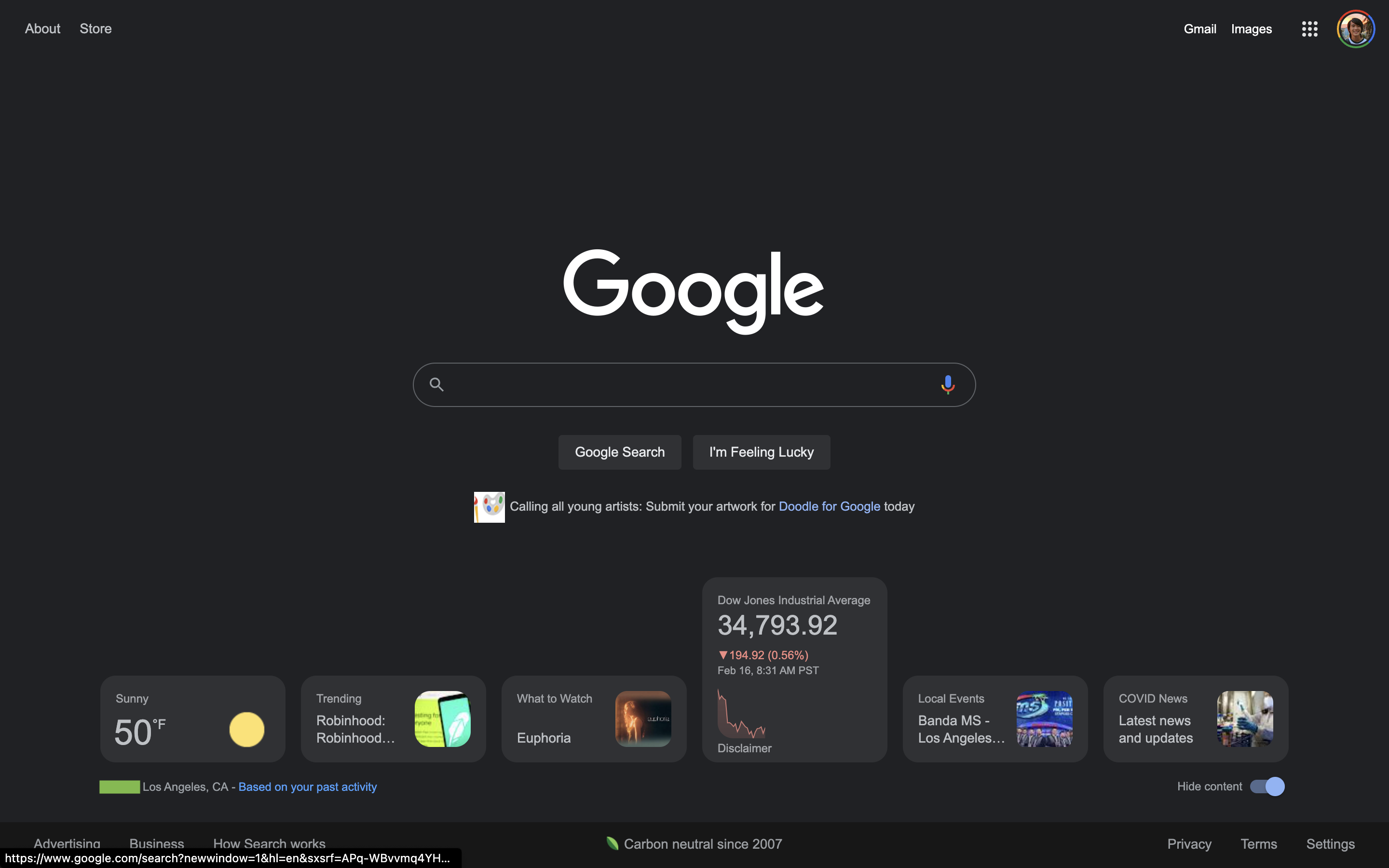
The Google homepage has historically been known for providing a clean interface that primarily offers a Search field. Google Search is now testing a row of cards on desktop web for an experience that’s similar to Discover.
Update 8/4: Following the original February appearance that ended after a few days, widgets on the Google homepage are being more widely tested. In recent days, we’ve had two reports of people temporarily seeing it live.
What’s new is a “Meet the new Google.com” card that prompts you to “Sign in to customize.” After doing so, tapping “Make the space yours” opens a “Hi, What are you interested in?” window that lets you customize the widgets. Available options include:
Air Quality, Cryptocurrency, Stock Market, Your Top Stocks, Events Nearby, Weather, Trending Searches, Top Stories, Sports, and What to Watch
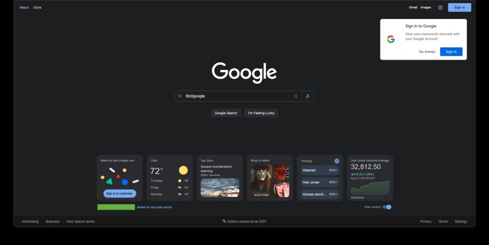
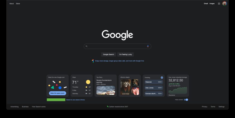
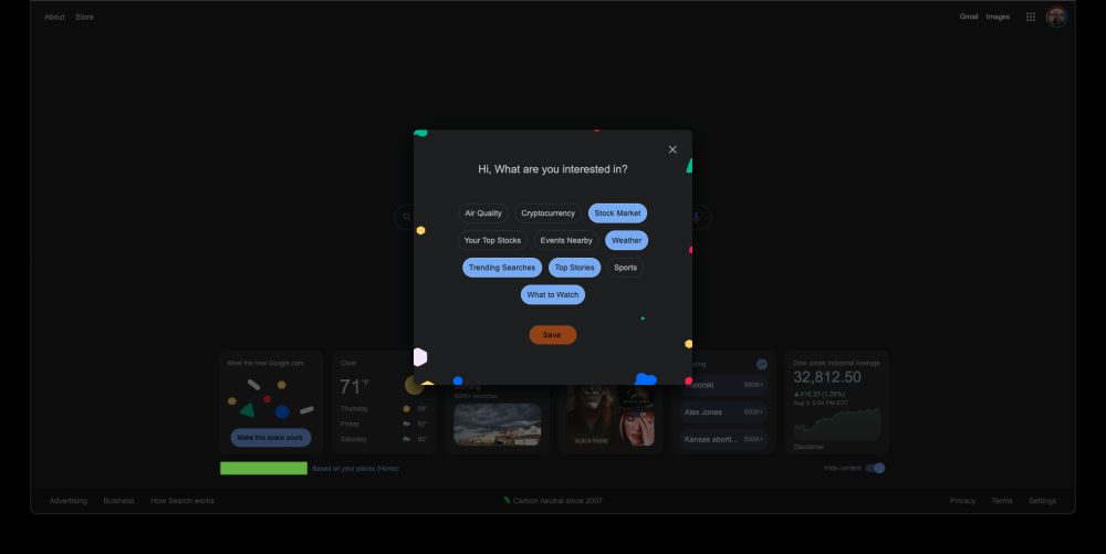
Meanwhile, by default, the cards are now expanded to be squares rather than shorter rectangles. This allows for more information to be shown at a glance.
This experience being branded as the “new Google.com” is quite interesting given the company’s previous insistence that homepage remain minimalist. That said, these items might be helpful, while the user-facing announcement suggests that a wider launch could be near.
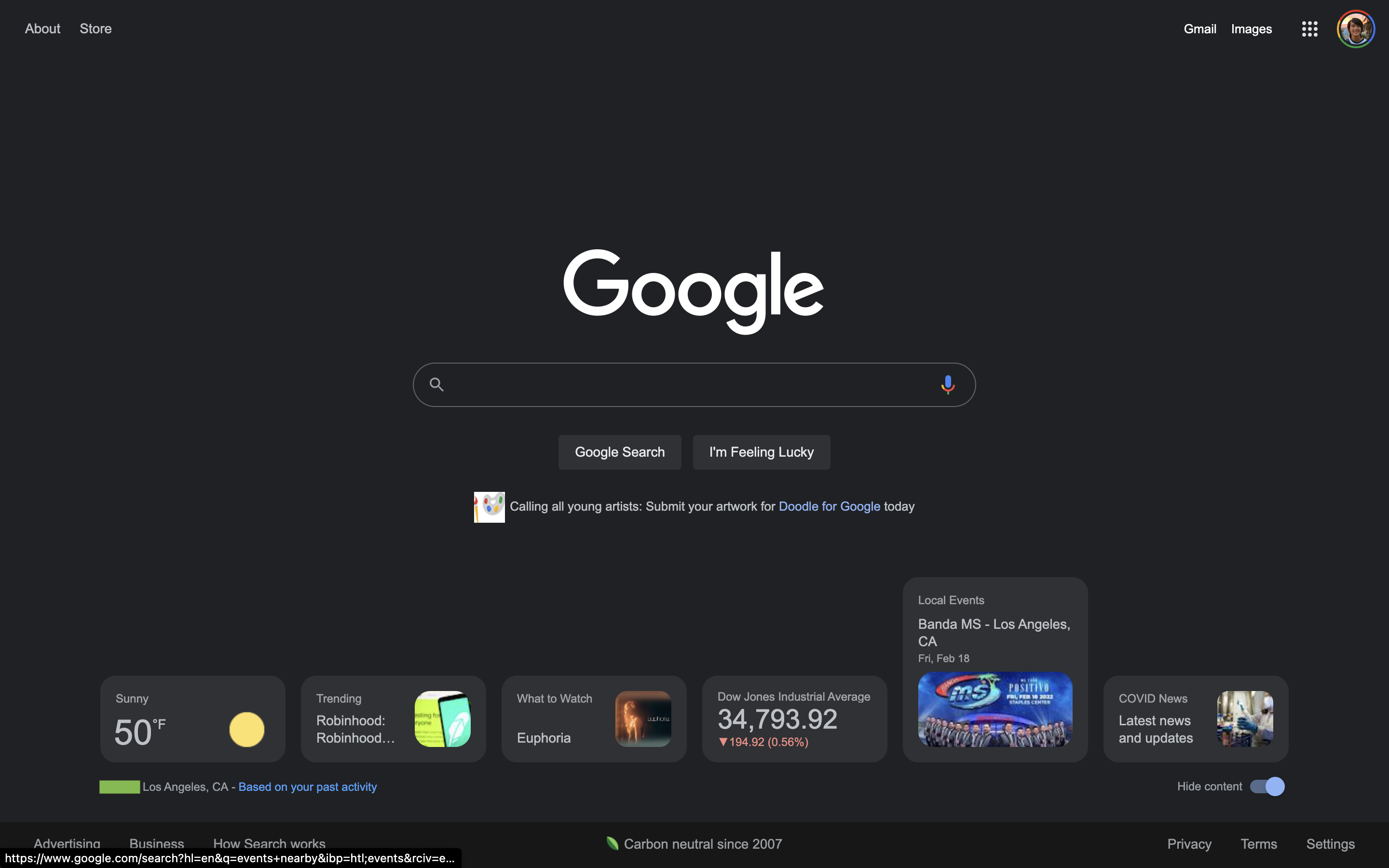
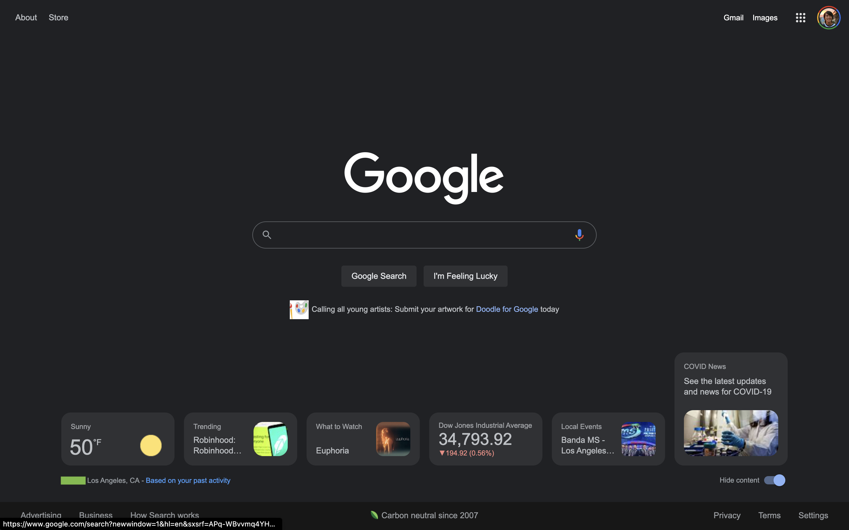
Original 2/16: These cards appear at the very bottom of google.com. There’s a “Hide content” toggle in the bottom-right corner, while Google notes your zip code/city and explains that the information offered is “Based on your past activity.” When the window is fully expanded, six cards are offered and they all expand on hover:
- Weather: Condition (with) icon + temperature. Three-day forecast on hover
- Trending: Cover image with search count
- What to Watch: Shows and movies with cover art
- Stocks/markets: Day graph on hover
- Local Events: With date
- COVID News
Tapping opens the full web result with the usual Knowledge Panel card and/or related Google Search experience. The number of cards that appear depends on the size of your screen with no way to scroll and see more without physically expanding the window.


We’re only seeing this rolled out on two Google Accounts, albeit across several signed-in devices, today. As such, this is very likely a test to determine whether a full rollout is warranted.
9to5Google’s Take
This very much results in a Google Discover-like experience, but without subjecting people to another feed to scroll through. The company, back in 2018, was adamant that Discover was not coming to the desktop web – just mobile.
What Google Search is testing today is quite like widgets and provides more utility to a very popular web destination without cluttering the clean experience. Weather is of course the most useful addition, while this is a better approach than the increasingly busy Chrome New Tab page. It also harkens back to the days of the iGoogle dashboard.
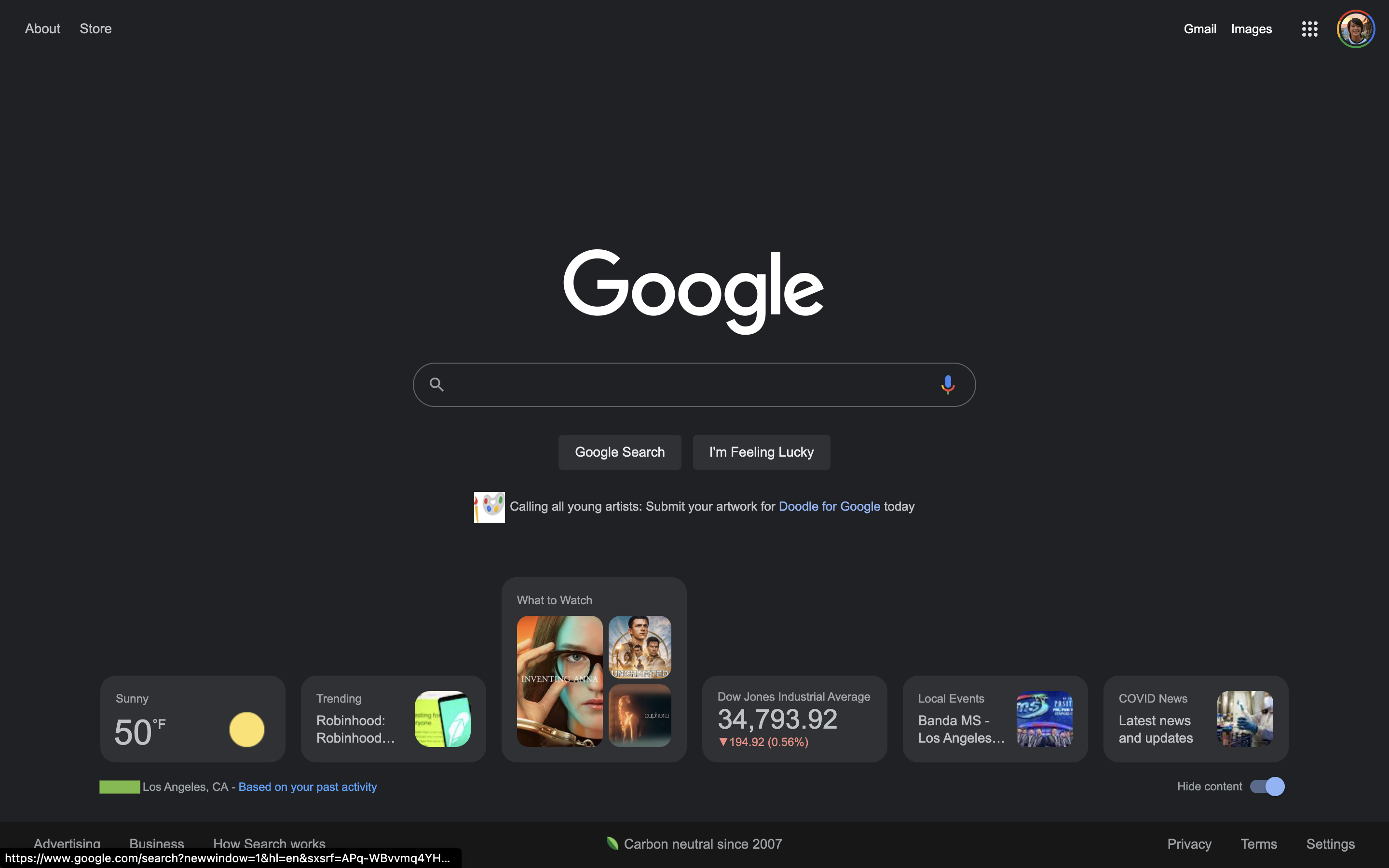
‘New Google.com’ adds weather, news, and other cards, enters wider testing
- aum
-

 1
1


3175x175(CURRENT).thumb.jpg.b05acc060982b36f5891ba728e6d953c.jpg)
Recommended Comments
Join the conversation
You can post now and register later. If you have an account, sign in now to post with your account.
Note: Your post will require moderator approval before it will be visible.