On its 40th anniversary, we look back at the machine that brought the GUI to personal computers.
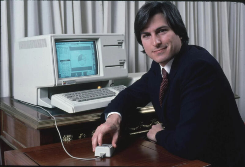
Steve Jobs posing with the Lisa in 1983.
Forty years ago today, a new type of personal computer was announced that would change the world forever. Two years later, it was almost completely forgotten.
The Apple Lisa started in 1978 as a new project for Steve Wozniak. The idea was to make an advanced computer using a bit-slice processor, an early attempt at scalable computing. Woz got distracted by other things, and the project didn’t begin in earnest until early 1979. That’s when Apple management brought in a project leader and started hiring people to work on it.
Lisa was named after Steve Jobs’ daughter, even though Jobs denied the connection and his parentage. But the more interesting thing about the Lisa computer was how it evolved into something unique: It was the first personal computer with a graphical user interface (GUI).
The vision takes shape
GUIs were invented at Xerox’s Palo Alto Research Center (PARC) in the early 1970s. The Alto workstation, which was never sold to the public, had a bitmapped screen that mimicked the size and orientation of a piece of paper. PARC researchers wrote software that displayed windows and icons, and they used a mouse to move a pointer on that screen.
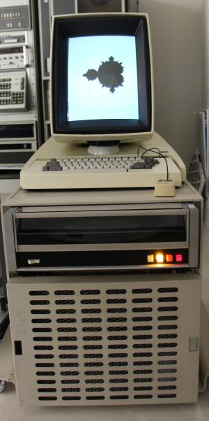
Jef Raskin, an early Apple employee who wrote the manual for the Apple ][, had visited PARC in 1973. He believed that GUIs were the future. Raskin managed to persuade the Lisa project leader to change the computer into a GUI machine. However, he couldn’t convince Jobs, who thought Raskin and Xerox were incompetent.
Raskin altered his approach and got graphics programmer Bill Atkinson to propose an official tour of PARC in November 1979. Because Jobs thought Atkinson was great, he agreed to come along. Jobs’ visit to PARC became the stuff of legend, a tale of a brilliant visionary seeing the future of computing for the first time. But in reality, Atkinson was already working on LisaGraf—the low-level code that would power the Lisa’s GUI—months before Jobs saw the PARC demo.
The Lisa’s hardware changed as well. The team abandoned the bit-slice processor and adopted Motorola’s new 68000 CPU. The 68000 was a 16/32-bit chip and used a 24-bit address bus, giving it a maximum of 16 megabytes of memory. This was fine, as memory prices were still sky-high in 1980, and most computers of the day had a maximum of 64 kilobytes of RAM.
In January 1981, senior leadership at Apple got tired of Jobs’ constant interference and micromanagement of the Lisa project and officially removed him from the team. Jobs seethed, then took over a smaller skunkworks project being run by Raskin.
This would become important later.
By early 1982, the Lisa hardware was mostly finalized. However, the software was still in flux. A team of designers—including Larry Tesler, who had left PARC to join Apple—had been busy doing tons of research, prototyping, and testing. The main question they had was: How should the Lisa’s GUI actually work?
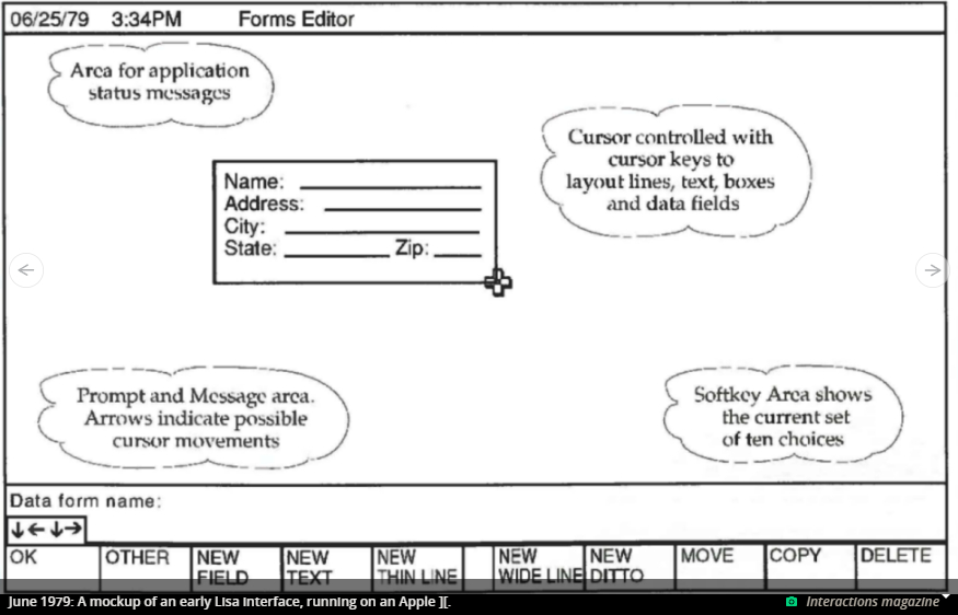
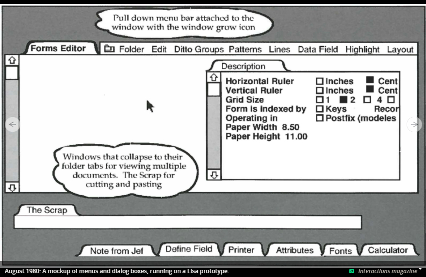
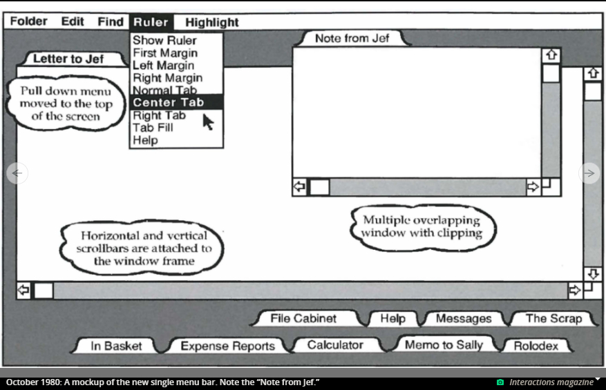
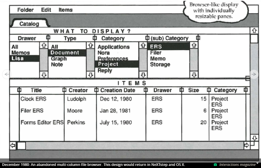
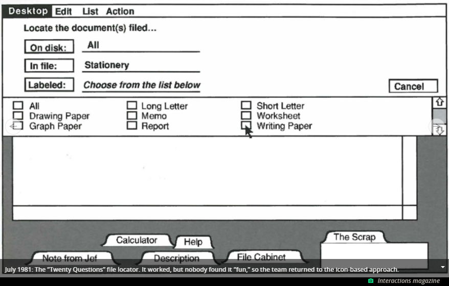
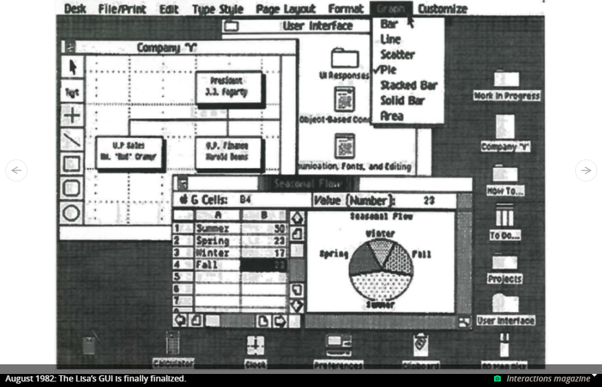
In an article in Interactions magazine, designers Roderick Perkins, Dan Smith, and Frank Ludolph described how the Lisa’s interface changed from early prototypes to a familiar desktop with icons, then away from that model, then finally back to an icon-based, document-centric approach. The goal was to make the Lisa powerful and fun to use.
At long last, the Lisa was ready to be unveiled to the public. On January 19, 1983, Apple announced the computer, which it accurately described as “revolutionary.”
Lisa meets the world
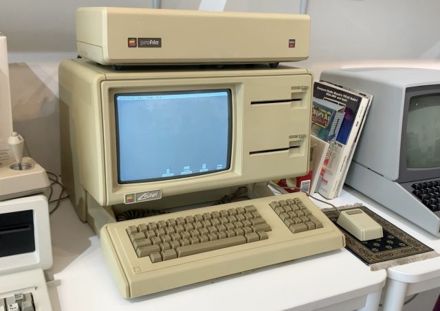
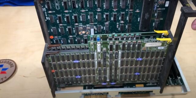
The Lisa was an all-in-one computer with a 12-inch monochrome screen at a resolution of 720×365 pixels. It used a Motorola 68000 CPU running at 5 MHz. It had 1MB of RAM. The computer came with two Apple-designed “Twiggy” 5.25-inch floppy drives, but it was designed to be used with Apple’s “ProFile” 5MB hard drive, which sat on top. It also had three expansion slots. The Lisa’s keyboard was attached by a coiled cord, and a mouse was included.
The decision to go with a one-button mouse was, according to Tesler, arrived at after extensive user testing. Because of this, the Lisa software designers had to invent a new form of interaction called “double-clicking.”
The Lisa came bundled with both an operating system and an “office suite” of seven applications: LisaWrite, a word processor; LisaCalc, a spreadsheet; LisaDraw, a vector drawing program; LisaList, a primitive database; LisaProject, a project management app; LisaTerminal, a terminal emulator that worked with a modem; and LisaGraph, a chart-maker program.
The operating system (Lisa OS) had preemptive multitasking and could run many programs at once. It also supported virtual memory and memory protection. To gain these features required a Memory Management Unit (MMU) chip, but Motorola hadn’t built one yet, so Apple had to design a solution on its own.
All this revolutionary hardware and software was amazing, but it came at a steep cost: The Lisa’s price was $9,995, which would be nearly $30,000 today. This was too much for home users. Business owners—the target market for the Lisa—might pay this much, but they would expect a computer to support multiple users connected via cheap text-based terminals and to run boring accounting software, not esoteric design apps for budding graphic artists.
As a result, sales of the Lisa were slow. Only a few thousand computers were sold in the first year, and the numbers didn’t pick up much after that. They weren’t helped by Jobs running around telling everyone that the real revolutionary computer from Apple, the Macintosh, was just around the corner.
Using the Lisa
So what was the Lisa like to use? To find out, I tracked down the only working Lisa emulator, LisaEm, and put it through its paces. LisaEm tries to simulate the experience of using a Lisa as accurately as possible, right down to displaying a picture of the computer and letting the user click the power button and floppy drive directly.
After installing the operating system (which comes on five floppy disks) you can boot into the hard drive directly. The desktop has a gray background, a single menu bar on the top, and some icons near the bottom.
Double-clicking an icon opens a new window with a fast-expanding outline animation. In the top left corner of the window is a small version of the same icon, which you double-click to close the window.
But you never really “close” windows on the Lisa. The File/Print menu has two options: “Set aside” and “Save and put away.” Setting windows or apps aside closes them visually, but they remain in memory in case you want to use them again. Also, the system remembers where the window was and automatically saves any files or data you were working with, even if you turn the computer off. “Save and put away” just means you set a new undo point—the system has only one level of undo, and this gives some level of control for reverting to a previous version.
To move a window, you drag it by the title bar, and an outline follows the mouse cursor until you release the button. Only the portions of windows that are revealed by this move are redrawn. This is thanks to Bill Atkinson’s LisaGraf routines, which calculate all this automatically. Atkinson thought he had seen this effect at a PARC demo, but it actually never existed until he invented it.
A weird aspect of the system is that it is document-centric. So if you want to make a new document in LisaWrite, you don’t double-click the LisaWrite icon. If you do, the program launches, but it then admonishes you to go back and tear off a “LisaWrite Paper” instead. When you do that (by double-clicking), a new icon appears close to the LisaWrite Paper icon, and the current date is appended to the file name. You then double-click on that and the document is opened in LisaWrite.
This method has some advantages—you can never have any “Untitled” documents, and every document is automatically saved. But since you still have to know what application you want to make the document in—for example, if you want a new spreadsheet, double-click “LisaCalc Paper” instead—in practice, it ends up being somewhat clumsy. It also doesn’t make sense for some applications, like LisaTerminal. Interestingly, IBM copied this document-centric approach for its Workplace Shell desktop interface in OS/2 2.0.
Another strange aspect is how you install software from floppy disks onto the hard drive. If you just drag the icon from the floppy window to the drive window, the system complains that this is a “master” version. So you have to select the icon (or icons, since you’ll need the “Paper” and any additional files for the application), then choose “Duplicate” from the File/Print menu. This will make a new icon that blinks to remind you that it’s a sort of “shadow” copy. No copies have actually been made yet. You then drag this icon to the hard drive window, and after another confirmation, it will make a copy.
The seven applications bundled with the Lisa were remarkably full-featured at the time. LisaWrite, the word processor, includes a dictionary and spell checker, and it supports multiple fonts. Everything can be copied and pasted between apps, which is even more amazing since copy/paste didn’t exist yet and had to be invented by Larry Tesler. I could draw a simple Ars logo in LisaDraw and easily copy it into my LisaWrite document.
Apart from minor differences, the interface is eerily similar to the Macintosh GUI that debuted with the first Mac in 1984. There's a good reason for this.
After being kicked off the Lisa team, Jobs strong-armed his way into Raskin’s Macintosh project. Raskin loved GUIs, but he had different ideas for his computer, which he wanted to be an inexpensive and easy-to-use appliance. After being forced out of the Mac team, Raskin resigned from Apple. Jobs liked the “appliance” metaphor, but he wanted the Macintosh to be a cheaper Lisa.
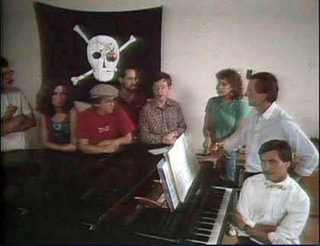
Jobs achieved this by taking the small Mac team and shuffling them into a separate building, putting a pirate flag on the roof, and then going on nerd raids to steal hardware, software, and engineers from the Lisa team.
LisaGraf, the highly optimized set of graphics routines written by Atkinson, was renamed QuickDraw and lifted wholesale to the Mac. This was easy, since both machines used the 68000 processor. The single menu bar and the desktop and icon interface were also moved over, although they had to be redesigned a little. The main reason for this? Cost.
The $9,995 price of the Lisa seems outrageous compared to the $2,495 introductory price for the Mac. But think of what Jobs removed to hit that target. The Mac had only one floppy and no hard drive. The hard drive alone was a $3,499 add-on included in the Lisa’s price. The Mac had only 128KB of RAM, compared to 1MB in the Lisa, which was eight times as much and cost about $2,400 at the time. The Mac had a smaller 9-inch screen at a lower 512×342 pixel resolution. It had no bundled software other than MacWrite and MacPaint. This was because the software had to be rewritten in assembly language to hit the much smaller memory targets, and assembly language programming took much longer to write.
The Macintosh was also incompatible with software for the Lisa. New software had to be written for the Mac from scratch—although ironically, in the beginning, the only way to develop this software was on a Lisa.
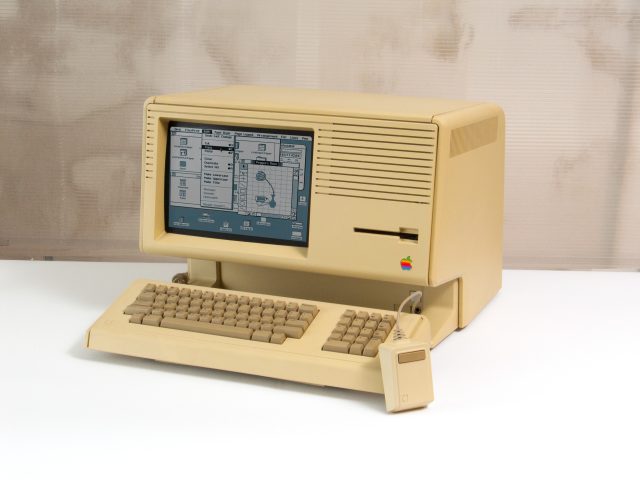
The Lisa 2 was released in 1984 at the same time as the Mac. It had a different case but was the same internally. It came with the now-standard (and more reliable) 3.5-inch floppy drive and had room inside for an MFM hard drive, which was becoming a popular choice in the PC world. It cost a more reasonable $3,495 to $5,495, and sales started to pick up.
But Jobs had deposed the executive who had originally thrown him off the Lisa team and now found himself in charge of both the Mac and the Lisa. He renamed the Lisa 2 the “Macintosh XL” and shipped it with software that emulated the Macintosh operating system instead of the Lisa software. In 1985, he discontinued the Lisa entirely. The remaining inventory was sold to a third party, and in 1989, Apple buried 2,700 Lisas in a landfill to get a tax break.

What could have been
Hitting its cost target was a good thing for the Mac, which sold much better than the Lisa. But it turned the computer into a less functional machine. Multitasking was gone—the original Mac could only run one application at a time. Autosaving was also gone, as was virtual memory and memory protection and Lisa OS’s resilient file system. It took many years for these features to return, by which time the price of both memory and hard drives had plummeted. In an alternate universe, the Lisa’s price could have steadily decreased while its capabilities kept growing. For example, the Lisa team had plans to extend the single level of undo to an unlimited undo.
The main criticism of the Lisa, other than its price, was that the system was too slow. I did not find this to be the case—the overall speed was only slightly slower than the original Mac. Applications took longer to start up on the Lisa, but these applications also had more features. In any case, the speed differences would have gone away as CPUs became faster and compilers improved.
While some features of the Lisa’s interface, like clicking on a “paper” icon instead of an application to open a new document, were confusing, the computer set the standard for how GUIs would work for decades to come. The concept of menu bars and pull-down menus, double-clicking, the smart redrawing of overlapping windows, and even the idea of copy and paste was invented at Apple and first shipped in the Lisa.
The Lisa is a footnote in the history of computing. But today, 40 years after it was first announced, it reminds us that the best ideas don’t always win out, and that there are many lessons we can learn from the past.



Recommended Comments
There are no comments to display.
Join the conversation
You can post now and register later. If you have an account, sign in now to post with your account.
Note: Your post will require moderator approval before it will be visible.