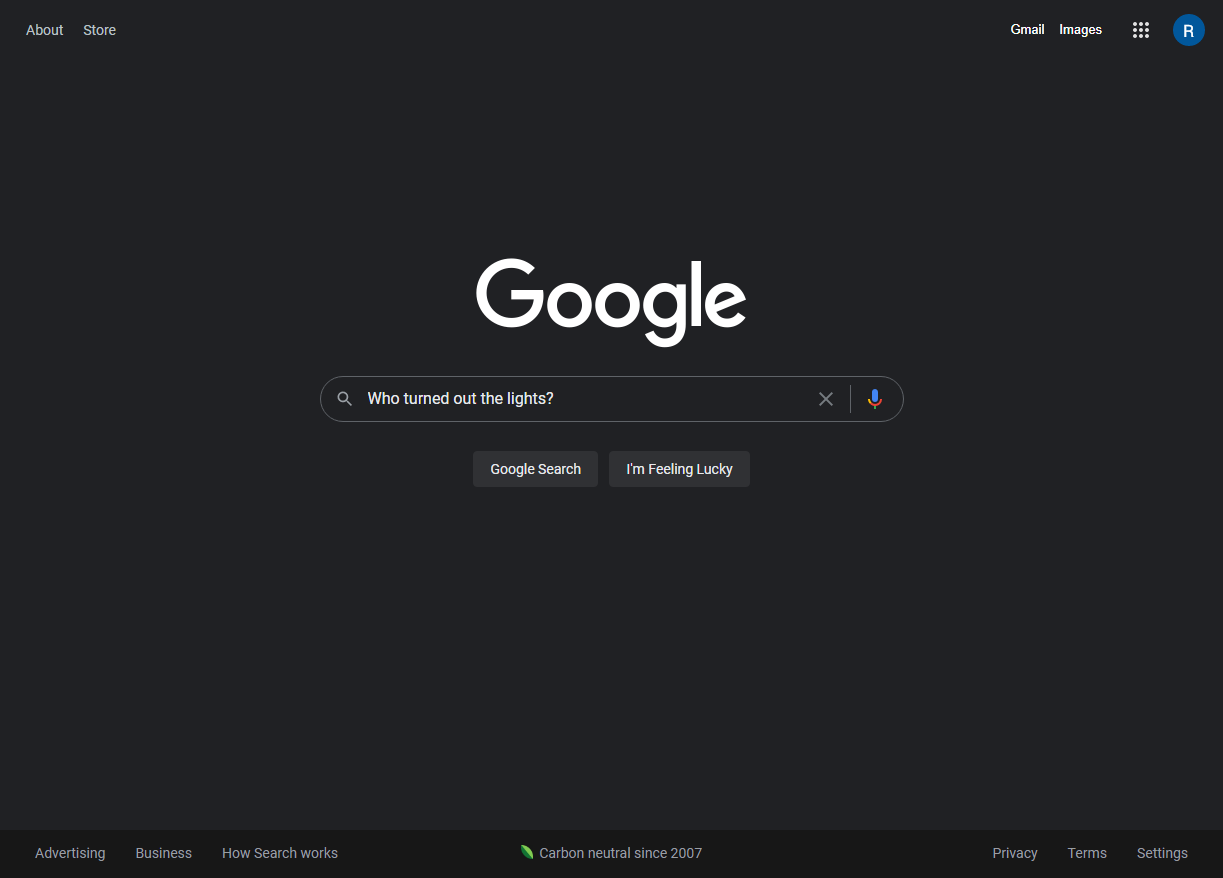
Say goodbye to the blinding-white Google.com start page and search results.

Dark mode! It's finally here.
First image of article image gallery. Please visit the source link to see all images.
It's finally happening: Google.com is getting a dark mode. What was once the domain of janky site-theming browser extensions can now be enabled right from the Google home page. An official post from the support forums says that dark mode in desktop Google Search is rolling out starting today and will reach every user "over the next few weeks."
Whether or not you have dark mode right now depends on your Google account. I have the new mode on two of my four Google accounts (don't ask), including both a personal account and a paid Google Workspace account. To enable the feature, head to the Google.com settings—on the home page, this page is linked in the bottom left, and on a search results page, it's under the gear button in the top right. On the settings page—if dark mode has made it to your account—you'll see a new "Appearance" section where you can turn on the style.
After turning on dark mode, you'll get a quick theme switcher in the gear button, allowing you to easily jump between dark and light modes. The dark setting seems to work on all the Google.com sections, like news, shopping, books, images, etc.
If you don't have an "Appearance" section in the settings, you don't have dark mode yet. Keep waiting!
Google.com dark mode is rolling out to everyone
(To view the article's image gallery, please visit the above link)
- Bl4ckCyb3rEnigm4, yaschir and tipo
-

 3
3


3175x175(CURRENT).thumb.jpg.b05acc060982b36f5891ba728e6d953c.jpg)
Recommended Comments
There are no comments to display.
Join the conversation
You can post now and register later. If you have an account, sign in now to post with your account.
Note: Your post will require moderator approval before it will be visible.