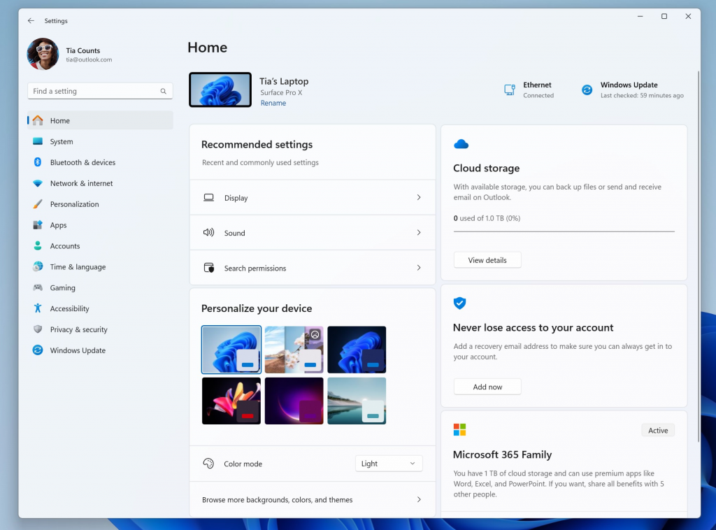
Microsoft released a new Insider build to the Beta channel of the Windows 11 operating system. One of the new features of the release brings the new Settings homepage to testers.
Microsoft unveiled the new Settings homepage earlier this year and it seems that it has not made any adjustments to it ever since the initial reveal, other than moving the blocks around a bit.
The Settings Homepage is opened automatically when users open the Settings app on their devices. This is done via Start > Settings or by using the keyboard shortcut Windows-I.
Windows 11 users who open the Settings app currently on their devices are taken to the System category. Windows 11 highlights Windows Update, OneDrive and Microsoft 365 already there at the top.
The new Settings homepage moves two of the three, OneDrive and Microsoft 365, as blocks to the main interface.
The following interactive cards are displayed in the latest iteration of the Settings homepage:
- Recommended Settings -- a selection of settings based on the user's activity to save users time.
- Cloud Storage -- displays the storage of OneDrive (maybe other connected cloud accounts in the future).
- Account recovery -- to make sure that users have configured account recovery options of their Microsoft account to avoid being locked out.
- Personalization -- displays a handful of customization options, e.g., to change the theme or colour mode.
- Microsoft 365 -- displays the subscription status and/or benefits of a Microsoft 365 subscription.
- Xbox -- displays the Xbox subscription status and options to manage the subscription using the Settings app.
- Bluetooth devices -- quick options to manage Bluetooth devices.
Four of the seven options are linked to commercial subscription services or cloud services: cloud storage, account recovery, Microsoft 365 and Xbox.
While some Windows 11 users may find the display of OneDrive storage useful on the frontpage of the Settings app, others may see it as yet another way to sell storage upgrades to customers. Similarly, Microsoft 365 and Xbox show the benefits of these subscriptions to users who are not subscribed. Account recovery, finally, may be useful to some, but it also is designed to link more data to an account.
The three cards that are not promotional in nature leave a mixed feeling. The recommended settings card could be useful, but it depends on the operating system's ability to pick the right options for display. If it just uses part activities, it could display settings to the user that are not needed anymore, similarly to how ads on the web sometimes continue to display promotions for a service or product after you have purchased such a product or service already.
Personalization looks to be less useful, unless changes to the theme or colour mode are made on a daily basis. Even then, right-clicking on the desktop and selecting Personalize opens the detailed personalization options right away.
Bluetooth devices, finally, may be useful to users who connect lots of Bluetooth devices to their Windows 11 machines.
A dedicated Settings homepage is not a bad idea, but Microsoft's implementation lacks useful options. There is no option to customize the cards, e.g., hide some or add others. Why not give users an option to add links to their preferred Settings page to the Recommended section?
Now You: what is your take on the new Settings homepage? Anything you'd like changed?


3175x175(CURRENT).thumb.jpg.b05acc060982b36f5891ba728e6d953c.jpg)

Recommended Comments
There are no comments to display.
Join the conversation
You can post now and register later. If you have an account, sign in now to post with your account.
Note: Your post will require moderator approval before it will be visible.