Windows 11 File Explorer's context menu is one of the changes that didn't receive a warm welcome from users when the operating system debuted. Recently, a hidden feature was discovered that lets you restore the old menu style, but there is a catch.
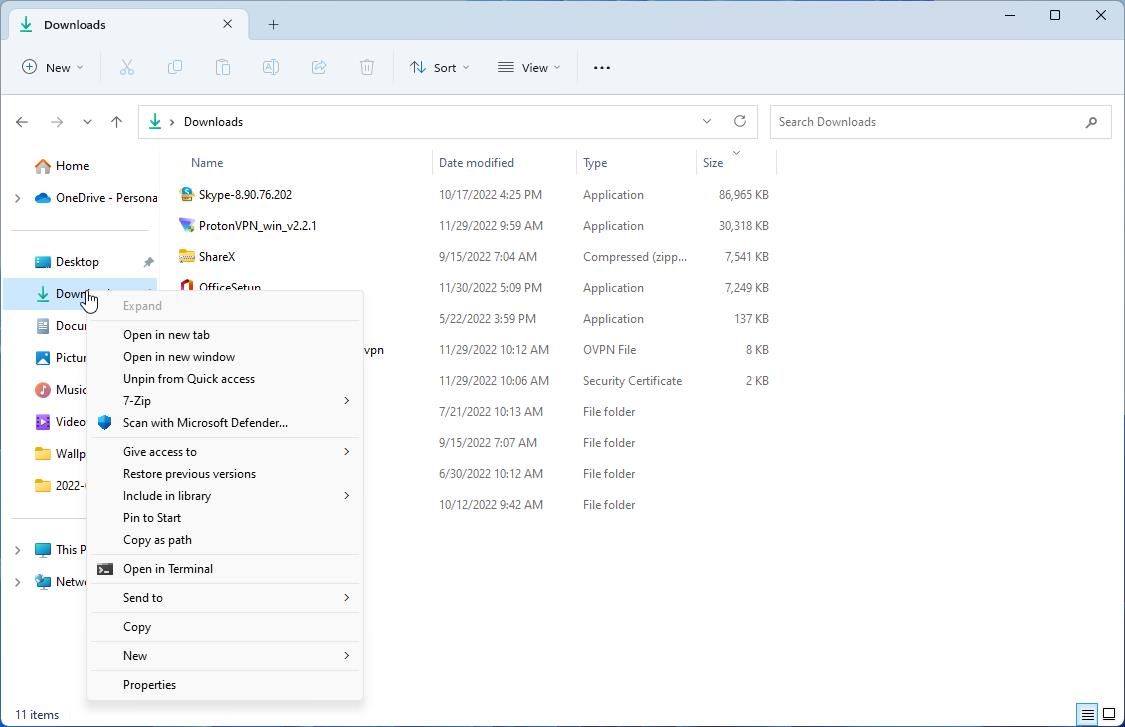
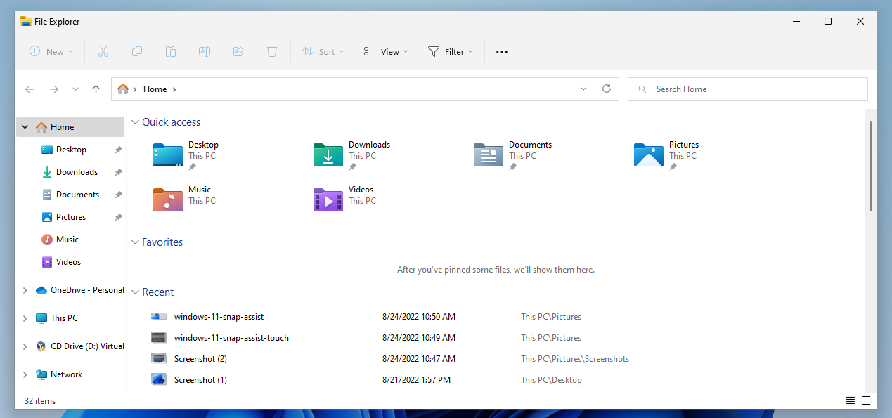
This method does not replace the menu in File Explorer's right pane, it only changes the file tree's menu. You will need to be on the Windows 11 version 25227 or above Dev Channel. For reference, Build 25227 was released on October 22nd.
How to restore the classic context menu in Windows 11's File Explorer's left pane
1. Download ViVeTool from its GitHub page, and extract the archive's contents to a folder.
2. Open the Terminal (PowerShell) with administrator privileges. You can use the Win + X menu, or right-click on the Start button to run the app.
3. Switch the path in the Terminal to the folder that you extracted ViveTool exe to.
e.g. C:\ViVeTool
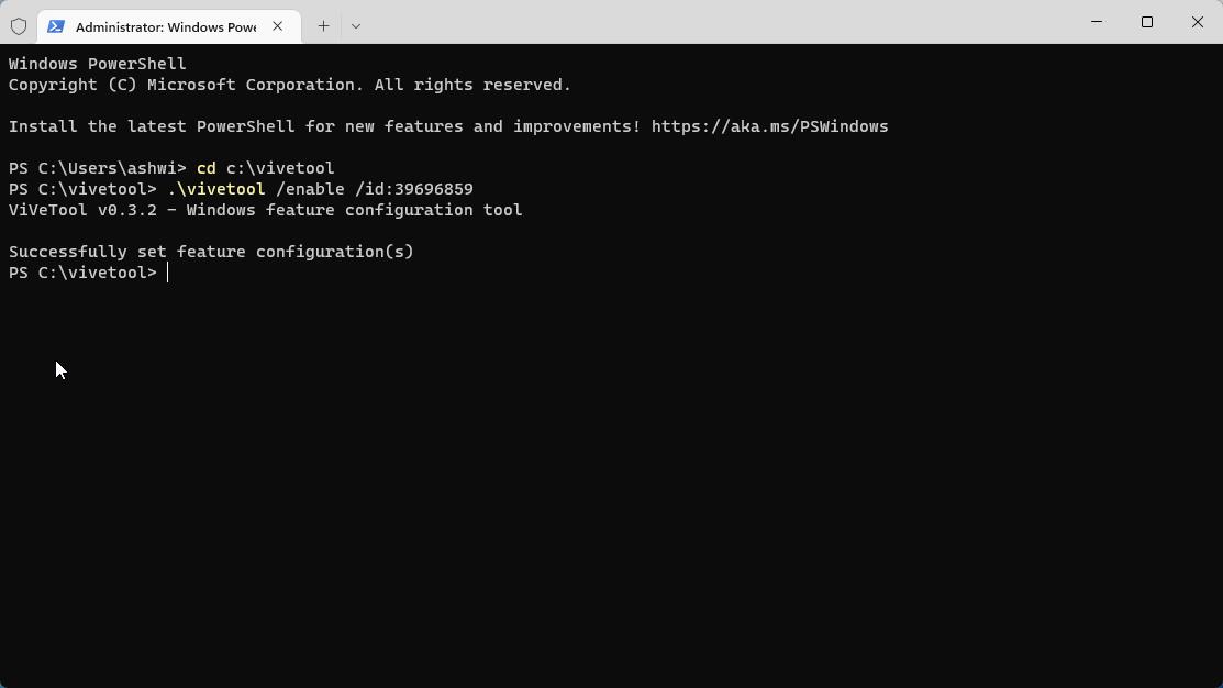
4. Paste the following command in it, and hit Enter.
.\vivetool /enable /id:39696859
5. You don't have to restart your computer, or even close File Explorer. The setting is applied immediately.
Note: You can use Command Prompt too, the only difference is that you need to delete the . and \ symbols before the command.
vivetool /enable /id:39696859
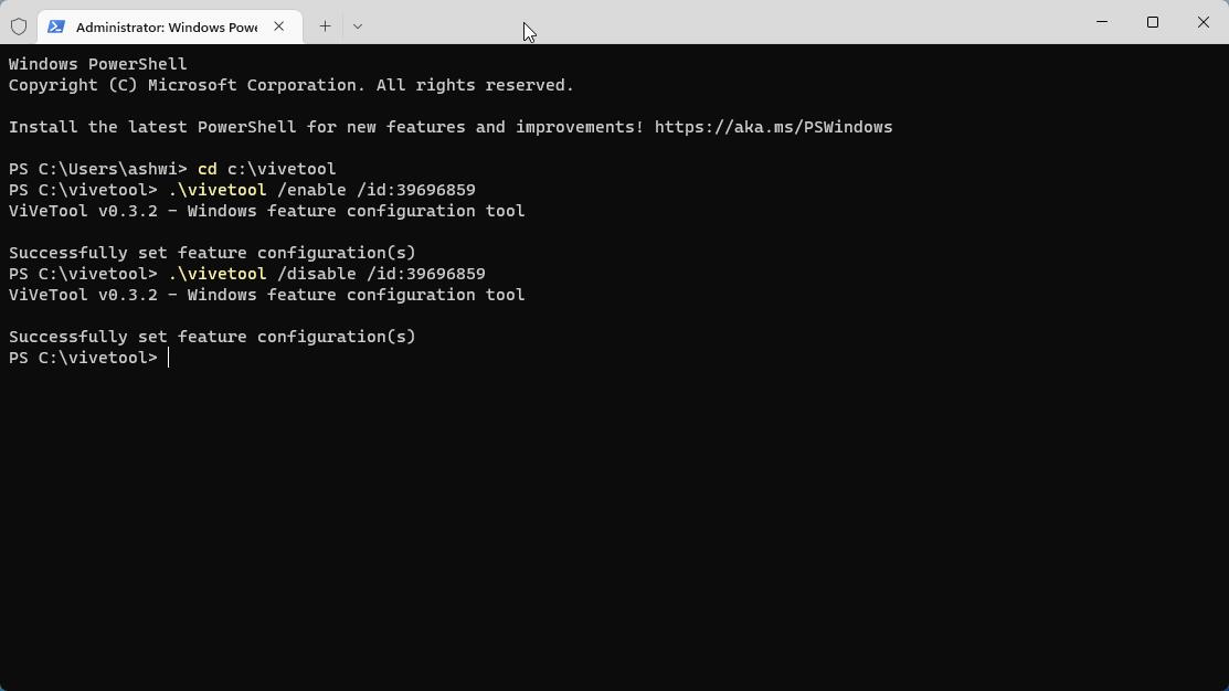
The old context menu has some extra options which can be useful for some folk. Don't like the old menu? You can revert the changes by replacing the word enable in the command with disable.
I tried it on the stable channel to see if it would work, and though ViVeTool was able to set the configuration, it really didn't take effect. So, how is this change possible in Windows 11 Dev Channel builds? According to PhantomOfEarth (via DeskModder), the feature has an ID called “AccessibilityXAMLContextMenu", and its default value is disabled. This suggests that it could be available as a toggle under the Accessibility settings in Windows 11. That should be an interesting move, though I think this context menu would be more useful if it worked in the right pane in Explorer too, that's where we deal with files, archives, etc.
When I first tried Windows 11, I didn't really like the new context menu. That's mostly because the animation was slow to render, which in turn caused a minor lag, not just in File Explorer, it was noticeable on the desktop screen too. But things have changed since then, I don't mind the new menu now that it is more responsive. That said, File Explorer's performance still continues to be wonky.
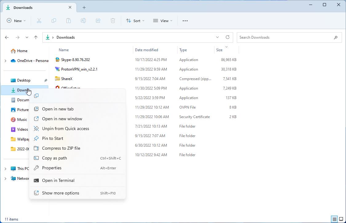
The only thing that I miss in Explorer's new menu are the options to access some third-party tools, for example, accessing 7-zip's menu to create archives. The new context menu does support 7-Zip for opening files, though this really depends on the third-party program's developer, they have to update it to match Windows 11's standards. This is the only reason why I click on Show More Options to access the legacy menu.
Which style do you prefer in Windows 11's File Explorer? The new menu or the old one?
[Windows 11 Dev Channel] Restore the old context menu style in File Explorer's left pane


3175x175(CURRENT).thumb.jpg.b05acc060982b36f5891ba728e6d953c.jpg)
Recommended Comments
There are no comments to display.
Join the conversation
You can post now and register later. If you have an account, sign in now to post with your account.
Note: Your post will require moderator approval before it will be visible.