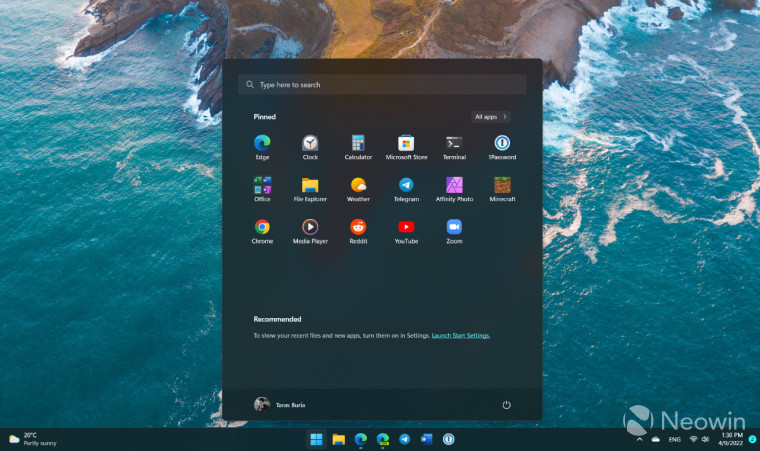
Whether you are a fan of it or not, Microsoft thinks the Recommended section can help users on Windows 11. First introduced in the original release (21H2), the company has made tweaks and changes to it over the months, trying to find the right balance of usefulness while also trying to push users towards checking out more of what the OS has to offer via promotions and advertisements. At one time, right around Valentine's week, it was also contemplating renaming the Recommended portion to "For You", perhaps to appeal to more of the casual audience out there who are familiar with it elsewhere like Instagram or TikTok.
However, it is not unfair to say that most of the enthusiast kind don't really find it too appealing. Searches about removing the Recommended content from the Start menu is generally a top result on Google, which shows that there are certainly quite a few out there that don't like it. Neowin has also published a guide on that if you want to check it out.
And if you are wondering, there is a good reason why some users are so annoyed by it. Microsoft added recommended websites under this section, something which it removed in a consequent build. However, the recommended websites was not dead yet as the tech giant brought it back again in May this year where webpages were suggested to users. And Microsoft has been experimenting with a Settings menu toggle that will shove even more recommendations for new apps, tips, shortcuts, and such.
Finally, though, it looks like Microsoft may have hit gold. Some of the most recent Dev Channel builds now show details about a file when you hover over it with the mouse. The change was spotted by Windows enthusiast and Twitter user PhantomOcean3.

As you can see in the image above, when hovering over a recently created text file named "ttt", the pop-up shows details about the file, like its location and its date of creation, a feature that certainly seems to be something that more users, especially enthusiasts, will find helpful and appreciate more.
Source: PhantomOcean3 (Twitter)


3175x175(CURRENT).thumb.jpg.b05acc060982b36f5891ba728e6d953c.jpg)
Recommended Comments
There are no comments to display.
Join the conversation
You can post now and register later. If you have an account, sign in now to post with your account.
Note: Your post will require moderator approval before it will be visible.