The team of the open source Thunderbird email client has been working on a new version of Thunderbird for some time. Today, Thunderbird 115 Supernova has been released, but it is not yet available as an automatic update.
The official release notes of Thunderbird 115 are massive, listing dozens of new and changed features. Considering that Thunderbird 115 is just the first step in the modernization of the email client, users can expect that additional features and changes are implemented in coming updates as well.
Note: Thunderbird 115 is not yet available via the email client's automatic updating functionality. Interested users need to download the Thunderbird 115 installer from the official website to install it manually on their devices. Thunderbird 102 continues to be fed with security updates in the meantime. Users who upgrade may want to create backups first before they do so.
Thunderbird 115

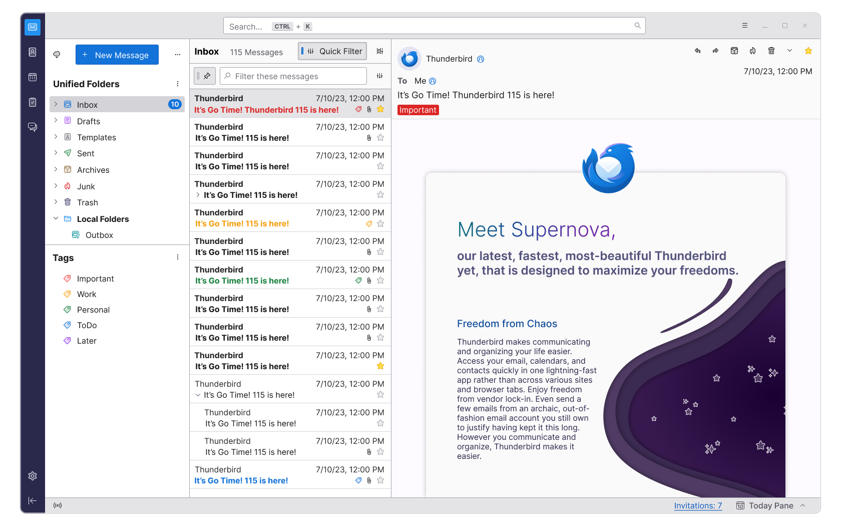
The first thing that Thunderbird users may notice is that the interface has changed. Thunderbird 115 features a three column design by default, a new set of icons and graphics, a new toolbar at the top, and a sidebar on the left side of the browser window.
Note that the default design is only default for new installations. Users who upgrade from an earlier version of Thunderbird retain a design similar to the one they had used prior to the update.
The new three-pane design displays the new Unified Folders and Tags pane on the left side, the list of emails in the middle pane and the selected email on the right pane. The new universal search option is displayed above all panes.
Good news is that Thunderbird 115 includes lots of customization options to change the look and feel of the client. Select Menu > View and then Toolbars, Layouts or Folders to get customization options. Want to bring back the Menu bar? You can do that there. Dislike the new layout of panes? You can restore the classic view. Want the table design of emails? You find that option there as well so that switching from Cards view is just a matter of a few clicks.

Folders allow you to display the classic per-account folder structure, a unified folder structure or several others. One interesting aspect here is that you can display multiple folder views and sort them based on your preferences. Display the unified folder view at the top and below that the individual accounts that you have added to the email client.
Especially the unified folder view can be a game changer for users who have added multiple email accounts to Thunderbird.
The main toolbar can also be customized. You can select the customize option to remove items from it that you don't require, e.g., Chat or Tasks, if you don't use those, and add others to it, such as Reply, Next Unread or Print.
Speaking of customization options, selecting the three dots displayed in the folder pane displays options to remove the awkwardly looking "new message" button there among other things. It is even possible to remove the entire folder pane header to free up room for the folder listing.
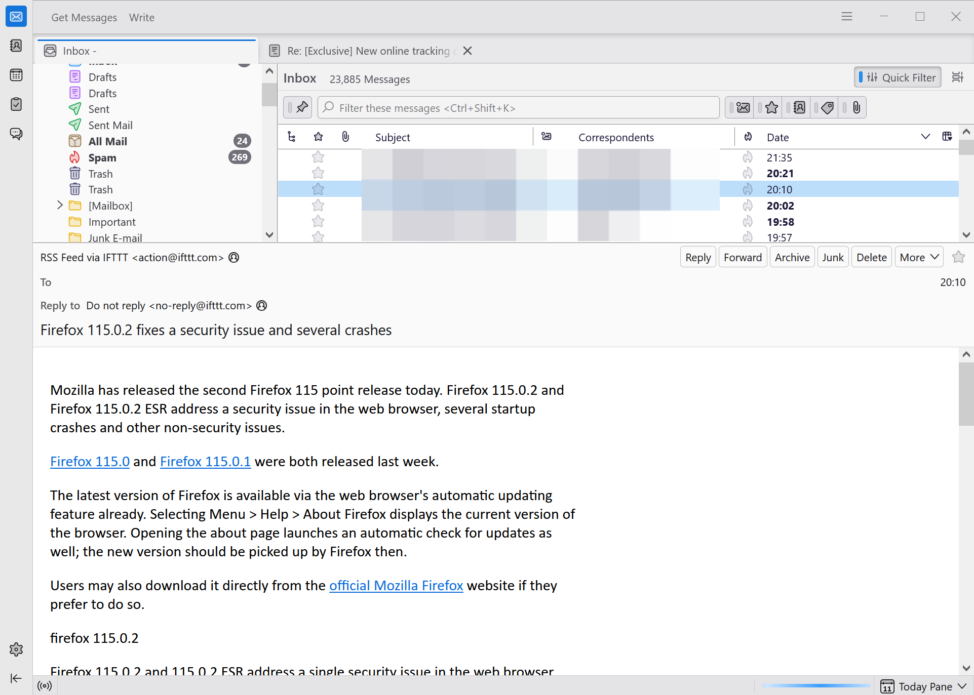
Here is a screenshot of a customized interface after playing around with the options for about a minute.

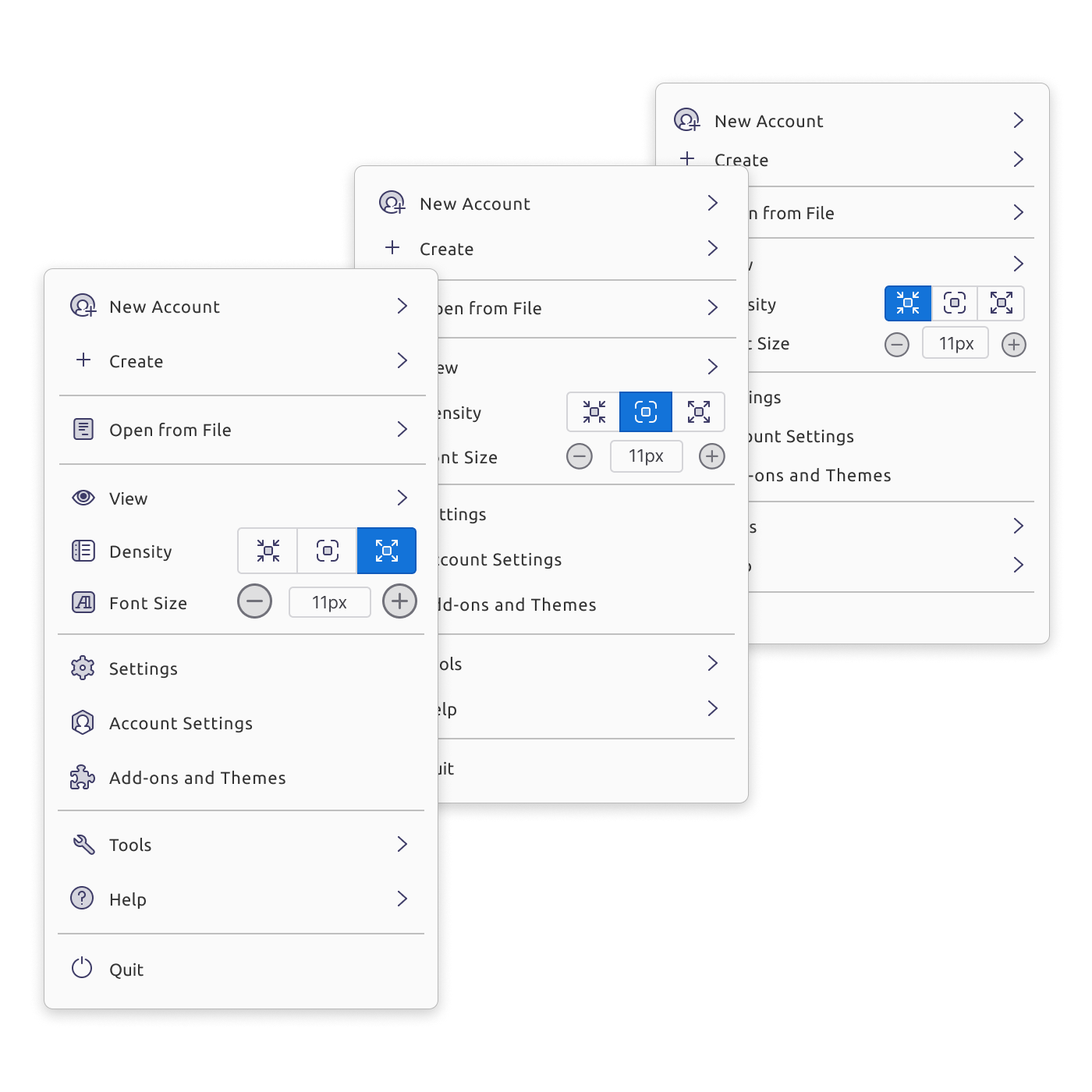
The new main menu offers several new features. There is a new density option, which you may use to increase or decrease the use of whitespace in the email application.
The interface is not fully customizable using the available Settings and options, but it offers a lot of options to adjust the interface to your needs. While there has been an extensive beta period, early adopters may encounter bugs or issues. One issue that I noticed was that I could not hide the Menu Bar anymore after a while. A restart of the email client resolved that issue.
The team highlights other areas of improvements in the official release notes. Here is an overview of important changes in Thunderbird 115:
- Sortable Folder Modes to move folders up and down easily in the sidebar.
- Tags View is a new view of the Folder Pane.
- Cards View designed for "people used to modern webmail". It "emulates a mobile interface list with multi-line support.
- Further improved address bar featuring a new tabular view, improved Edit view and more.
- Improved accessibility by introducing keyboard navigation options and screen reader accessibility across the entire application. The Tab-key and left and right arrow keys may also be used widely for navigating mail content.
- Calendar's design was improved, featuring a new month layout, an improved day, week, month grid and more.
- Encryption and OpenPGP improvements, e.g. support for user-designed OpenPGP passphrases.
- OAuth2 support for Fastmail added.
- Minimal user agent is sent by default now.
- New option to always show the system tray icon.
- Remote calendars may be reloaded individually now.
Closing Words
Thunderbird 115 is a big release for the team. Some users may have mixed feelings about the release, some may decide to wait with the upgrade to see how it evolves over the coming weeks and months, and others still may want to try it right away.
It is too early to give it a final verdict, considering that it has been out for less than an hour right now.
Now You: what is your take on the new Thunderbird so far?
- vhick and flash13
-

 2
2


3175x175(CURRENT).thumb.jpg.b05acc060982b36f5891ba728e6d953c.jpg)
Recommended Comments
There are no comments to display.
Join the conversation
You can post now and register later. If you have an account, sign in now to post with your account.
Note: Your post will require moderator approval before it will be visible.