A few months ago, a report spilled the beans on Microsoft's plans to return to shipping a major Windows version every three years. Although we do not have official confirmations from Microsoft, the company has already spoiled the surprise by revealing an early prototype with some radical user interface changes. While waiting for the software giant to confirm or deny rumors about Windows "12," users are busy making concept videos, and we think Microsoft could steal a thing or two from this one (via BetaNews).
Personally, I am not a fan of homemade Windows concepts, but this one stands out thanks to some clever ideas and neat tricks. They try to take the existing Windows 11 features and improve their looks and usability. For example, a more dynamic widget area with a media player, calendar schedule, stocks, and weather. The other side of the taskbar could provide other sorts of notifications, such as connecting Bluetooth devices.

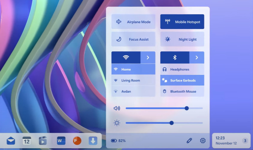
The concept also reworks the quick settings section with the main focus set not on looks but on usability. Bluetooth devices and available Wi-Fi networks appear right away when you open the flyout without requiring you to make an extra click.

My favorite part of this concept is how it reworks Windows Widgets and default wallpapers. In addition to the standard Windows Widget board, "Windows 12" from the video offers the ability to pin widgets to the desktop and make the wallpaper adapt to them. It creates a neat-looking desktop with tons of room for personalization, not to mention having widgets where they should be.

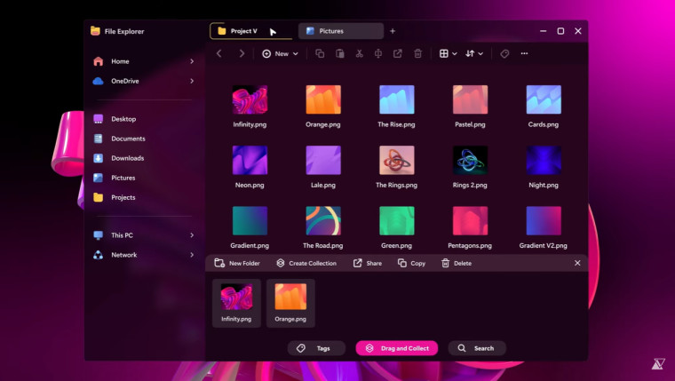
Finally, the creator of the concept offers an alternative take on multitasking by splitting two apps within one window and grouping files in collections inside File Explorer (similar to collections in Microsoft Edge).

Overall, I really like how well-made this concept is, what idea its offers, and how it maintains the balance between the looks and features. If only Microsoft could borrow and implement the ideas in the next big Windows release instead of filling its operating system with annoying ads.
- Kaos and BobikH
-

 2
2


3175x175(CURRENT).thumb.jpg.b05acc060982b36f5891ba728e6d953c.jpg)
Recommended Comments
There are no comments to display.
Join the conversation
You can post now and register later. If you have an account, sign in now to post with your account.
Note: Your post will require moderator approval before it will be visible.