


3175x175(CURRENT).thumb.jpg.b05acc060982b36f5891ba728e6d953c.jpg)
Think Microsoft's new Windows 11 Properties dialog is flawed? Fans proposed better ideas, but they sparked a fresh design debate instead.
We recently learned that Microsoft is finally redesigning the Properties dialog box in Windows 11. This revamp leverages WinUI 3 and also implements a proper dark mode. Many were pleased that Microsoft is finally redesigning a legacy UX, but some were also conscious of the chance that it's a functional interface that the company may break during its revamp. Now, some Windows 11 enthusiasts have shared what they would like the Properties dialog to look like.
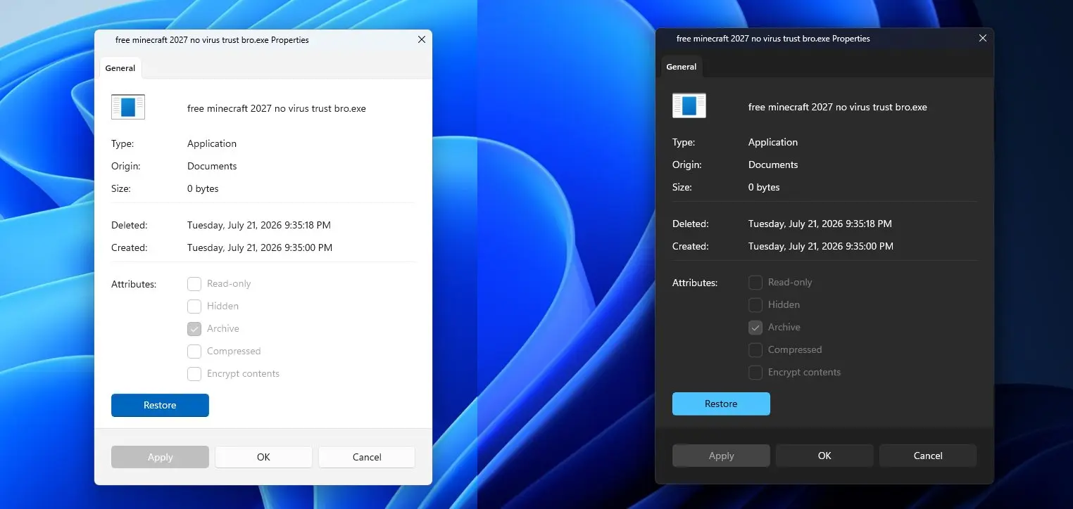
As a refresher, this is what an in-testing version of the Properties UI looks like in an Insider build of Windows 11. You can see both the light and dark versions side by side, complete with rounded corners:
Reddit user evilbulk has expressed dissatisfaction with Microsoft's approach and shared their vision on r/Windows11, claiming it to be superior:
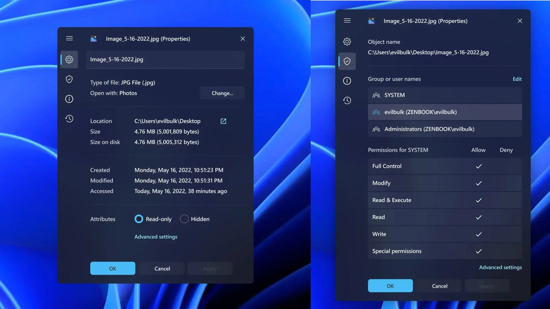
While some have appreciated the effort, many have criticized the sidebar, also noting that some design choices don't make sense. For example, the checkboxes for permissions can be replaced by radio buttons to indicate a toggle mechanism. Similarly, many find it difficult to understand what the sidebar icons mean at a glance.
Personally, I feel like the UX seems very similar to the Settings app, rather than a dialog box. I would be overwhelmed to see so many visual indicators if I just wanted to quickly check a file's properties. I actually prefer the minimalist interface that Microsoft is actually going for.
On the same thread, user Extreme_surikat_360 has shared another redesign for the Properties UI, but they claim that it is not their design, and they don't know if it is AI-generated:
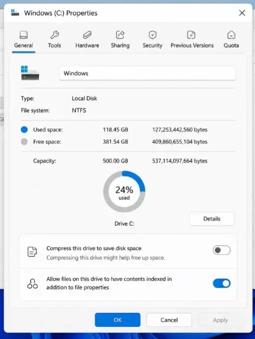
Once again, some have expressed confusion about what the icons at the top mean. Personally, I also feel like it doesn't adhere to Microsoft's current design language and seems to be a mashup of various Windows eras.
All in all, while many would complain that Microsoft's revamp of the Properties UI isn't perfect for one reason or the other, it appears that there really isn't a "perfect" UI that works for everyone. But that is to be expected from an operating system that is used by over a billion customers.
Hope you enjoyed this news post. Feedback welcome.
Posted Thursday 23 July 2026 at 7:22 am AEST (my time).
News posts: 2023 5,800+ | 2024 5,700+ | 2025 5,700+ | 2026 (to end of June) 2,475
Recommended Comments
There are no comments to display.
Join the conversation
You can post now and register later. If you have an account, sign in now to post with your account.
Note: Your post will require moderator approval before it will be visible.