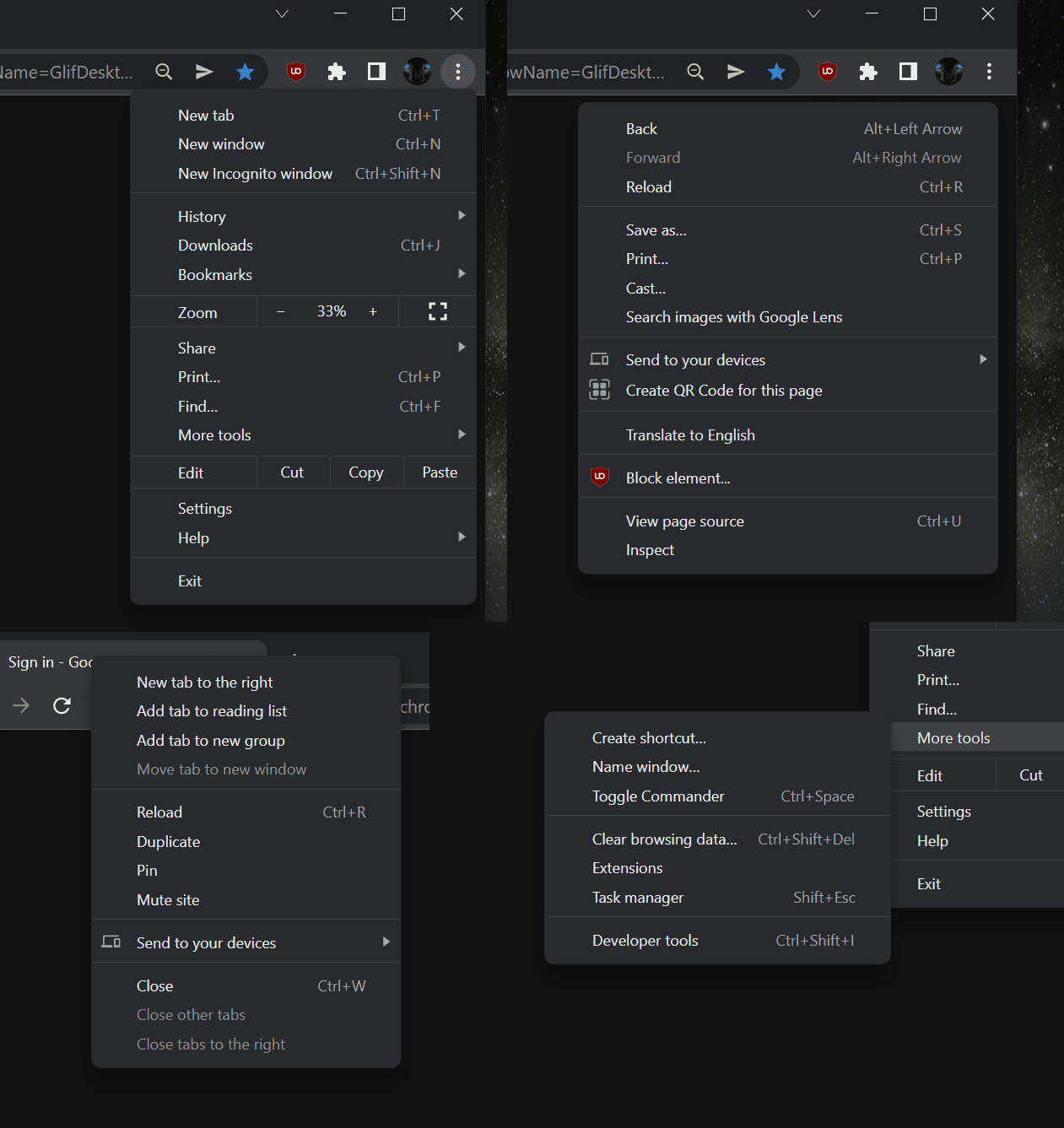
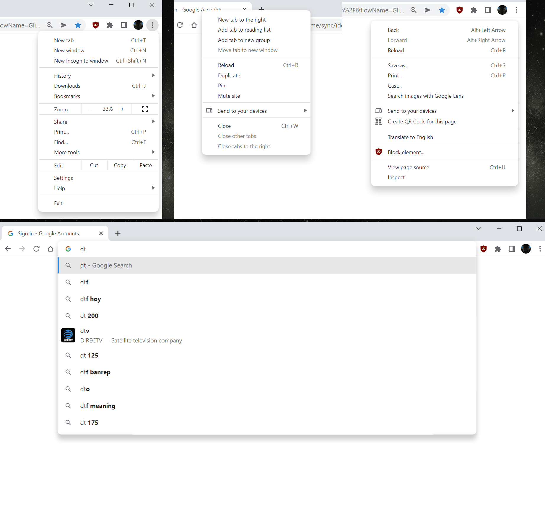
We reported a few days ago that Google is working on making Chrome look more native on Windows 11.
According to a new patch on the Chromium Gerrit, Google was working on making their menus “Windows 11 style” when the browser is being run on the new operating system.
Now a flag for the new menus has shown up in the latest Canary version of the browser, allowing us to take a look at what the company is looking to deliver.


As can be seen from the screenshots, the menus now have rounded corners, deeper drop shadows and are more clearly separated from the origin of the menu, giving them a floating appearance.
Unfortunately, it does not look like Mica transparency support is present yet, though Google may of course add this at a later point.
The flag to enable this is:

Given that it has just shown up in the Canary version of the browser, it will likely be at least 4 weeks before we see the changes in the Stable version.
via Leo Varela


3175x175(CURRENT).thumb.jpg.b05acc060982b36f5891ba728e6d953c.jpg)
Recommended Comments
There are no comments to display.
Join the conversation
You can post now and register later. If you have an account, sign in now to post with your account.
Note: Your post will require moderator approval before it will be visible.