Microsoft is gearing up to ship the next major feature update for Windows 11, known as "version 23H2" and likely dubbed the "2023 Update" when officially released. The company has been testing this next release in preview over the last handful of months, and now the update is almost ready to ship, allowing us to begin reviewing all the new features ahead of release in a few weeks.
Windows 11 version 23H2 is shaping up to be quite a significant release, with lots of quality of life improvements as well as big new features to take advantage of. We've got a brand-new File Explorer design, a new Windows AI assistant along with general AI enhancements in a number of areas, lots of improvements to the Taskbar, and notable in-box app updates as well.
The good news is this update will be delivered relatively seamlessly thanks to Microsoft's servicing style update method, which will apply this release like a normal monthly security update. That means it shouldn't take too long to download and install, with only a couple of minutes of downtime.
I'm pretty sure Microsoft has finalized the feature set of this release, but if Microsoft adds any last minute features to the update before it starts shipping, we'll be sure to update this review with the additional information. With that in mind, this is my review of the Windows 11 version 23H2 update!
Windows 11 version 23H2: What's new?
Here's a quick rundown of all the notable new features and improvements that are shipping as part of the Windows 11 version 23H2 release. I'll dive into the most notable features in-depth further down.
- Windows AI Copilot
- AI-powered file recommendations in File Explorer and Start
- AI review summaries in Microsoft Store
- A new AI Hub for AI-powered apps in the Microsoft Store
- Taskbar app labels and general improvements
- New sound output menu
- A new Settings homepage
- Native RGB peripheral controls
- A new File Explorer design with more modern interfaces
- In-box support for more archive formats like .RAR
- A new File Explorer "Gallery" feature
- A new cloud-based backup and restore feature
- Snipping Tool and Notepad improvements
- Inking directly into text boxes
- General accessibility improvements
- Account recommendations in Start and Settings
- HDR desktop wallpaper support
- New Windows Spotlight wallpaper UI
- And more!
Windows Copilot
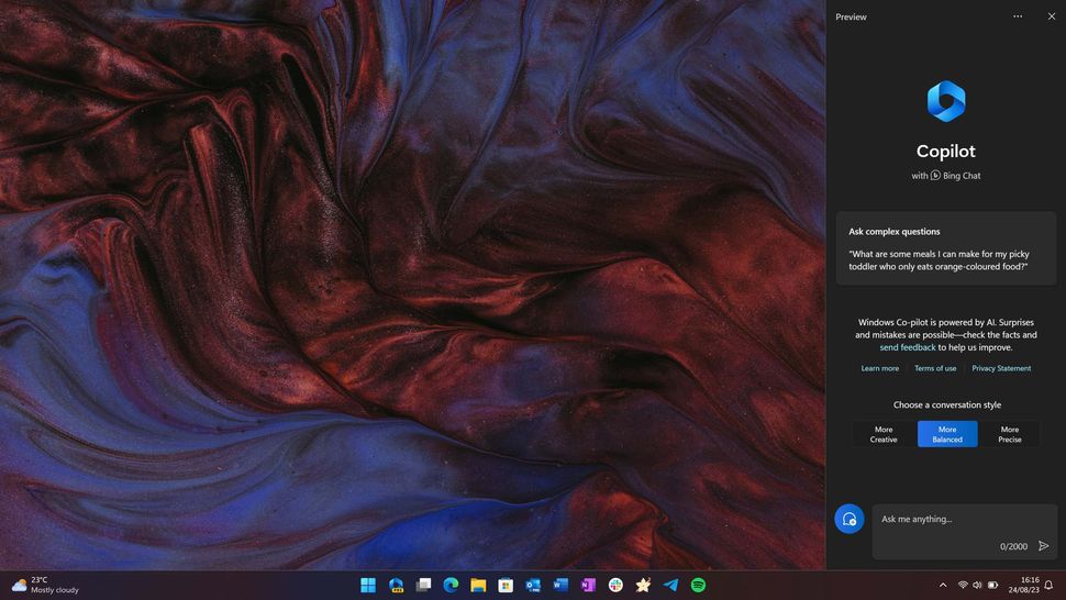
The new Windows Copilot interface. (Image credit: Windows 11)
Microsoft's blockbuster new feature for this release is undoubtedly its new Windows AI assistant, which builds upon the already available Bing Chat AI as an in-box replacement for the old Cortana assistant Windows used to have. While Cortana is still built-in to Windows 11 by default, the app is no longer functional and is expected to be removed in a future update.
Microsoft's new AI assistant is called "Windows Copilot" and is launching in a "preview" state as Microsoft is still building out new features and functionality for this new generative AI tool. Unlike Cortana, Windows Copilot is pinned to the Taskbar by default, and will be front and center for millions of Windows 11 users once they upgrade to the 23H2 release.
Clicking on the Windows Copilot icon will open up a sidebar on the right side of your screen, which will push over any content you've got open and load up a conversational chat interface not dissimilar to Bing Chat where you can begin interacting with the new Windows Copilot assistant. It does require an internet connection to function, and its feature set is pretty limited at this time.
Essentially, Windows Copilot can do pretty much everything Bing Chat can do today, plus a few extra "Windows-y" things to make it the Windows Copilot. Overtime, these capabilities are expected to expand and become more complex, but as of now the things Copilot can do as a Windows assistant is fairly limited.
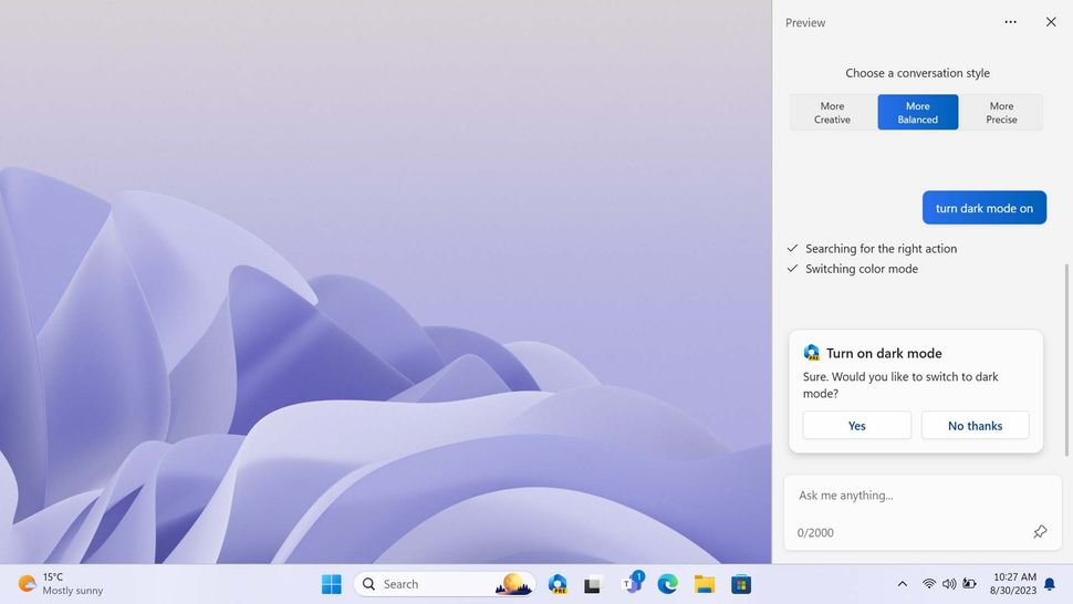
You can use it to control basic Windows settings. (Image credit: Windows Central)
Testing a number of commands, here are the things I've found it can do successfully:
- Turn Bluetooth on and off
- Turn do not disturb mode on and off
- Turn dark mode on and off
- Take a screenshot
Any system command it does successfully understand will prompt a dialog to confirm that you want to configure said setting. It doesn't just do it, which I guess is a safety feature, but I wish you could turn that off. If I'm typing in a command, it's because I want that command done. I don't need a confirmation step slowing things down.
Also, worth noting, unlike Cortana there's currently no way to interact with the Windows Copilot using your voice. It's typing only, or nothing at all. This will likely change, as the Bing Chat UI in mobile apps already supports voice input, so it won't be hard to bring that over to desktop.
Here is a list of things I tried that it currently cannot do:
- Turn Wi-Fi on and off
- Turn battery saver on and off
- Open apps
- Analyze content on screen outside of Edge
- Configure settings outside the ones it can do above
- Organize snap layout
- Search my files
So, there's really two sides to Windows Copilot, there's the Bing Chat aspect, which is excellent and very good at internet-based search queries, content analysis in Edge, and creative writing prompts. But then there's the Windows Copilot aspect, which is barebones and not very capable at the moment. This will surely improve over time.
Windows Copilot is great as a quick access model to Bing Chat. If you need an itinerary for an upcoming vacation, a roundup of reviews for a recent product, or the contents of a webpage summarized in Edge, the Windows Copilot has you covered. In fact, I've found the most useful function of Windows Copilot is that integration with Edge to analyze open web pages.
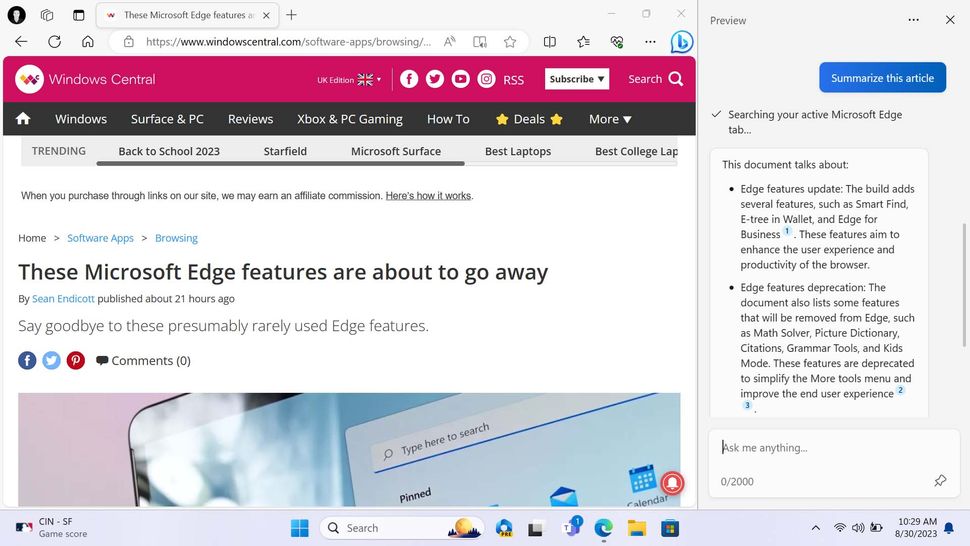
Its most useful feature is being able to analyze web content in Edge. (Image credit: Windows Central)
This is handy for when you are reading a long story on a website in Edge, and would rather have Windows Copilot tell you the TL;DR instead. Now, currently this ability to analyze content in an app is exclusive to Microsoft Edge, meaning Windows Copilot cannot see content in other apps, and therefore is unable to do anything with them.
I will also say that the Windows Copilot is slow. Most commands and queries entered into the assistant will take multiple seconds to be processed, even commands that are intended to handle local functionality. In fact, this is the sole reason I find myself not using Windows Copilot that frequently, because it's just too slow.
Asking it to change my system theme from light to dark can take anywhere from 10 to 20 seconds, depending on how fast you type out the command. It's literally quicker to open Settings > Personalization and select the Dark theme yourself than it is to ask the assistant, so why would you ever ask it?
In its current basic form, I think this functionality is primarily for users who may not know where to find specific settings. If you didn't know how to change your system theme, being able to ask Windows Copilot to do it is actually great. But I just wish it was faster.
This is something that will likely improve over time, and it's important to remember that Windows Copilot is launching as a "preview" feature, so there's lots of room for improvement here.
File Explorer
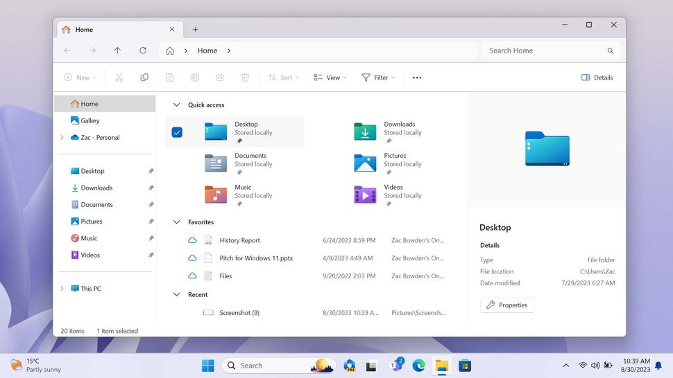
The new File Explorer redesign. (Image credit: Windows Central)
A big area of change with version 23H2 comes in the form of a new File Explorer app design, which attempts to clean up the File Explorer interface while also modernizing more parts of it to align with the rest of the Windows 11 aesthetic. Additionally, the File Explorer has a couple of new features, some of which have been a long time coming.
We'll start with the UI stuff, which is immediately noticeable as soon as you open the File Explorer and arrive at the home page. The header of the app has been reorganized in a way that now represents something similar to a web browser. We have our tabs along the top like usual, then immediately below that we find the navigation controls, address bar, and search bar.
Microsoft has also taken this opportunity to update the address bar itself, and is now using a modern interface with consistent drop-down menus for navigating between directories. There's also a new "backup" button that will appear in the address bar when you're in a folder that isn't currently syncing with OneDrive.
The command buttons, such as copy, paste, delete, and share, which used to be in the header area, have been moved just below it. This small change does a lot to make the UI feel less cluttered, and I think it's a deliberate choice to make the File Explorer feel more like a web browsing experience.
The default home page that you land on when opening a new instance of File Explorer has also been updated with Microsoft's modern UI framework. Visually, it's similar to the old home page, but is now using entirely modern technology. There are some minor UI updates to things like checkboxes, which now align with the rest of Windows 11's design language.
Microsoft has also completely redesigned the details pane, which is a UI that you don't normally see unless you manually enable it. That's still the case here, but if you do choose to enable it, you'll now see a rich, modern interface that includes things like recent edits and activity if the document you've selected is being shared with other users.
There's also new integration with Microsoft 365, where the details pane will pull in relevant comments and recent emails it thinks might be related to the document you've selected. This feature is limited to users using Windows 11 for work with an Azure AD account hooked up.
Along those same lines, Microsoft has also added some "AI" capabilities to the File Explorer, which will surface relevant files in a new "Recommended" section at the top of the home page. This is also tied to Azure AD accounts currently, so you won't see it on a PC using a personal Microsoft account.
Elsewhere, Microsoft has added support for more archive formats as native file types within File Explorer. This means users will no longer need to download third-party apps to unpack .7zip and .RAR files. As of right now, it's not possible to create archives with these new file formats, just unpacking for now.
Here's the list of archive formats that are now supported, in addition to the ones Windows already had:
- .tar
- .tar.gz
- .tar.bz2
- .tar.zst
- .tar.xz
- .tgz
- .tbz2
- .tzst
- .txz
- .rar
- .7z
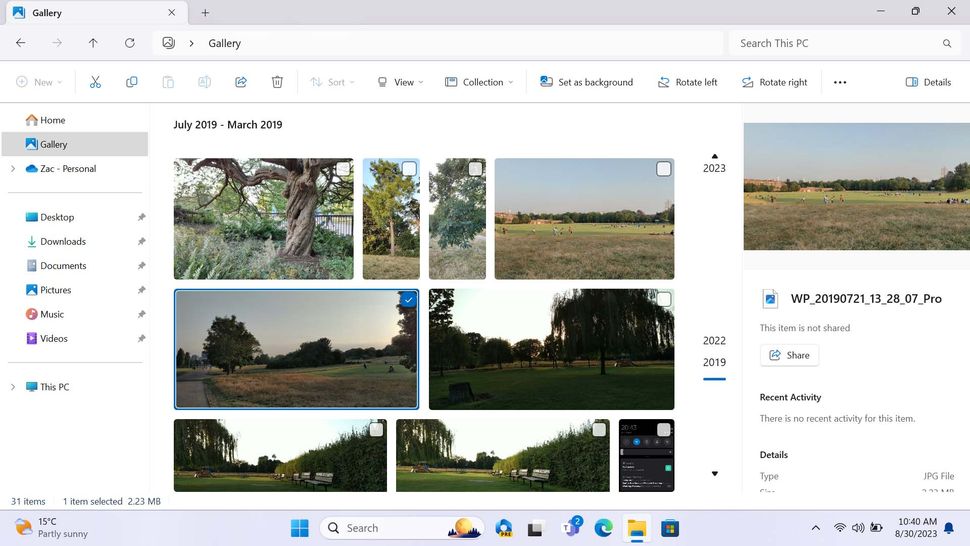
There's a new Gallery feature for viewing all your photos. (Image credit: Windows Central)
Lastly, Microsoft has built a brand-new Gallery feature into the File Explorer app, which acts as a rich viewing experience for images that are pulled in from the default Photos location, and wherever else the user chooses. Once setup, you'll be able to scroll through your entire library of photos, no matter where the photos are stored on your computer or OneDrive. The UI even has a timeline scrollbar, which lets you jump back in time quickly and easily to find older photos, assuming they're dated correctly.
Overall, the 23H2 release brings with it a major update to the File Explorer, with even more parts of it now updated with modern code. That said, the new File Explorer is still not entirely complete. The left-hand navigation pane hasn't been touched, the file properties dialog is still from Windows 95, and the file copy dialog is still from Windows 8. Plus, those last two interfaces still don't have a dark mode.
Furthermore, I'd go so far to say that performance has gotten a little bit worse with the new File Explorer. I've not done scientific tests, but I really feel like I'm waiting an extra beat when clicking through directories and launching the File Explorer itself. This will almost certainly be addressed in the coming weeks, but it's something to keep in mind.
Start & Taskbar
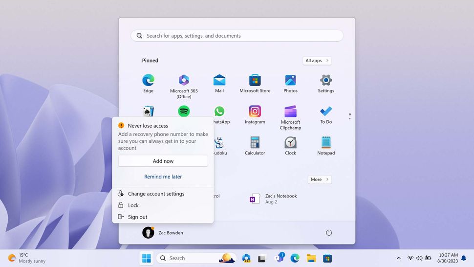
The Start menu will now show account "recommendations." (Image credit: Windows Central)
Microsoft has once again made several changes to the Taskbar with version 23H2, all of which I'd argue are good changes. We've even got the return of some classic functionality in the form of ungrouping app icons, something that Windows 7 through Windows 10 supported, but was removed with the launch version of Windows 11.
Now, it's back. Users who prefer having app icons ungrouped on the Taskbar can now re-enable that functionality. Additionally, users can also set the Taskbar to always show app labels, instead of just showing the app icon. This is handy for those who struggle to remember what icons are what, and prefer reading the name of an app when it's running on the Taskbar.
The notifications icon on the Taskbar has had its behavior changed too. Previously, the notifications icon on the far right would display a number depending on how many missed notifications you had. Now, Microsoft has replaced this with a simple bell icon that will light up if you've missed a notification. You no longer get a missed counter.
There are also minor improvements to the Task View interface, which will now pop up the name of a virtual desktop whenever you switch to it. It also has an improved animation when switching between desktops, though the animation still isn't perfect, and I'd argue still comes across as "unfinished." Elements on the Taskbar will pop in whenever you switch to a new desktop, instead of seamlessly appearing with the rest of the desktop.
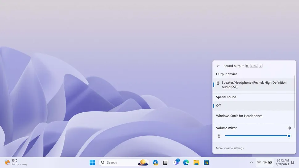
The new sound output menu lets you control the volume levels of individual apps. (Image credit: Windows Central)
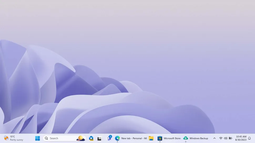
You can now show app labels on the Taskbar. (Image credit: Windows Central)
Moving on to the Quick Settings panel, Microsoft has made a couple of enhancements to the volume and casting experiences. We'll start with volume, which now has an updated mixer interface, allowing you to adjust the different volume levels of individual apps. This functionality was already part of Windows before, but it's now been modernized with version 23H2.
The Start menu has also received a few minor updates that enhance the UI you see when hovering over files in the "Recommended" section below your pinned apps. Now, you'll see a rich thumbnail preview depending on the file in question, instead of a basic tooltip as was the case previously.
Microsoft has also added "AI" to the Start menu, though this only works with Azure AD accounts currently. Using AI, the Start menu will now show recommended files it thinks you might want to jump into based on recent activity in shared files across Microsoft 365, similarly to the AI Microsoft has added to File Explorer.
Lastly, the Start menu now shows a little alert next to your user icon if you're using Windows 11 without a Microsoft Account, or without OneDrive set up. In these scenarios, you'll see a little dot next to your profile picture in the Start menu, and clicking on it will show a small popup asking you to set up the feature in question.
Many consider this to be an advertisement for Microsoft accounts and services, and I do agree, but as someone who normally uses Windows with both a Microsoft account and OneDrive set up, it's not something that has annoyed me in day to day usage. Luckily, if you are someone who refuses to use Windows with an online account, you can turn off these ads.
Apps & Widgets
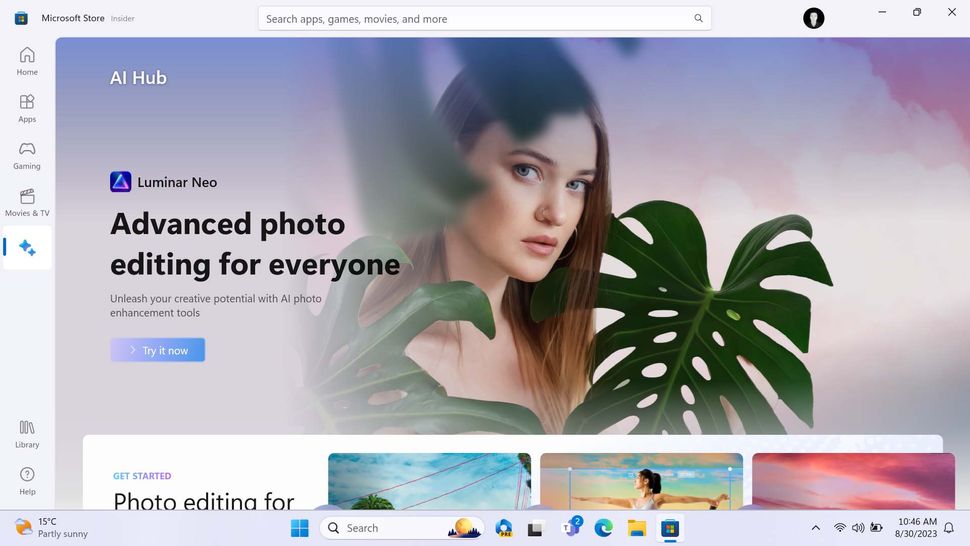
Microsoft has made several changes and improvements to a number of in-box apps with the 23H2 update. Starting with Paint, which finally has a dark mode and centered canvas interface. These are small, quality of life changes, which I'm very happy to see being given the time of day at Microsoft.
Microsoft Store is being updated with AI capabilities and a new AI hub for collecting Windows apps that take advantage of AI capabilities. App pages now also have the ability to generate a review summary, based on user submitted reviews.
Snipping Tool has also been updated, now with the ability to quickly jump into Paint or Clipchamp when taking a screenshot or screen recording. It also has an updated UI that enhances the Win+Shift-S keyboard shortcut with the ability to initiate a screen recording, instead of just a screenshot.
Microsoft has built a new app for developers that it calls "Dev Home," which will be automatically downloaded and installed on PCs that are setup as development workstations when setting up Windows during the out of box experience phase.
This app is designed to streamline the process of setting up a new devbox with all the apps, tools, and frameworks required to build apps on Windows. Dev Home can even sync up with GitHub project repositories, and provides a handful of useful system widgets that you can pin to the Windows Widgets Board.
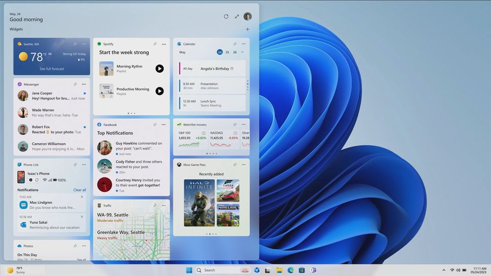
The Windows Widgets Board with no MSN feed. (Image credit: Microsoft)
On the subject of the Widgets Board, Microsoft says that it will be releasing an update later this year that allows users to adjust the layout of the widgets and news feed, even allowing users to outright remove the MSN feed if they wish. This hasn't yet been put into public testing, so I've not been able to try it for myself just yet.
Lastly, Notepad has been updated with the ability to remember content without saving. This is more of a backup solution for when you lose power or the app randomly crashes, but instead of losing all your work, Notepad will now remember your last state and bring it back.
Settings & Enhancements
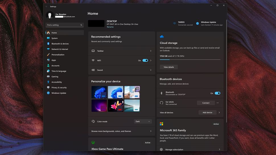
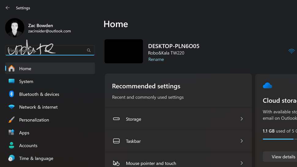
Settings has a brand new landing page for common settings. (Image credit: Windows Central)
Microsoft has added a brand-new home page to the Settings app on Windows 11 with the 23H2 update, which presents a selection of most commonly used settings front and center. Instead of hunting for Bluetooth or system theme settings, you'll now see that sort of thing straight away as soon as you launch the Settings app.
The company says this landing page "evolves and learns with you," which means it will dynamically adjust depending on which settings you access most. The interface is sorted into a selection of "cards" which are broken down into the following categories:
- Recommended settings
- Cloud storage
- Account recovery
- Personalization
- Microsoft 365
- Xbox
- Bluetooth Devices
Microsoft is unfortunately using this new surface to advertise its Microsoft 365 subscription services, providing an overview of your account if you're already subscribed, and offering quick access to subscribe if you're not. Currently, it doesn't seem possible to turn off this new home page if you don't like it.
Elsewhere in the Settings app, users will now notice a new Dynamic Lighting category under the Personalization tab. This area introduces in-box RGB peripheral support for the first time in a Windows product, allowing users to configure the lights on a keyboard, mouse, or even monitor, without needing to download a third-party app to do so.
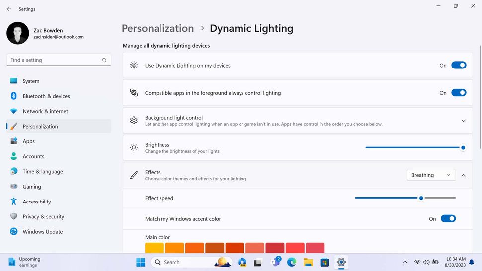
You can control the RGB lighting on select peripherals. (Image credit: Windows Central)
This functionality is limited to a number of Razer products currently, but I expect this will expand to more peripheral makers over time. I tried using it with my Keychron K2, but Windows 11 was not able to configure it.
The built-in RGB controls are somewhat more limited than what you'd find in Razer's own RGB customization tool, but it still offers enough for most casual users who aren't looking for super in-depth lighting control. There are several lighting effects to choose from, including breathing, rainbow, wave, wheel, and gradient effects.
Microsoft has also added the ability to set your RGB lighting to your Windows accent colour, which means you can sync your lighting with your wallpaper if you set your accent colour to match your desktop wallpaper in Settings.
The 23H2 release also introduces native HDR support for desktop wallpapers. If you're using Windows on a PC with an HDR monitor, you can now set an HDR image as your background and Windows will correctly display it as HDR content. Surprisingly, this was not the case prior to 23H2.
On the same line as personalization, Microsoft has rebuilt the Spotlight Wallpaper features with the 23H2 release. Now, there's a rich interface for switching between four spotlight wallpapers, which are selected weekly. Right-clicking on the spotlight icon on the desktop will show you a brief description of the image, and the ability to vote it up or down depending on your preference.
Inking directly into text fields is now possible. (Image credit: Windows Central)
A big new feature shipping in this release is the ability to ink directly into text fields. This is something iPadOS and Android has had for some time, and it's now finally coming to Windows. Pen users will no longer be forced to write into a dedicated handwriting panel to input text using a pen. Just write on the screen in the area where a text box is, and Windows will recognize it as text and input it automatically.
Lastly, Microsoft has added a new "Dev Drive" feature to the Settings app, which lets developers create a storage volume designed to improve performance in key developer workloads. Using ReFS technology, Dev Drive is essentially a VHD that's been optimized for developer projects and tools. Users can configure the size and location of the VHD, and once setup, will appear on Windows as a native storage volume.
You can learn more about Dev Drive on Microsoft's documentation website.
Windows Backup & Restore
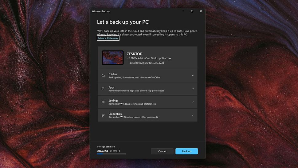
You can now backup apps and settings to the cloud. (Image credit: Windows Central)
Windows 11 is finally getting a competent cloud backup and restore solution. Starting with this release, users will find a new "Windows Backup" app in the Start menu, which will let users easily sync their Windows settings and apps to the cloud, using OneDrive, for restoration on a new or existing PC when factory reset.
This feature works in conjunction with the Microsoft Store, which will sync the apps you have downloaded and restore them by automatically downloading them again when you set up a new PC. During the Windows setup experience, a new page will prompt the user to restore from a previous backup that was made using this new Windows Backup tool.
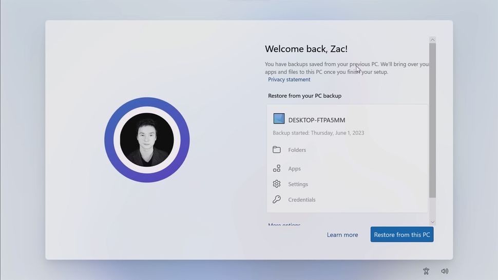
Those cloud backups can be restored when setting up a new Windows PC. (Image credit: Windows Central)
In fact, it will even remember your pinned app preferences, and attempt to pin the apps you had saved to your Taskbar automatically. Any app that wasn't downloaded from the Store will still be synced, but not automatically downloaded. The user will have to manually click on the icon to initiate the download by hand.
Conclusion
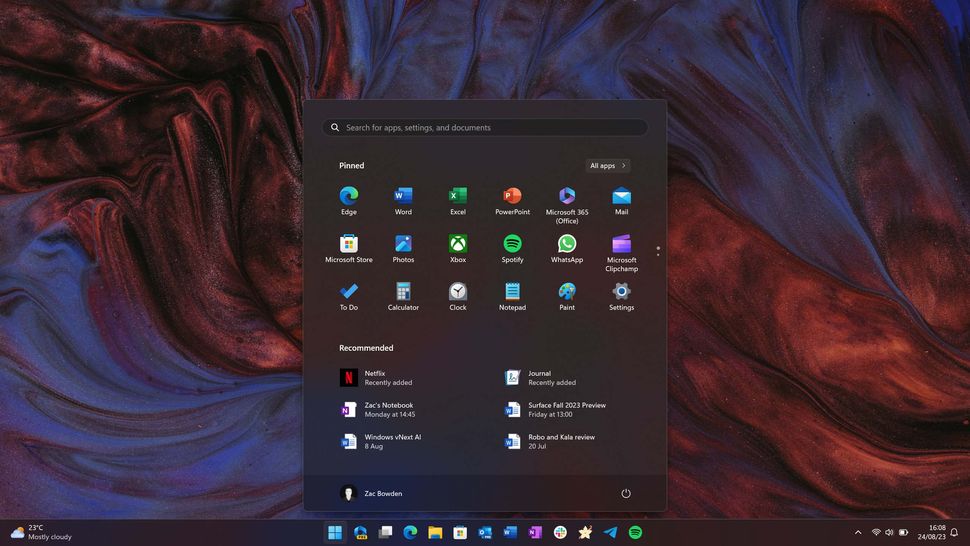
The Windows 11 desktop. (Image credit: Windows 11)
Overall, I think the Windows 11 23H2 update continues the trend of improving and fixing Windows 11 for those who found it to be a functional downgrade from Windows 10, while also continuing its goal of modernizing the OS where it can. With that said, if you didn't like Windows 11 before, I don't think this release will do much to change your mind about it.
I do like the inclusion of Windows Copilot, even if it's secretly an Edge feature under the hood. It's very basic right now, but I know this will change over the year ahead. The version 23H2 update marks the first time Microsoft is starting to properly integrate AI-powered experiences into the OS, just look at how many "AI" driven features are being introduced:
- File recommendations in Start
- File recommendations in File Explorer
- Windows Copilot
- AI Hub in Microsoft Store
- AI review summaries in Microsoft Store
- Smart snap assist (coming later)
I fully suspect we're going to see much more AI functionality built into Windows with the next major version of the OS, which is expected to ship towards the end of next year. But for now, I think we can mark this version of Windows 11 as the first port of call for this AI-in-the-OS journey that Microsoft is undoubtedly planning to take us on.
Elsewhere, the new File Explorer is looking good, for the most part, and I really do appreciate the inclusion of more in-box archive formats. But the UI is still a mishmash of old and new, and performance has definitely taken a step back as a result of these changes and additions. Hopefully this is addressed in subsequent bug fixing updates.
I love the new cloud backup and restore feature, as it will make my life as a PC reviewer so much easier. I also love the new Dynamic Lighting option in Windows Settings, as I've always hated having to download Razer's heavy proprietary software just to change the colour of my keyboard keys.
The Windows 11 version 23H2 update is expected to begin rolling out in October. Microsoft will likely announce general availability during its September 21 event in New York. Once that happens, we'll update this review with any additional information that might be important to include once availability is announced.
- mcmin
-

 1
1


3175x175(CURRENT).thumb.jpg.b05acc060982b36f5891ba728e6d953c.jpg)
Recommended Comments
There are no comments to display.
Join the conversation
You can post now and register later. If you have an account, sign in now to post with your account.
Note: Your post will require moderator approval before it will be visible.