Microsoft is experimenting with new icons for its software, and I wish this fan-made yellow icon was officially in the mix.
Microsoft is working on new icons for several of its applications. Earlier this year, the tech giant sent a survey to select users asking for feedback on new icon designs.
"At Microsoft, we're always striving to improve our products and create a user experience that truly resonates with you," read the email sent in April. "Today, we're excited to invite you to participate in a brief 15-minute survey that will help us better understand your preferences and opinions about our exploration of different iconography designs for Microsoft 365."
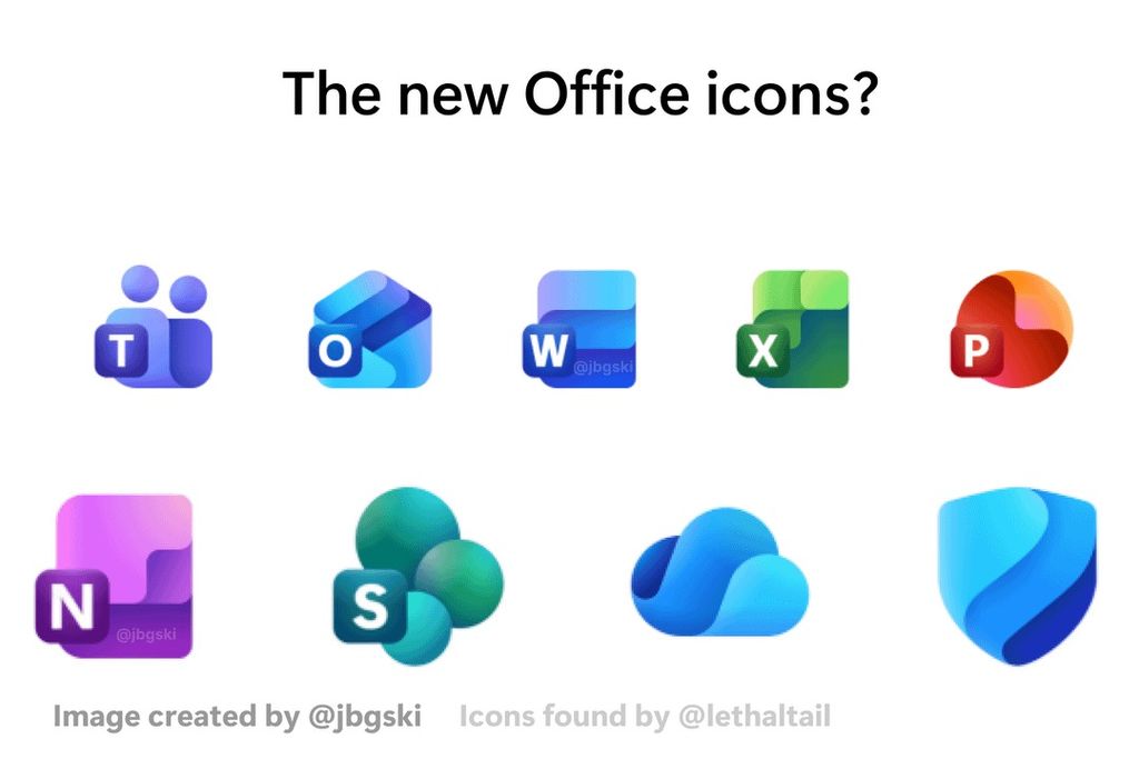
That survey included potential new icons for Word, Excel, PowerPoint, Outlook, OneDrive, SharePoint, Teams, OneNote, and Defender. Now, those who enjoy the new icons can download and use them, albeit unofficially.
The new Microsoft 365 icons feature depth in their designs.
(Image credit: Microsoft (via Reddit user jbgski))
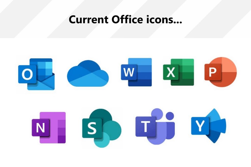
The current Microsoft 365 icons have flat designs that are in line with current trends in the industry.
(Image credit: Microsoft (via Reddit user jbgski))
Reddit user Thunder_Ruler0 cleaned up the leaked icons and created high-resolution versions of each of them. The resulting icons look clean, especially considering they're based on fuzzy source material and the artist created the upscaled versions in a couple of hours.
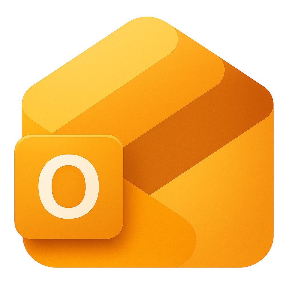
Microsoft changed the Outlook logo from gold to blue with the release of Outlook 2013, but an artist has
created a modern Outlook icon in the classic color.
(Image credit: Thunder_Ruler0 via Reddit (icon based on design by Microsoft))
Thunder_Ruler0 shared a Google Drive folder with the icons in their Reddit post.
I like the look of all the new icons, but the Outlook icon may gain the most attention. In addition to having a modern design, the Outlook icon is yellow. That would be a return to form since the Outlook icon was changed from yellow to blue over a decade ago.
As far as I can tell, the new yellow Outlook icon is only a fan creation by Thunder_Ruler0. The survey sent out by Microsoft last month only showed a blue Outlook logo.
Outlook 2013 introduced a blue logo for the app, marking a major shift from preceding versions of Outlook. Until that point, Outlook had a yellow logo that clearly differentiated it from other Microsoft services.
Word, OneDrive, Yammer, Defender, and Outlook all have blue logos in 2025. Microsoft's icons differ in shape, but I would love to see more color variation across the Microsoft software suite.
If you prefer the refreshed Outlook icon in blue, it is also available in Thunder_Ruler0's Google Drive folder.
As for actually using the yellow Outlook icon, you may have more luck switching to it for Outlook (classic). The new Outlook is a store app, so customizing its icon is tricky. You can create a desktop shortcut for the app and change its icon through Properties, though I haven't had any luck getting the custom icon to appear in the Start menu.
Which Outlook icon is your favorite? Let us know in the comments!
Source
Hope you enjoyed this news post.
Thank you for appreciating my time and effort posting news every day for many years.
News posts... 2023: 5,800+ | 2024: 5,700+ | 2025 (till end of April): 1,811
RIP Matrix | Farewell my friend 

3175x175(CURRENT).thumb.jpg.b05acc060982b36f5891ba728e6d953c.jpg)
Recommended Comments
There are no comments to display.
Join the conversation
You can post now and register later. If you have an account, sign in now to post with your account.
Note: Your post will require moderator approval before it will be visible.