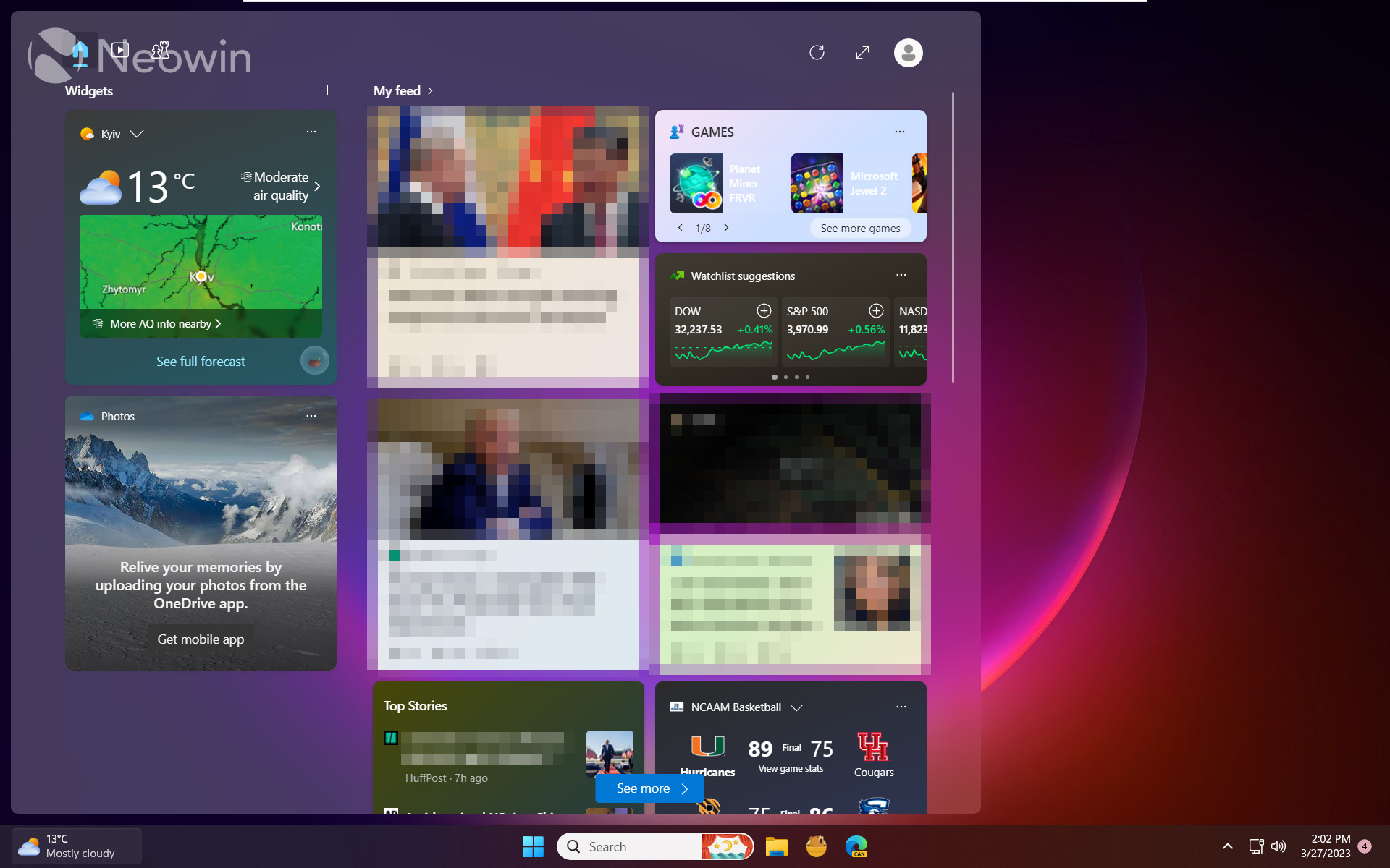
The latest Windows 11 Canary build adds a little order to the chaotic Windows Widgets space, where Microsoft mixes useful widgets with not-so-useful news (The meaning of your dreams: Read these surprising interpretations! and more). Build 25324 features a larger 3-column canvas with dedicated sections for widgets and the feed.
The updated widgets experience is not available to all insiders—it is yet another feature with a gradual rollout that helps Microsoft to monitor feedback before pushing it to a broader audience. However, you can force-enable it using the ViVeTool app (via @thebookisclosded on Twitter).

Caution: Back up important data before using the ViVeTool app. It can break things and make unstable Windows builds even more buggy!
How to enable the updated Windows Widgets in build 25324?
- Launch Microsoft Store and update Windows Web Experience Pack to version 523.8200 or newer.
- Download ViveTool from GitHub and unpack the files in a convenient and easy-to-find folder.
- Press Win + X and select Terminal (Admin).
-
Switch Windows Terminal to the Command Prompt profile with the Ctrl + Shift + 2 shortcut or by clicking the arrow-down button at the top of the window.

- Navigate to the folder containing the ViveTool files with the CD command. For example, if you have placed ViveTool in C:\Vive, type CD C:\Vive.
- Type vivetool /enable /id:43028164 and press Enter.
- Restart your computer.
Microsoft says the updated widgets will help users quickly access glanceable content from their favorite apps and services. Also, it enables users to "take a high-value break with personalized news content," which is a somewhat questionable statement considering what Microsoft promotes in the feed. Also, giving news two columns and only one to widgets says much about what Microsoft considers more important.
In addition to the redesigned layout, Microsoft is experimenting with animated widget icons and the ability to move widgets to the right on the taskbar.
Do you like the redesigned Widgets Board? Let us know in the comments.
Microsoft tests redesigned and better-organized Windows Widgets, here is how to enable them


3175x175(CURRENT).thumb.jpg.b05acc060982b36f5891ba728e6d953c.jpg)
Recommended Comments
There are no comments to display.
Join the conversation
You can post now and register later. If you have an account, sign in now to post with your account.
Note: Your post will require moderator approval before it will be visible.