3175x175(CURRENT).thumb.jpg.b05acc060982b36f5891ba728e6d953c.jpg)
A year since it was first put into testing, Microsoft still hasn't delivered its new simplified date and time layout for the System Tray on the Taskbar for Windows 11. Turns out, that's because of negative feedback from users.
Last year, Microsoft began testing a new change to the System Tray on the Taskbar on Windows 11 that aimed to clean up the area with a more simplified date and time layout. The new layout removed the AM/PM indicator, as well as the year from the date, leaving just the time, day, and month.
"We are trying out a more simplified system tray to highlight the date/time in a shortened form and to show the notifications bell icon based on DND status" said the Microsoft changelog when this feature was first put into testing back in 2024.
This new layout was far cleaner, still displaying the same vital information but without the unnecessary fluff around it. Most people don't need reminding what year it is, or whether it's before noon or afternoon. The time and day/month are more than enough, or so I thought.
Earlier this year, Microsoft pulled the testing of this new simplified System Tray layout. At the time, the company said they were pausing the rollout to address some issues, implying that it would return in a future update. Microsoft said "the more simplified system tray with shortened form date/time is being temporarily disabled to address a few issues" at the time.
However, it's now been half a year since the feature was pulled, and we've seen no sign of it since. Now, Microsoft Principal Product Manager, Brandon LeBlanc has confirmed on X that due to negative feedback, the simplified System Tray hasn't returned. LeBlanc doesn't explain what negative feedback influenced this decision, or whether the feature might return in the future.
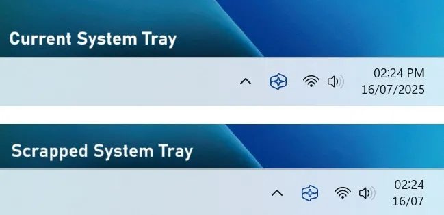
The scrapped simplified date and time layout was much cleaner.
(Image credit: Windows Central)
I don't understand why such a change would warrant negative feedback from users though. Cleaning up the System Tray is a good thing, especially if it's something that makes that area of the Taskbar take up less space. Removing the AM/PM indicator and the year shouldn't be a big deal.
I suspect that some of the feedback Microsoft received was from Windows users that don't like change and prefer having as much information on screen as possible. It could have also been influenced by the education sector, where children likely do need reminding of that information more often.
Recommended Comments
There are no comments to display.
Join the conversation
You can post now and register later. If you have an account, sign in now to post with your account.
Note: Your post will require moderator approval before it will be visible.