Jump to content
  • Microsoft is wrong: The new Outlook for Windows is not ready for prime time


    Karlston

    • 276 views
    • 6 minutes
     Share


    • 276 views
    • 6 minutes

    The new Outlook is now generally available on Windows, but it still sucks as a default OS mail client.

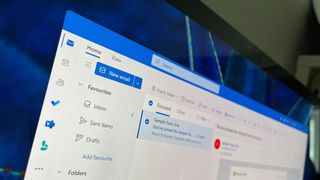
    As of today, Microsoft’s new Outlook for Windows app is generally available to the masses. That means Microsoft thinks the app is ready for prime-time use and is removing the “new” badge from the app’s icon and name. It’s now just Outlook, the definitive article.


    Confusingly, this doesn’t mean the new Outlook is replacing the old Outlook just yet. That will happen, but for now, the new Outlook (which is now just Outlook) is still an opt-in experience that you can enable within the old Outlook (which is still just Outlook.) So what does general availability even mean for Outlook… the new one, that is?


    It appears general availability for Outlook means it’s ready to replace the built-in Windows Mail & Calendar apps. Starting with Windows 11 version 24H2, the older Mail & Calendar apps are no longer installed by default. Instead, the new Outlook is pre-installed and is the default email and calendar experience on Windows PCs with version 24H2.
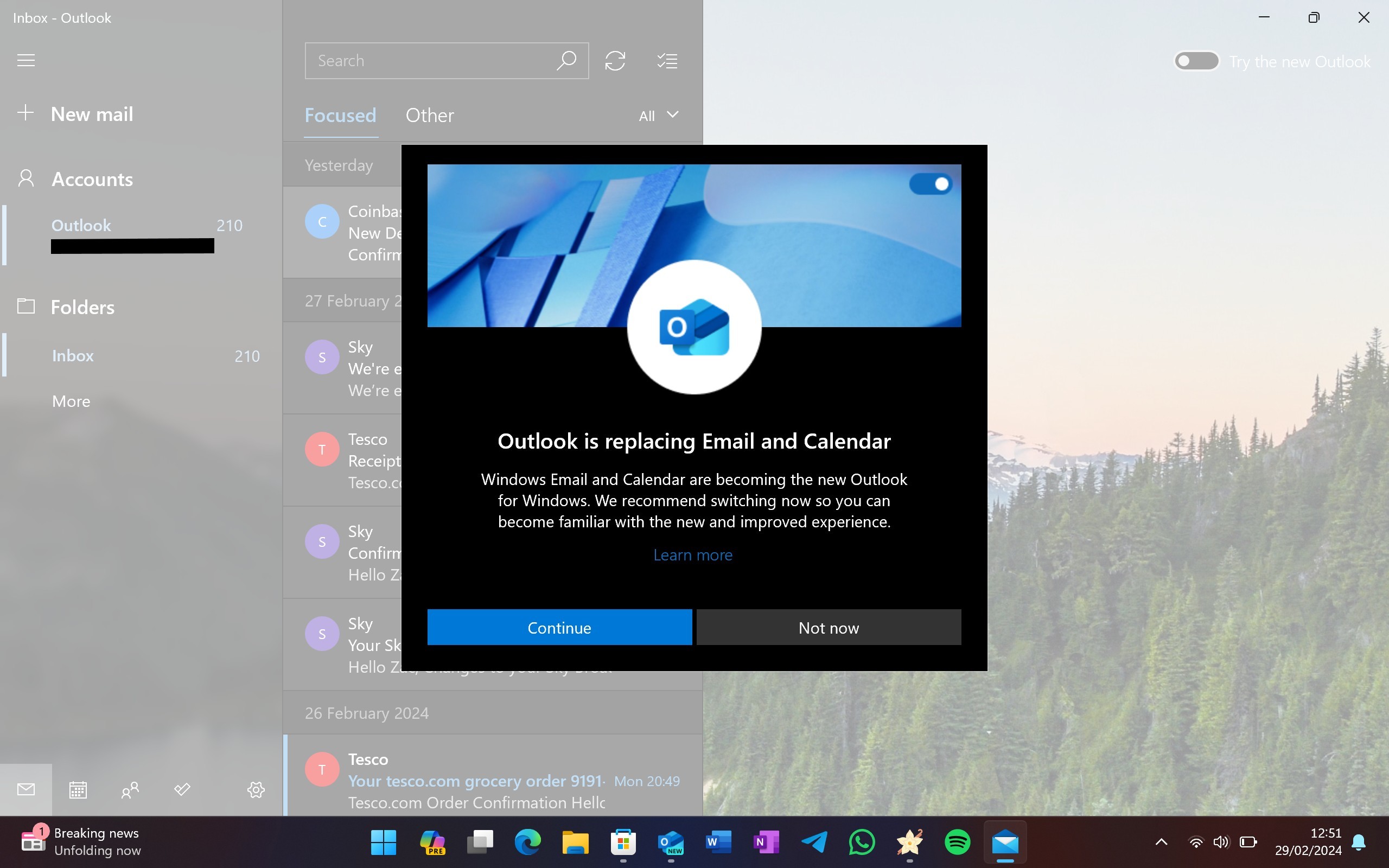
     

    Outlook will replace Mail

    Windows Mail has automatically been replaced with Outlook on at least two of my PCs already.

    (Image credit: Windows Central)


    This will trickle down to older versions of Windows too, including Windows 10 now that Outlook is generally available. In the coming days and weeks, the Windows Mail & Calendar apps will be automatically replaced with the new Outlook, and the older Mail & Calendar apps will no longer be available starting January 1.


    This is a problem because I don’t think the new Outlook is good enough to be a default email client on any operating system. A few months ago the app was sorely lacking in features and quality, and while many of the complaints I had back in March have been addressed, some important ones still haven’t.


    To begin, the app is still slow, much slower than Mail & Calendar. Those apps open instantly and show me new email notifications as soon as they arrive in my inbox. The new Outlook still takes a couple of seconds longer to open, and a couple more seconds to load an email that I’ve clicked into via a notification.


    The notifications themselves also trickle in behind other apps, including Outlook on my phone and the Mail & Calendar apps on PC. I don’t understand why the new Outlook isn’t able to fetch notifications as quickly as the other clients, or why it takes up three times as much RAM when open compared to the older Mail & Calendar apps it’s replacing.


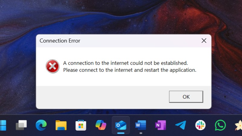
    The new Outlook doesn't support offline viewing

    Support for offline viewing is still "rolling out."

    (Image credit: Windows Central)


    For a default OS emailing experience, the design and UX are abysmal. Why is this app so darn ugly compared to many of the other built-in utility apps on Windows 11 like Paint, Notepad, Microsoft Store, and Settings? Outlook stands out like a sore thumb and doesn’t even look like a Windows app.


    That’s probably because it’s not a Windows app, it’s a web app. For whatever reason, Microsoft thinks it’s okay for the default Windows mailing experience to be no better than a gloried website. When I compare this experience to the clean and lightweight one of Apple Mail on the Mac, or Samsung Mail on a Galaxy Tablet, it’s simply no contest. Those apps are easier to use, smoother to navigate, and faster too.


    And if you're using Windows with touch, you're in even bigger trouble. The new Outlook does nothing to ensure a good experience when using a touchscreen or pen. Apple Mail on iPadOS destroys the new Outlook when it comes to navigating the app with a finger. There are no swipe gestures for deleting or flagging emails, no pinch-to-zoom gestures, and no dragging and dropping emails into folders with touch on Outlook for Windows. Even Mail & Calendar had this basic functionality.


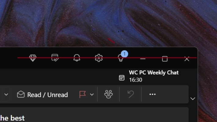
    I mean, for a generally available app, the very least Microsoft could do is ensure the buttons that run along the top of it are all aligned with each other. I guess that’s too much to ask.


    Misaligne buttons in Outlook

    The window controls aren't even aligned with the rest of the buttons on the top row. Like, come on!

    (Image credit: Windows Central)


    For those of you who use the classic Outlook app, Microsoft fully intends to replace that with the new Outlook too, but that's not happening just yet. For now, the new Outlook is still an opt-in experience and will become an opt-out experience for new users in the coming months. Microsoft doesn't intend to kill classic Outlook for at least five years.


    So, what can Microsoft do to improve Outlook for Windows? First, it should really think about abandoning web tech in favor of a native Windows UI framework such as WinUI 3. I can't fathom why Microsoft thinks it's acceptable for a first-party, pre-installed, essential Windows app such as a mail client to not showcase the best of Windows. 


    Second, it needs to support basic touch functionality at the very least. Microsoft's best-selling PC is a tablet called the Surface Pro, and now that device is going to suffer significantly when it comes to reading email in the default Windows client. It's just shocking.


    Third, it needs to be faster and lighter. If it's not as fast as the old Mail & Calendar apps, I don't want it. Those are so lightweight and easy to use, the only problem they have is Microsoft abandoned them. I wouldn't be mad if Microsoft decided to unabandon them and deliver new features, functionality, and UI improvements to these older apps instead.


    In short, I think Microsoft needs to go back to the drawing board. The default Windows mail client should be a native Windows app, not a web app.


    Source


    Hope you enjoyed this news post.

    Thank you for appreciating my time and effort posting news every single day for many years.

    2023: Over 5,800 news posts | 2024 (till end of July): 3,313 news posts


    User Feedback

    Recommended Comments

    There are no comments to display.


    Join the conversation

    You can post now and register later. If you have an account, sign in now to post with your account.
    Note: Your post will require moderator approval before it will be visible.

    Guest
    Add a comment...

    ×   Pasted as rich text.   Paste as plain text instead

      Only 75 emoji are allowed.

    ×   Your link has been automatically embedded.   Display as a link instead

    ×   Your previous content has been restored.   Clear editor

    ×   You cannot paste images directly. Upload or insert images from URL.


  • Recently Browsing   0 members

    • No registered users viewing this page.
×
×
  • Create New...