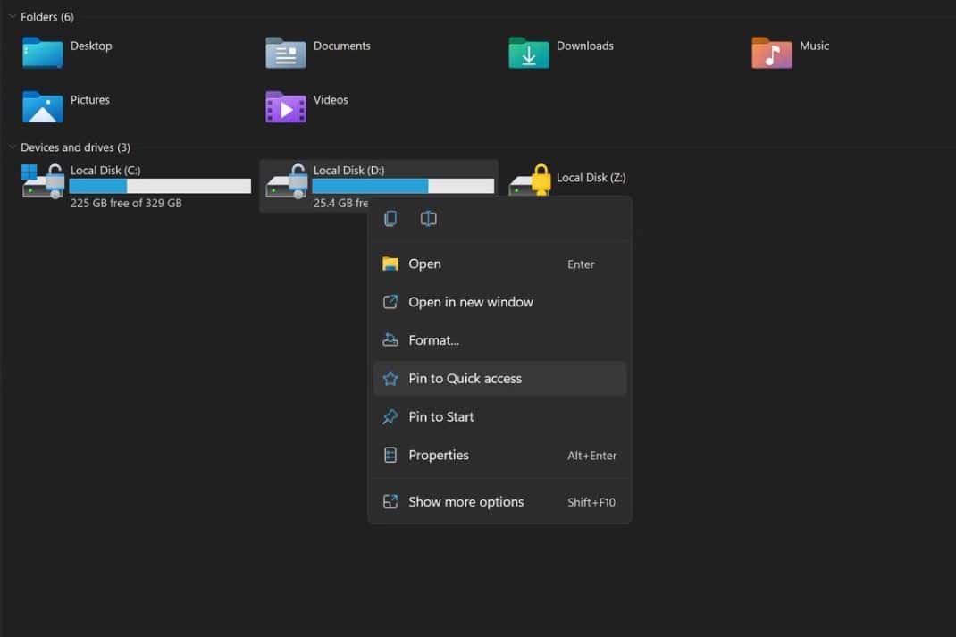


This week, Microsoft will release the first Windows 11 preview build to Insiders in the Dev Channel. The build version is expected to be 22000.51. Recently, some new screenshots of Windows 11 preview build 22000.51 got leaked online. In one of the File Explorer screenshots, we can notice the new context menu (check the image above). As you can see in the screenshot, the new context menu looks clean with Fluent Design-inspired icons.
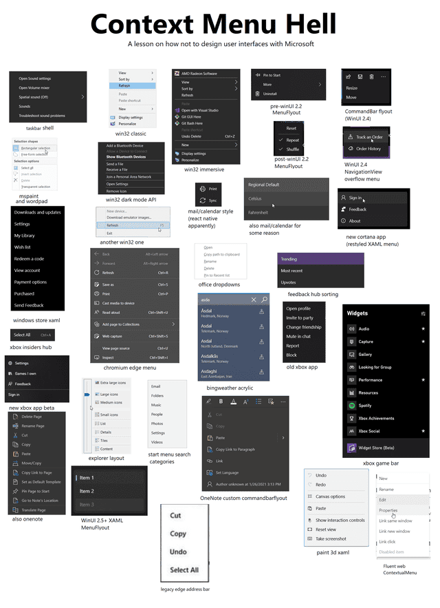
The problem with Microsoft’s design has always been consistency. Microsoft should mandate developers to follow one context menu design for modern Windows apps in Windows 11. In Windows 10, every Microsoft app had its own context menu design. Look at the image below.

Let us know your thoughts on the new context menu in Windows 11.
via: ALumia_Italia
Recommended Comments
There are no comments to display.
Join the conversation
You can post now and register later. If you have an account, sign in now to post with your account.
Note: Your post will require moderator approval before it will be visible.