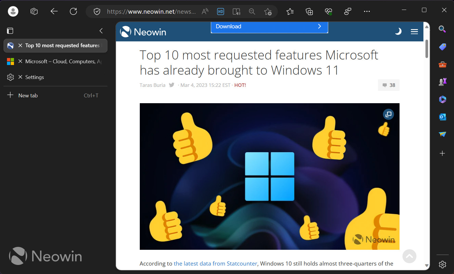
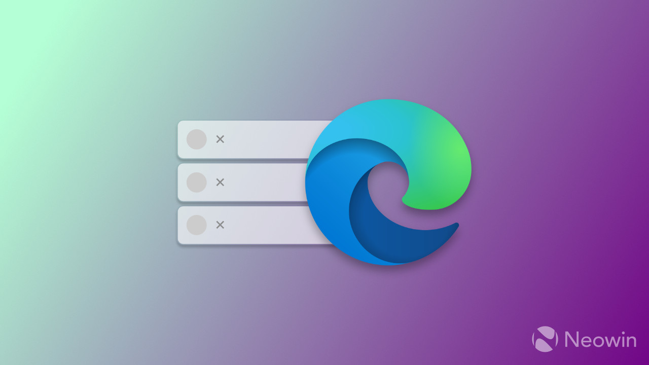
Vertical tabs in Microsoft Edge, the feature that lets you move the tab strip from the top to the left, have a few benefits over the standard layout. However, it also makes some actions less convenient. For example, closing a tab using the "x" button is a little more complicated and requires more mouse travel. Microsoft understands the inconvenience and is working on fixing it by moving the close tab button to a new home.
Some Edge Canary users noticed that the "x" button now sits at the left side of a tab next to its favicon. Besides, the close button remains visible, even with the vertical tabs pane collapsed. It is a small change, but it makes closing tabs much quicker and more apparent, something fans of the vertical tabs feature will surely welcome.

Microsoft will soon make it possible to close webpages and perform other in-browser actions with a new long-awaited method. The company is working on adding mouse gestures to Edge, allowing you to close a tab, open a new page, reload, add to favorites, and execute other commands while holding the right-click button and moving the mouse in a specified direction.


3175x175(CURRENT).thumb.jpg.b05acc060982b36f5891ba728e6d953c.jpg)
Recommended Comments
There are no comments to display.
Join the conversation
You can post now and register later. If you have an account, sign in now to post with your account.
Note: Your post will require moderator approval before it will be visible.