3175x175(CURRENT).thumb.jpg.b05acc060982b36f5891ba728e6d953c.jpg)
A small change in Edge highlighted how much I wish Microsoft would let us customize menus.
Microsoft Edge now shows the shortcut to create tab groups within the browser's dropdown menu. Normally, such a small addition would go unnoticed or be added with little fanfare, but the tab group shortcut pushed Edge over a milestone.
Now, when you open the "Settings and more" menu within Edge, the browser can’t fit everything on the screen — at least not on many laptops.
If you're on a desktop or a massive laptop, you may be able to see each item, but even on my 16-inch workstation I need to scroll down in that Edge menu to select "Settings" or "Help and Feedback."

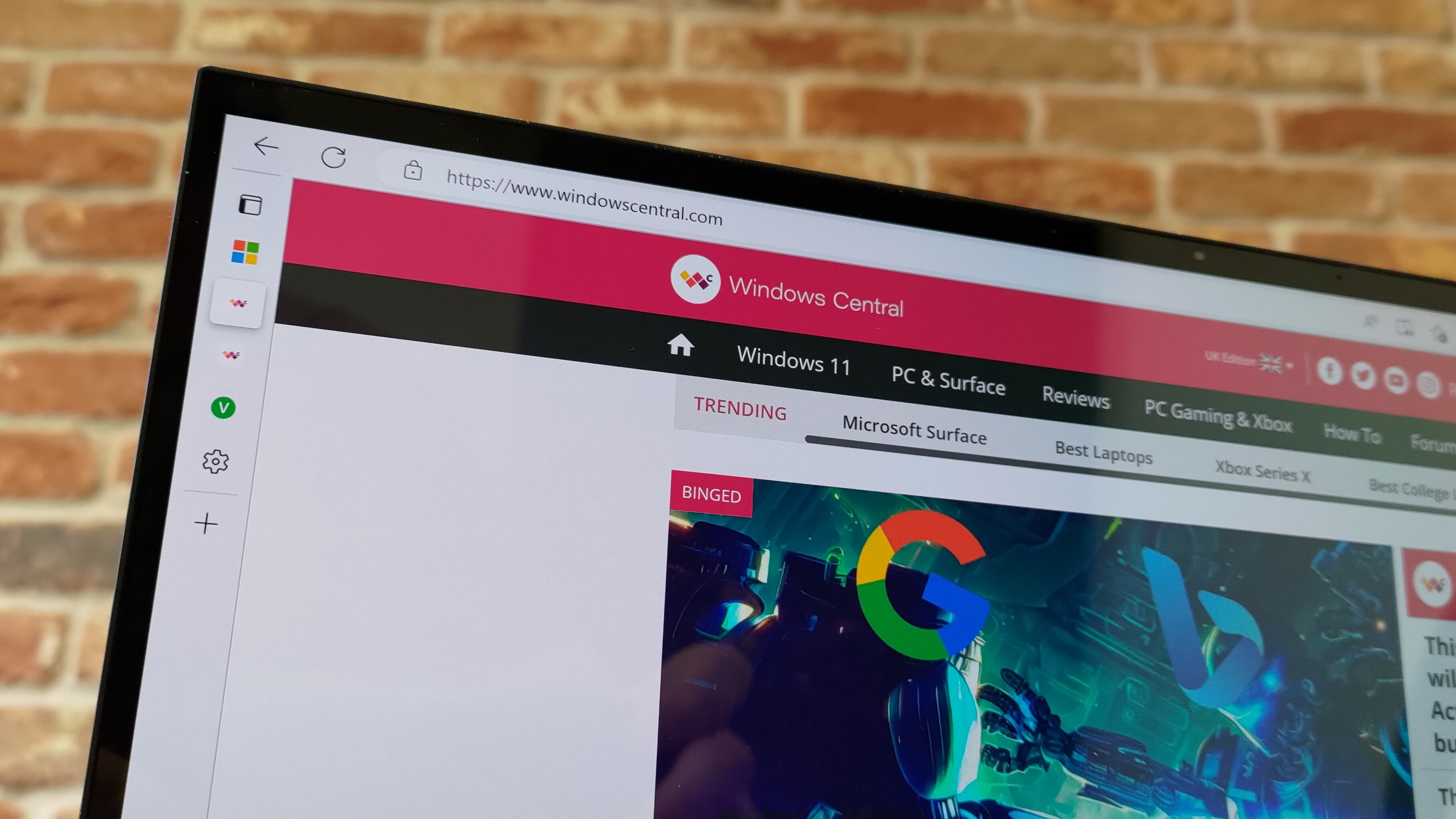
You now have to scroll to see all of the menu items in Microsoft Edge when using most laptops.
(Image credit: Future)
The need to scroll within that menu was highlighted on Reddit by user "JiroBibi."
To be completely honest, I don't think scrolling is a massive deal, but I would prefer the option to remove some of the items from the menu. At minimum, it makes sense to move the "more tools" section further up in the menu since smaller screens require scrolling to get to that shortcut.
Does Microsoft care about consistency?
One of the benefits of Windows is that it supports a tremendous number of programs and apps. But with backward compatibility and legacy support comes inconsistency, unless a company is willing to do a visual overhaul of an operating system.
My colleague Zac Bowden has highlighted context menu inconsistencies in Windows since at least 2015. Admittedly, Microsoft has upgraded several UI elements over the past decade, but Windows is far from perfect.
Recommended Comments
There are no comments to display.
Join the conversation
You can post now and register later. If you have an account, sign in now to post with your account.
Note: Your post will require moderator approval before it will be visible.