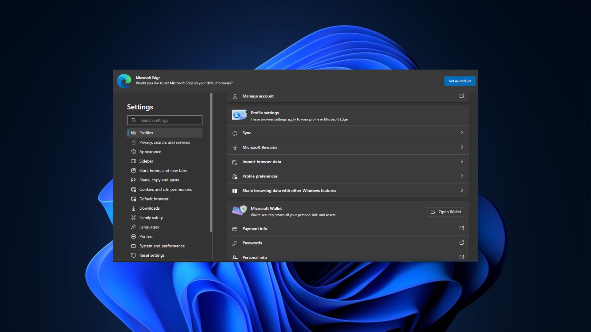
Microsoft wants to revamp Edge's Settings page to enhance its navigation and user experience.
What you need to know
- Microsoft wants to make Edge less bloated by decluttering its Settings page.
- The company intends to add a new quick-access panel on the landing page for Edge Settings for easy accessibility and navigation.
- Microsoft intends to compress its long list of Edge Settings options by grouping them into subsections like a table of contents in a book.
Recent updates
This article has been updated to reflect avid tech enthusiast Leo Varela's (Leopeva64 on X) chronological findings about the subtle changes Microsoft has been testing on Edge's Settings page to improve its user experience and navigation.
Microsoft Edge is arguably one of the best Windows 11 browsers. However, users have often placed Microsoft under fire for making the software bloated with "unnecessary" features that might not be useful in the everyday use case.
As it happens, Microsoft might be on course to fix some of these issues. As first spotted by Leo Varela on X, Microsoft is seemingly revamping Microsoft Edge's Settings page, making it more organized.
On the Microsoft 365 roadmap website, the company registered the anticipated changes under an entry titled: Microsoft Edge: Elevating top settings and improving settings page navigability. The company further details the steps it intends to take to make Microsoft Edge more user-friendly, including the addition of a new quick-access panel on the landing page for Edge Settings.
The panel will feature the most commonly used actions in the Settings menu for easy accessibility and navigation, allowing you to make changes and tweaks to your Settings configurations with fewer clicks. As highlighted in the entry, the changes are expected to start rolling out in October 2024 — but as is often the case, these plans may be subjected to change.
Microsoft also plans to bring one-click shortcuts for the most common options to Microsoft Edge's Settings submenus, including System and Performance or Appearance.
Finally, the tech giant also intends to compress its long list of Settings options by grouping them into subsections — similar to a table of contents you'd find in a book.


3175x175(CURRENT).thumb.jpg.b05acc060982b36f5891ba728e6d953c.jpg)


Recommended Comments
There are no comments to display.
Join the conversation
You can post now and register later. If you have an account, sign in now to post with your account.
Note: Your post will require moderator approval before it will be visible.