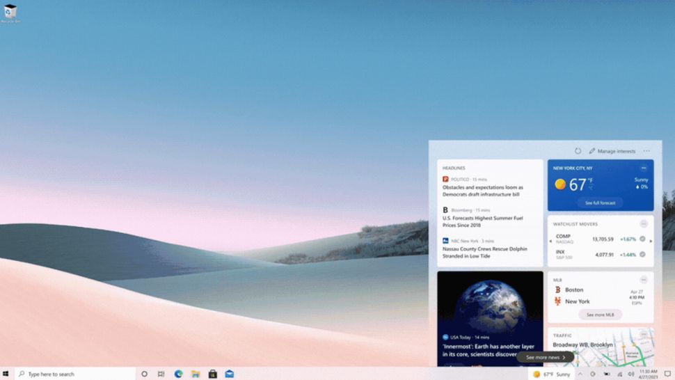
I never thought I'd actually say this but after months of alternating between Windows 10 and Windows 11 for my daily workflows on my primary machine - on which I dual-boot both the operating systems -, I kind of miss News and Interests' integration with the Taskbar in Windows 11.

Let me be clear right off the bat, I don't use News and Interests from the Taskbar on Windows 10 on a daily basis, but that information is still always there, I don't have it hidden. While it may sound extremely mundane, I find it weirdly relaxing to glance at the current temperature from time to time. It also accounts for some small talk when I'm sharing my screen with some offshore clients and colleagues and they inevitably point out how hot/cold it currently is in my country.
Adding more to this utility, I also have the option to click on the temperature information in the Taskbar, which then opens a dedicated window on the left where I can see weather trends, entertainment news, stock rates, and more. I want to emphasize that this is not something I do on a daily basis, but I don't have any complaints with the information being there if I need it. It's not intrusive and is occasionally useful in terms of keeping up to date with the latest happenings.

Microsoft has completely revamped this experience in Windows 11, and News and Interests does not "integrate" with the Taskbar in the traditional sense of the word anymore. Instead, that section has been split off into a dedicated app called Widgets that is still grouped as a Taskbar icon, but behaves like a separate app. When you click on it, it opens to the left of your screen instead of the right, and actually contains more information than was present in Windows 10.
I have talked about my Widgets experience in detail in my Closer Look article on the topic a few months ago, so I'm not going to spend too much time retreading familiar ground. Functionality-wise, it offers more capabilities and integrations than what is present in Windows 10, but overall, I feel like it occupies too much space on the screen (as can be seen in the screenshot above) and is considerably more intrusive than its predecessor.
But perhaps my main complaint is that it does not feel native to the Taskbar anymore. It is effectively a separate app. You can't configure it to show weather information at all times on the Taskbar, nor can you drag it to a less intrusive space on your display.
I know that not everyone will feel about this the same way considering that it's a minor feature and my reasons for missing it are seemingly quite mundane and subjective. For example, I consider the bottom right of the display to be a less intrusive space but maybe someone else prefers having Widgets occupy half of their screen on the left. Personally, I find it annoying that the Widgets open on the left as they hide most of the icons if you have enabled them on the desktop or take up most of your "useful" screen space if you're doing something else in the background too. It shouldn't be this distracting, in my opinion.
In fact, some eagle-eyed viewers may also notice that the temperature is set to Celsius (my preference) in the Windows 10 screenshot but is set to Fahrenheit in the Windows 11 screenshot. This is not something I did intentionally or even as a mistake, it just emphasizes my disinterest in the Widgets section in its current implementation, proving that I didn't even bother to set it according to my preferences.
One thing I do find rather strange is that News and Interests integration on Windows 10 isn't really an old feature. It was rolled out in late April for the operating system whereas Windows 11 was announced in June, roughly two months after. However, we still get a vastly different experience which makes it feel like that both of them were designed by different teams even though they became available to users in close vicinity, in terms of rollout.
Overall, this disjoint in experience does raise a few questions for me. Has Microsoft's internal testing revealed that the Widgets experience in Windows 11 is better than News and Interests in Windows 10? Or is this revamp just a way to differentiate more between the two operating systems? Will the company explore the option of unifying its experience and perhaps, offer more customization in terms of Widgets placement and Taskbar integration in the future? I hope that Microsoft answers these questions one day, but for now, I actually kind of miss News and Interests' integration with the Taskbar when using Windows 11.
I actually miss News and Interests integration with Taskbar in Windows 11
- aum
-

 1
1


3175x175(CURRENT).thumb.jpg.b05acc060982b36f5891ba728e6d953c.jpg)
Recommended Comments
There are no comments to display.
Join the conversation
You can post now and register later. If you have an account, sign in now to post with your account.
Note: Your post will require moderator approval before it will be visible.