
3175x175(CURRENT).thumb.jpg.b05acc060982b36f5891ba728e6d953c.jpg)
Microsoft Excel has a lot of features that amaze people to date. There is something new that people learn each day. Today, we will look at adding and customizing data labels in Excel charts.
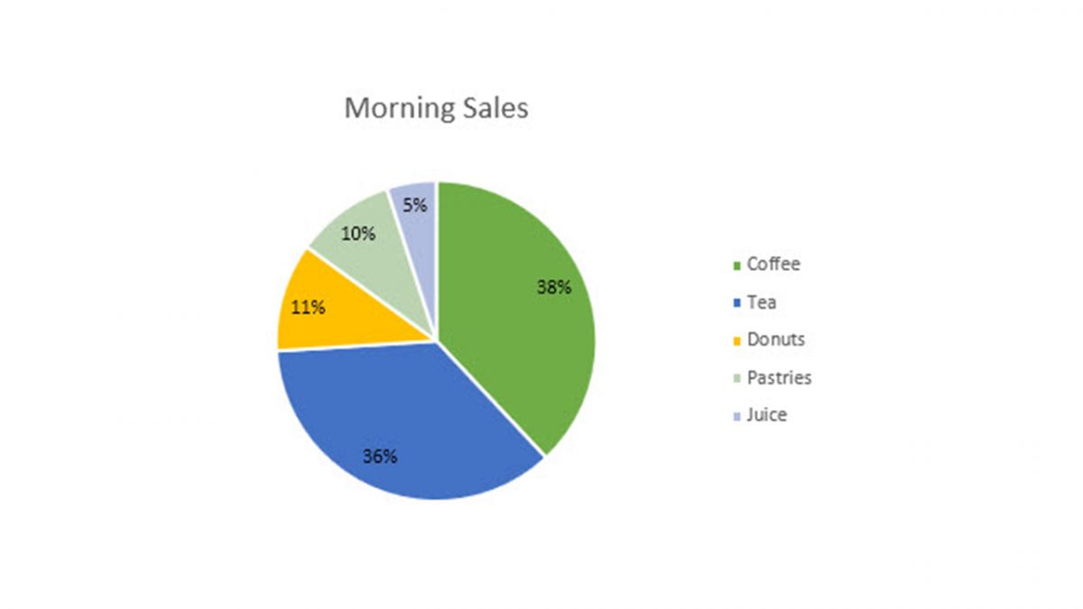
Excel charts contain a lot of data, and reading a chart at one glance can be challenging. Using data labels is a great way to point out important information. A data label can be used as part of a column or bar diagram. It can even be used as callouts when you create a pie chart.
Adding Data Labels
To show how to add data labels, we will take the example of a pie chart. While most people use a legend to show what's in a pie chart, a data label is much more efficient.
To add a data label, create your pie chart. Open it and then click on the tab that says Chart Design. Under that, click on the 'Add Chart Element' dropdown. You will see various options - you need to hover your mouse over data labels. Once done, you must pick a position to place your data label. A pie chart will have various options, including center, outside, inside, callout, and best fit. These positions may differ depending on which chart type you're using.
You can also add data labels using another method. Next to the pie chart, you will see a '+' sign. This is the chart elements option. You will again see data labels as one of the options. Click the position you want, and you're done. You can try and experiment using different positions when placing your data label.
Adjusting Data Label Details
Once you add your data label, you can customize it depending on which values you want to show. Click on the chart and click the 'Add Chart Element' dropdown again. Under the data labels section, you will see 'more data label options.' Click on it, and your data label sidebar will open. You can mark which details you want to display and also the separator type.
In addition, you can even change their appearances, such as changing the colour of the line and border, adding effects to the data label, and changing the size and properties.
Data Labels Take Your Chart to the Next Level
With data labels, you can make your presentation attractive and readable at one glance. As mentioned, there are endless possibilities with Excel. Watch this space for more updates on Microsoft Office.
How to Add and Customize Data Labels in Microsoft Excel Charts?
Recommended Comments
There are no comments to display.
Join the conversation
You can post now and register later. If you have an account, sign in now to post with your account.
Note: Your post will require moderator approval before it will be visible.