Last week, we discussed how the new Desktop Widgets work in macOS 14 Sonoma. Now, we are going to take a look at the new lock screen experience.
Before that, here's a glimpse at the lock screen in macOS 13 Ventura.
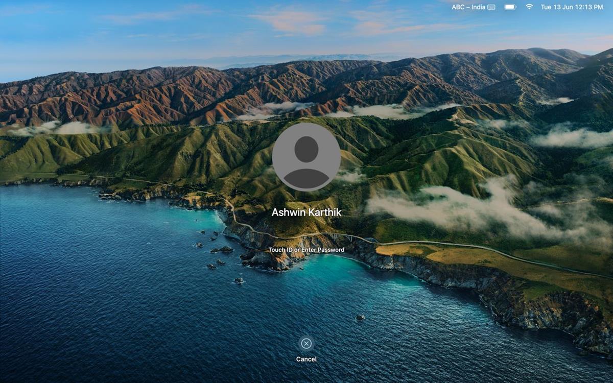
And this is the new lock screen in macOS Sonoma. As you can tell, the date, day and time are now displayed at the top center of the screen instead of in the top right corner on the menubar. It's kind of the same experience that you see on iPadOS.
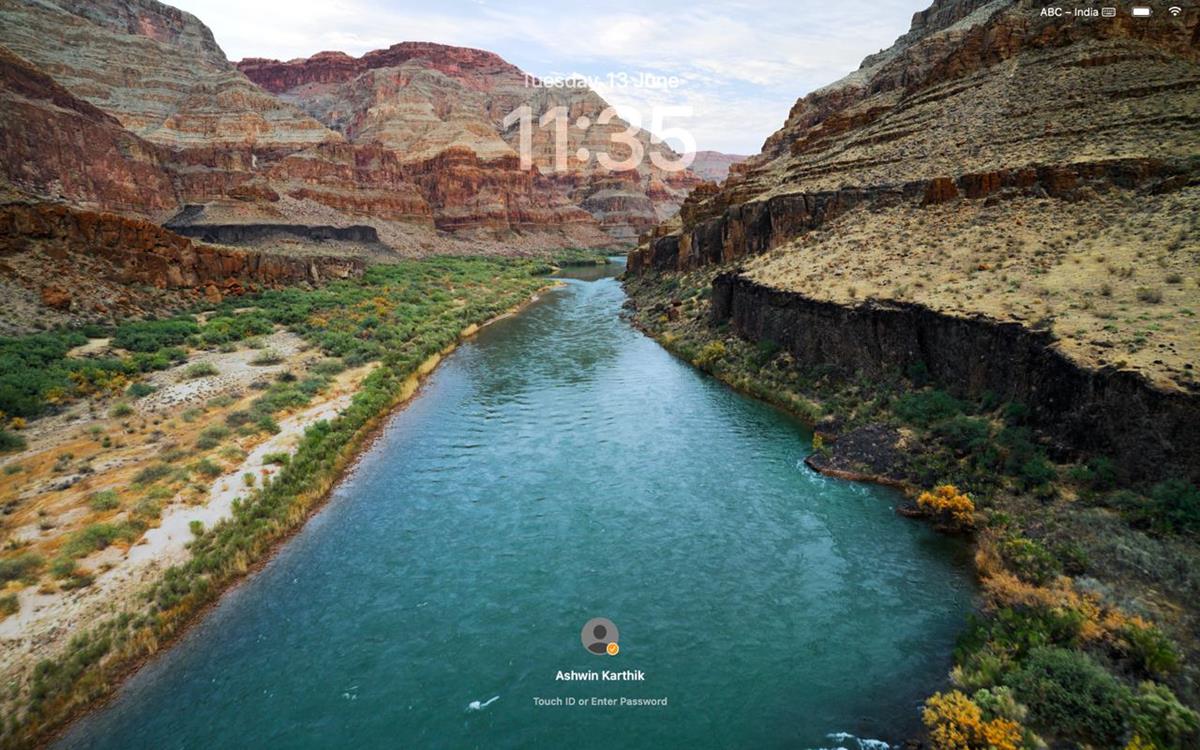
The login option with your user profile picture has been moved to the bottom, in a compact form. You can unlock the screen with your password or by using Touch ID, that has not changed.
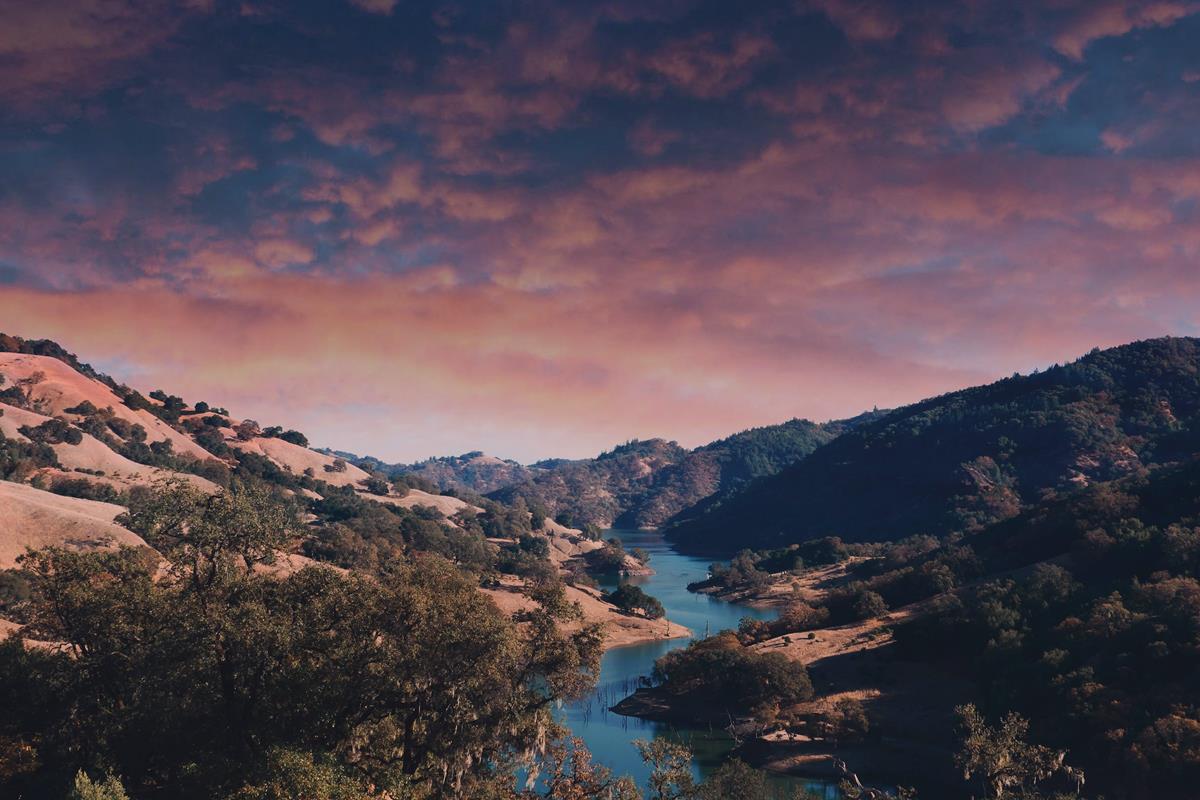
The lock screen's background images and wallpapers in macOS 14 Sonoma might look familiar to you, that's because they are similar to the Aerial screen savers and wallpapers that are available on Apple TV. These are not static images, they are slow-motion videos of stunning landscapes from around the world. For example, one of the screen savers features a river that is flowing through the Grand Canyon.
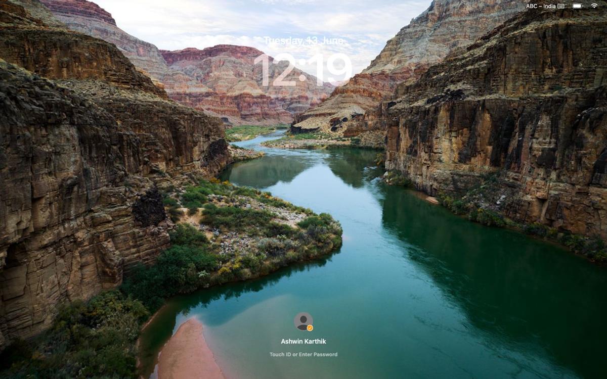
Here's the best part, once you log in, i.e. unlock the device, the screen saver transitions from an animated form to a wallpaper. The scene is identical to the frame that was visible on the lock screen. There's a very small delay during the transition from the video to the wallpaper, but I think that's a really nice touch, it's a little more immersive.
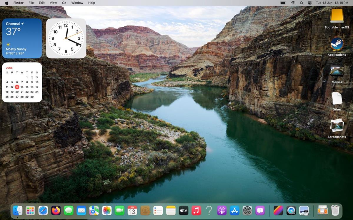
Hopefully this behavior won't affect the battery life too much. Want to see what it looks like in action? Here's a demo of the new lock screen experience in macOS 14 Sonoma. Please excuse the choppy frame rate, I had to compress the GIF to upload it to Imgur.
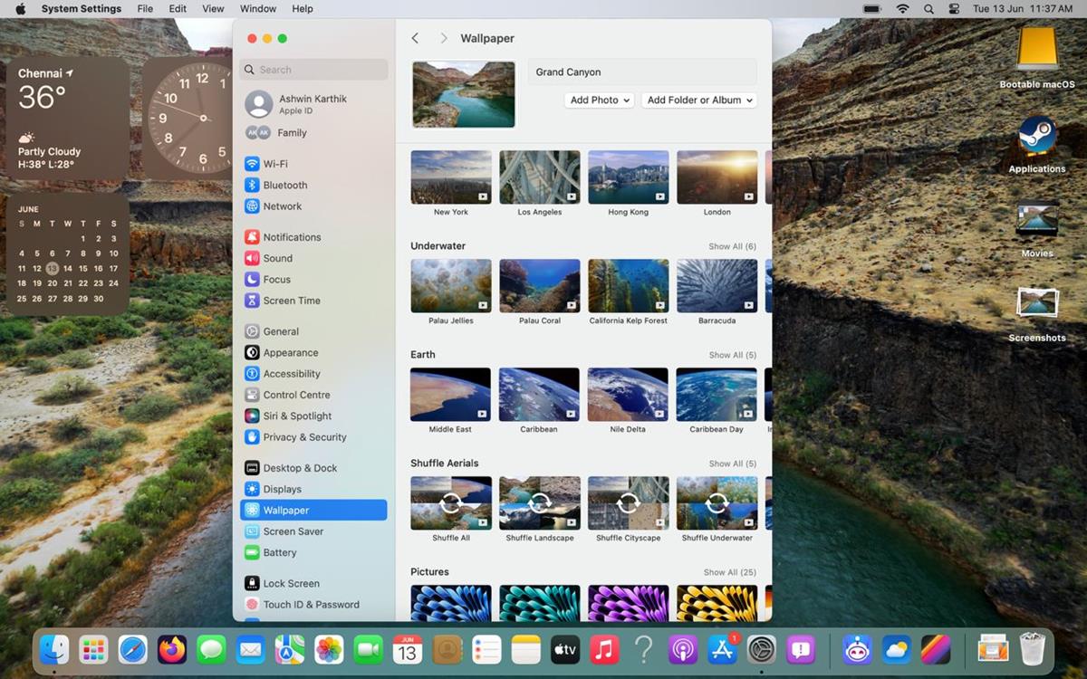
You can manage the lock screen options from the Settings > Screen Saver page. There are a few background categories that you may choose from including landscape, cityscape, underwater, and Earth. If you want to view the images randomly, you can set macOS Sonoma to shuffle between all the screen savers. Or, if you would prefer to randomize images from a specific category, for example: landscape, you can set it to just shuffle the selected section.
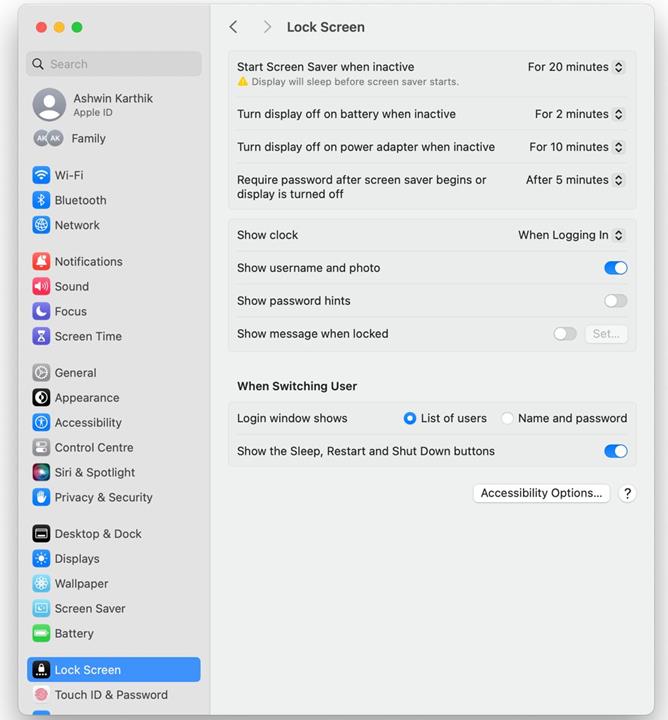
If you are not a fan of screen savers, you may turn the feature off completely from the Lock Screen settings, just set the "Start Screen Saver when inactive" to "Never". The other options allow you to manage when the screen saver kicks in, i.e. after a certain period of idle time. Want to remove the large clock? You can set it to show only on the menubar.
Now, the reduction of the login section's size results in quite a bit of empty space on the lock screen, even with the clock at the top. Did Apple make space to beautify the screensaver experience, to make it more immersive? Or could this be a hint that the lock screen in macOS Sonoma will support widgets?


3175x175(CURRENT).thumb.jpg.b05acc060982b36f5891ba728e6d953c.jpg)
Recommended Comments
There are no comments to display.
Join the conversation
You can post now and register later. If you have an account, sign in now to post with your account.
Note: Your post will require moderator approval before it will be visible.