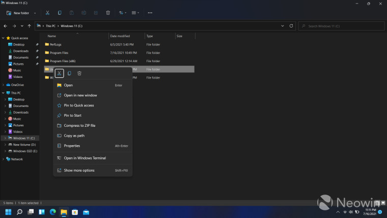
Although Windows 11 is set to publicly release later this year, people can still play around with it in the Insider Preview if they want. The OS contains a bunch of features and enhancements compared to its predecessor already, and we walked you through some of the major ones here. Windows 11 build 22000.71 also brought several changes to the OS, including tweaks to the context menu, and Microsoft has now broken down all the modifications it is making to the feature.

Microsoft highlighted a number of issues in the context menu of Windows 10 including the fact that it is overly long and contains options that are barely used, common commands are not grouped together, and they are too far from the cursor.
The Redmond tech giant is looking to improve on all these fronts in the Windows 11 context menu. Common commands are now right next to where the context menu is invoked. Furthermore, common commands like "Open" and "Open with" are grouped. Third-party developers can utilize IExplorerCommand and app identity to extend this menu, with apps containing more than one verb grouped into a flyout menu with app attribution. App extensions will also be grouped separately below the Shell verbs.
Microsoft has emphasized that it has not removed any Windows 10 context menu functionality completely as of yet. Users can still click on "Show more options" or Shift-F10 to load the old menu to make use of Shell verbs not present by default in the Windows 11 context menu and to utilize apps that have not been ported over yet.
There are a number of enhancements being made to the share dialog as well, detailed below:
- Nearby sharing is now much easier to use, with easy control over your discoverability setting up top and a link to more settings in the footer of the dialog.
- If you use the Mail app, the first entry in the contacts list helps you easily send an email to yourself.
- All apps can now participate in the Share dialog as targets. For unpackaged Win32 apps, this is covered in the same sample as the context menu. PWAs installed through Microsoft Edge are also supported if they implement the Web Share Target API.
Microsoft has also highlighted the best practices that developers should follow when registering their apps with the Windows 11 context menu, you can find more details over here.


3175x175(CURRENT).thumb.jpg.b05acc060982b36f5891ba728e6d953c.jpg)

Recommended Comments
Join the conversation
You can post now and register later. If you have an account, sign in now to post with your account.
Note: Your post will require moderator approval before it will be visible.