Windows 11, already a monumental shift in design from its predecessor, continues to evolve.
In its upcoming 23H2 release slated for fall, one of the standout features that has caught the eye of many is the 'never combine mode' for the taskbar.
Previously, Windows 10 users will recall the ability to keep icons on the taskbar separate, which can be especially helpful when juggling multiple windows from the same app. The 'never combine' option ensures each window has its representation on the taskbar without grouping them.
Microsoft removed the 'never combine mode' for the taskbar' with Windows 11, but it's finally coming back with version 23H2.
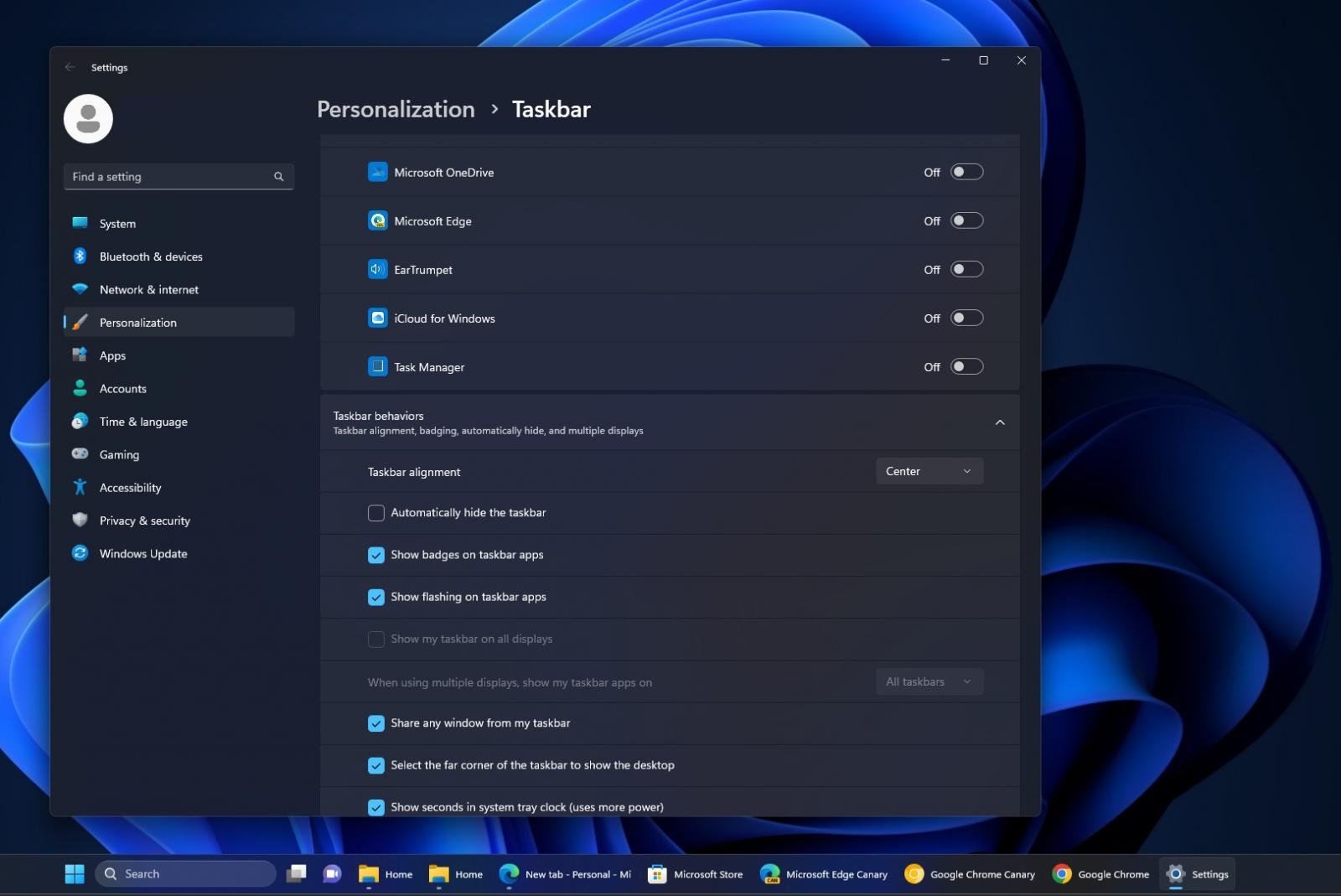
Additionally, enabling this mode has been streamlined for user convenience. The steps are straightforward:
- Access Taskbar Settings: Simply right-click on the taskbar. A menu will pop up.
-
Navigate to Taskbar Behaviors: Select “Taskbar settings” from the pop-up menu.

- Adjust Preferences: Under the section labeled “Taskbar behaviors”, find the option that reads “Combine taskbar buttons and hide labels”. From the drop-down menu adjacent to it, select 'never'.
But what if you're a power user with multiple monitors? Microsoft has improved the behaviour and introduced a separate setting dedicated to those who operate in multi-monitor environments. It allows them to choose if they want the 'never combine' feature applied consistently across all taskbars on different screens.
This feature can be particularly useful for those who multitask across various apps ns and prefer an ungrouped view on their taskbars. It offers more direct access to individual windows and can help in enhancing productivity by reducing the number of clicks and the time spent in searching for the desired window among grouped icons.
In conclusion, it is a reflection of listening to feedback and ensuring that users have the tools to customize their experiences.


3175x175(CURRENT).thumb.jpg.b05acc060982b36f5891ba728e6d953c.jpg)
Recommended Comments
There are no comments to display.
Join the conversation
You can post now and register later. If you have an account, sign in now to post with your account.
Note: Your post will require moderator approval before it will be visible.