Mozilla released Firefox 131.0 a few weeks ago. This kicked up a storm amongst users who were upset by a change. What's all the fuss about?
Firefox responds to user feedback about the List All Tabs button
Firefox users were unhappy that Mozilla had added a new "List All Tabs button" next to the plus button (new tab button). Was it a new addition? No, it has always been there, you just may have not noticed it. The old style used a downwards arrow (Caron symbol), which was quite minimalistic. The new style for the List All Tabs button has a bigger icon.

The fact that many people started complaining about the button does prove that the old icon was not noticeable and this perhaps unused by a lot of users. That's why Mozilla changed it to a bigger icon. Don't get me wrong, I'm not saying Mozilla did the right thing, I just wanted to point out what could have inspired them to change the style.
Anyway, the primary complaint from users was this: why can't we remove the List All Tabs button in Firefox? A few also raised the question of why the button existed, when Firefox View serves a similar purpose. That is a good point, and Firefox View can be removed if you don't like it.
So, what was the idea behind making the List All Tabs button permanent, aka non-removable? According to some comments from developers, it was done because the button contains the hidden tabs sub menu, and this acted as a preventive measure against add-ons that may hide tabs maliciously, or extensions that may not have a good UI to re-show the tabs. Naturally, this response was met with criticism from users, which gained the attention of the developers who then agreed to make the button removable.
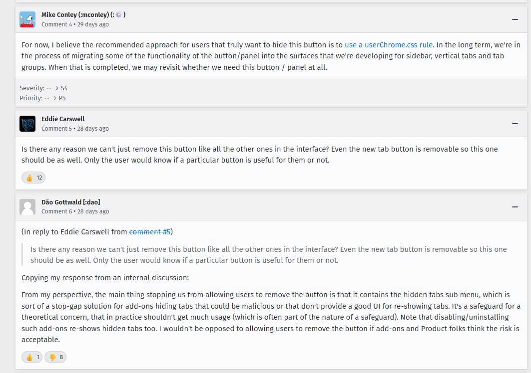
I'd like to point out a comment from another developer, who stated that Mozilla was working on migrating some of the button's functionalities into other areas such as the sidebar, vertical tabs and tab groups. He went on to explain that the dev team may reconsider the need for the button after those tasks have been completed. Okay, that sounds interesting, but the fact that a Mozilla dev recommended editing the userChrome.CSS to hide the button seems rather silly, but some users edited the CSS file. Others complained that there should be a toggle in the browser to allow users to choose what they want to use. I get it, I'm not a fan of unnecessary changes either, but it didn't bother me.
There's too much drama about this, I don't really care about the aesthetics, but it got me wondering, is the button useful?
Is Firefox's All Tabs button any good?
I have mixed feelings about it, it has some potential, but there is plenty of room for improvement. The close all duplicates tabs option is nice, but this action is already available in the tab context menu via a right-click on any tab. The New Containers option is handy too, but again this also exists, you just need to right-click on the new tab button. The List All Tabs button's namesake feature is to list all the tabs, which it does reasonably well, it's sort of like a vertical tab bar.

The main problem with the List All Tabs button is the search function, which is rather abysmal. Clicking on the Search tabs option in the menu changes the focus, i.e. moves the cursor from the pop-up menu to the address bar, and switches the search mode to find tabs.
Speaking of which, Firefox's keyboard shortcut (search open tabs) to use the feature is not super convenient either. You need to press Ctrl + L, type % followed by Space, it's rather odd to require multiple inputs for this action. In comparison, Chrome's Tab Search feature lets you search for tabs with Ctrl + Shift + A. This is slightly faster and more efficient.
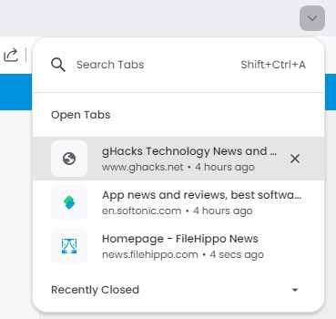
Circling back to the List All Tabs button's search, it feels rather outdated. One would expect that searching for a tab would filter the list of tabs directly in the pop-up to display the corresponding result, on an as-you-type basis. Right? I mean, that's how Chrome handles it. Guess what, that is exactly how the search function in Firefox View works. Why doesn't the List All Tabs button follow this design?
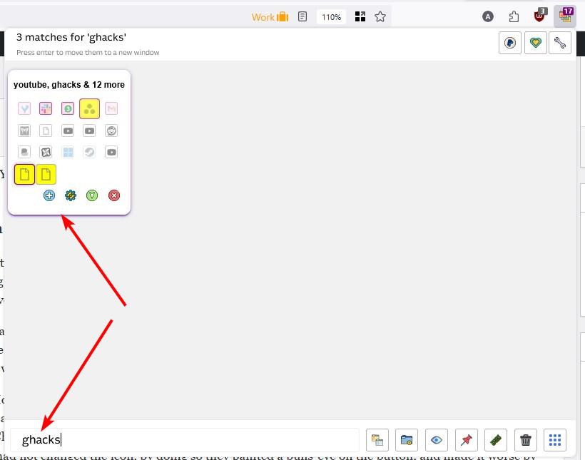
Take a look at Tab Manager Plus, I reviewed the add-on 4 years ago. This extension has a much better search function, you just need to type the name of the website or part of the page's title, and it highlights the relevant results. If an extension can do the job so efficiently, why can't Mozilla implement something similar in the browser?
Search All Tabs is another extension that can be used to find tabs quickly. You can read my review of the add-on here. TabSearch is another alternative that you may be interested in.
Mozilla lets users remove the List All Tabs button from Firefox's tab bar
Mozilla released the Firefox 131.0.3 update yesterday to patch some security issues. The change log for the update mentions that the update "fixes an issue where the List all tabs button was not able to be moved from the toolbar." Sure, it was "a bug". If you don't like the button, right-click on the Firefox toolbar, select Customize Toolbar, and click and drag the button away to the customization screen. There, problem solved.

Do you like the List All Tabs button in Firefox?
RIP Matrix | Farewell my friend ![]()
Hope you enjoyed this news post.
Thank you for appreciating my time and effort posting news every day for many years.
2023: Over 5,800 news posts | 2024 (till end of September): 4,292 news posts
- DKT27
-

 1
1


3175x175(CURRENT).thumb.jpg.b05acc060982b36f5891ba728e6d953c.jpg)
Recommended Comments
Join the conversation
You can post now and register later. If you have an account, sign in now to post with your account.
Note: Your post will require moderator approval before it will be visible.