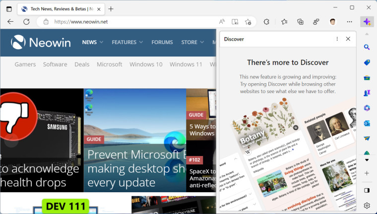
Although the most recent news about Edge has been mostly positive (improved password manager, a new productivity feature, and an upcoming reimagining), Microsoft is about to give its browser arguably one of the worst changes it has ever received. Edge insiders in the Dev and Canary channels noticed a new button on the toolbar that looks and works truly bewildering.
Called "Discover," the feature is Microsoft's new attempt to impose recommended content in Edge, and everything about this feature is 100% wrong. For starters, it sits where the menu button used to be, and an attempt to open the browser's menu (or close Edge) will result in annoying misclicks.

Questionable visuals are another thing that will grind customers' gears. Microsoft Edge is a minimal-looking browser with simple icons that do not attract unnecessary attention and do not get in your way. The "Discover" button looks like an absolute afterthought that will distract you with its bright purplish icon. Even though it is similar to the rest of the sidebar (assuming you are using it), the main problem is not getting any smaller. And a funny coincidence is that the only button you cannot reposition or remove from the toolbar is the one responsible for showing ads recommended content.

And there is the worst offender, the fact that "Discover" opens on hover, not when you click it. Remember Windows users hating Microsoft for making News and Interests (Windows 10) and Windows Widgets (Windows 11) open on hover? Tons of negative feedback caused Microsoft to reconsider its choices and add the option to open widgets on click. Unfortunately, the company is not learning its lessons—the "Discover" tab opens on hover or click, and you can't do anything about it.
Edge insiders already hate the new "Discover" tab, and the Edge Insider forums are slowly filling with heated comments. One can only hope Microsoft will come to its senses and realize that it needs to give users at least the option to hide or disable the "Discover" button. Otherwise, frustrated users will jump ship to other browsers, leaving Edge stagnated with its 11% market share.
Edge is about to get way more aggressive with recommended content and annoying UIs
- aum and scarabou
-

 2
2


3175x175(CURRENT).thumb.jpg.b05acc060982b36f5891ba728e6d953c.jpg)
Recommended Comments
There are no comments to display.
Join the conversation
You can post now and register later. If you have an account, sign in now to post with your account.
Note: Your post will require moderator approval before it will be visible.