Windows 95 introduced the iconic Start menu to the revolutionary taskbar, and Microsoft's OS influence is still felt 29 years later.
On August 24, 1995, Microsoft officially released Windows 95, its revolutionary operating system previously codenamed 'Chicago', to the public. I still remember when my parents upgraded the family PC from Windows 3.1 with a slew of floppy disks and the help of a tech-savvy friend, who helped sell them on the luxuries of a new, friendly user interface that would replace the archaic likes of the now-extinct 'Program Manager' app.
Twenty-nine years later, the impact of Windows 95 is still apparent in modern computing (and even popular culture as Finland embraced Windows95man,) with remnants of its old-school tools and apps still running quietly in the background of Windows 11.
In particular, I still rely on the 'more sound settings' panel to wrestle my microphone levels back to their proper numbers after Google Meet automatically adjusts them against my will. Prettier menus offer the same controls, but these retro 'Win32' apps still just work, thanks to Windows 95's foundations.
I could ramble about the iconic startup sound or how our costly printer never worked with Microsoft's 'Plug-and-Play' promises. However, one feature stands out more prominently than any other, and its legacy is a mainstay feature in Windows 11 with much less subtlety, even if Windows 8 previously tried to wrangle it into something entirely unrecognizable — the legendary and utterly iconic Start menu.
Everything changed with the Start menu

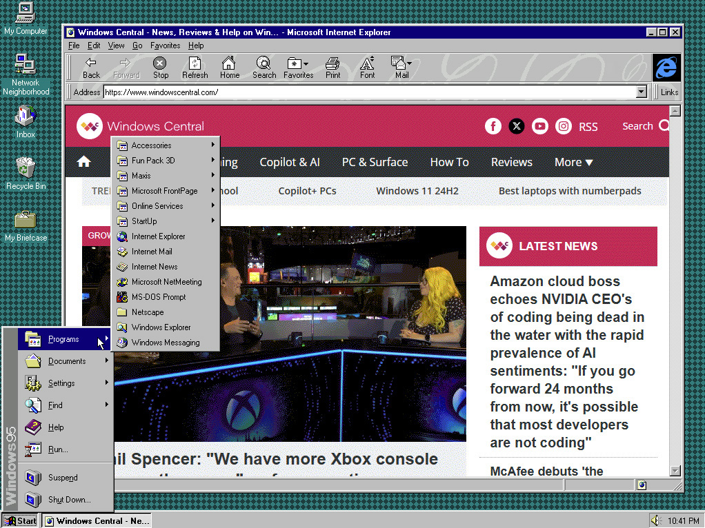
The classic Start menu would expand across your desktop until you found your favorite program.
(Image credit: Ben Wilson | Windows Central)
It seems like a given that a modern operating system should have some form of a taskbar and Start menu unless you're a die-hard fan of the Terminal, like my Linux-obsessed colleague Richard Devine, who is ever-eager to boil the most complex tasks down to the command line without needing to touch a mouse. Still, for your average user, the Start menu was a self-explanatory hub for all your programs and settings on Windows 95.
This pop-up menu was always snappy and responsive, at least if your processor wasn't bogged down with multiple programs running on a single core. It gathered all of Microsoft's stock applications (RIP Wordpad) and even listed any newly installed apps alongside them, divided into subcategories intended to keep things tidy. It wasn't uncommon to see a gigantic wall of tiled menus on some PCs as software libraries grew and larger hard drives (up to an unthinkable 32GB!) became more affordable, but a bit of housekeeping could clean it up.

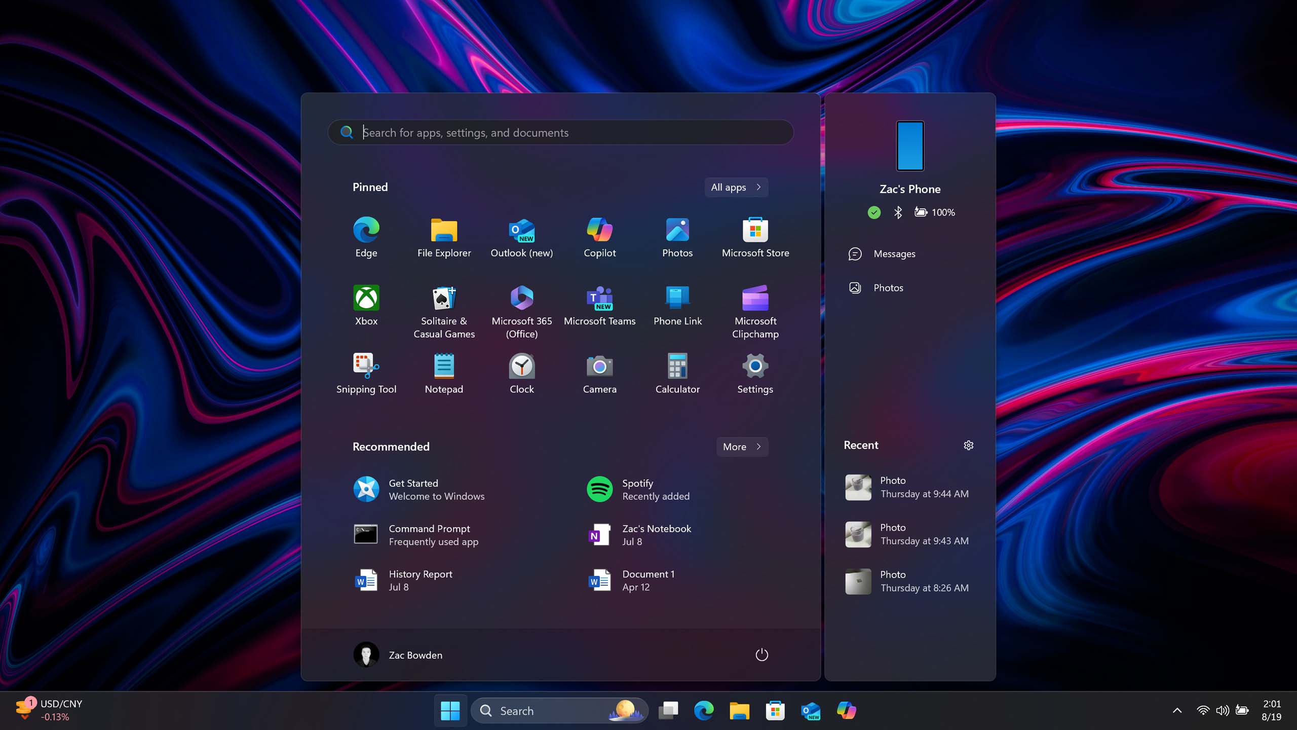
The latest Start menu design in Windows 11 24H2 is much bigger and aligned in the center by default.
(Image credit: Zac Bowden | Windows Central)
The Start menu experience is inherently the same on the latest build of Windows 11, version 24H2. It's an all-in-one solution for your apps, settings, and shortcuts, and even a return to responsive widgets, vaguely reminiscent of the live tiles featured on Windows 8's contentious Start menu replacement, is in the works. It's become a much more simplified version of its former self, reduced to a compact Windows logo now that its use is broadly understood and no longer needs explanation.


3175x175(CURRENT).thumb.jpg.b05acc060982b36f5891ba728e6d953c.jpg)


Recommended Comments
Join the conversation
You can post now and register later. If you have an account, sign in now to post with your account.
Note: Your post will require moderator approval before it will be visible.