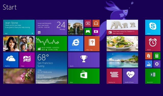
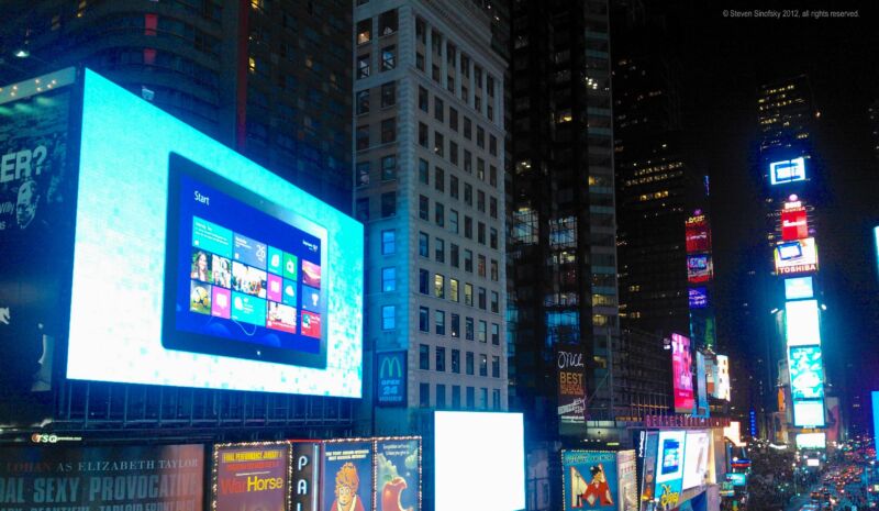
On October 26, 2012, Microsoft released Windows 8, a hybrid tablet/desktop operating system that took bold risks but garnered mixed reviews. Ten years later, we've caught up with former Windows Division President Steven Sinofsky to explore how Windows 8 got started, how it predicted several current trends in computing, and how he feels about the OS in retrospect.
In 2011, PC sales began to drop year over year in a trend that alarmed the industry. Simultaneously, touch-based mobile comping on smartphones and tablets dramatically rose in popularity. In response, Microsoft undertook the development of a flexible operating system that would ideally scale from mobile to desktop seamlessly. Sinofsky accepted the challenge and worked with many others, including Julie Larson-Green and Panos Panay, then head of the Surface team, to make it happen.
Windows 8 represented the most dramatic transformation of the Windows interface since Windows 95. While that operating system introduced the Start menu, Windows 8 removed that iconic menu in favor of a Start screen filled with "live tiles" that functioned well on touchscreen computers like the purpose-built Microsoft Surface, but frustrated desktop PC users. It led to heavy pushback from the press, and PC sales continued to decline.

Despite its drawbacks, some aspects of the Windows 8 interface predicted how we use tablets and other mobile devices today, including some features (like side-by-side apps and screen edge swiping) once considered too complex that Apple later adopted on the iPad. Necessary refinements aside (such as restoring the Start button for desktop users, which happened in Windows 8.1), one could argue that Windows 8 was ahead of its time, or "too much and too soon," as Sinofsky puts it in the interview below.
The Ars interview: Steven Sinofsky
To understand Steven Sinfosky's background at Microsoft, it's useful to know that he worked at the company for 23 years, beginning in 1989 as a software design engineer. After joining the Microsoft Office team in 1994, he worked his way up to managing the development of Office 2000, XP, 2003, and 2007. Two years later, he became president of Microsoft's Windows Division and oversaw the launch of Windows 7, which became a widely successful product for Microsoft. Following the launch of Windows 8, Sinofsky left Microsoft in December 2012.

In 2020, Sinofsky began writing detailed historical accounts of his time at Microsoft, and they turned into a Substack newsletter called Hardcore Software, which he publishes regularly. He's been thinking deeply about his history a lot recently, which makes this prime time for a retrospective interview, which we conducted via email. His answers have been lightly edited for formatting, punctuation, and brevity.
Ars Technica: What was the No. 1 driving force behind Windows 8’s interface design changes? The iPad?
Steven Sinofsky: You never say No. 1 reason, but the primary motivations for changing the interface of Windows 8 was because Windows had run its course.
If you look at how Windows was thinking when we built Windows 7 (2006–2009), the world was very focused on how the PC would be computing for what the industry called "the next billion." Windows 7 ended up being built at the tail end of a vision that would never be realized: The PC powering computing for the billions using PCs.
As we know now, with the iPhone in 2007 (+apps in 2008) and Android in 2008 (+/-), not only the next billion but the next billions were those on smartphones. Given that is how people were going to exclusively use computers, if there was any hope of growing the use of PCs, it would come from having an experience more aligned with smartphones. This applied to the basic user interface (launching programs) and metaphors (touch) as well as the underpinnings such as cloud storage and all-day battery life and also the way mobile hardware platforms raced beyond PCs, such as with sensors.
The whole point was to modernize computing on a PC to be in line with the modern computing experience on smartphones. This could easily be seen as "catching up," but really, the whole design was about taking the essence of a PC and pushing it beyond smartphones: Sharing between apps, advancing touchscreen typing, life files, file management, device support (printing!), and so on, that didn’t exist on smartphones.


3175x175(CURRENT).thumb.jpg.b05acc060982b36f5891ba728e6d953c.jpg)

Recommended Comments
There are no comments to display.
Join the conversation
You can post now and register later. If you have an account, sign in now to post with your account.
Note: Your post will require moderator approval before it will be visible.