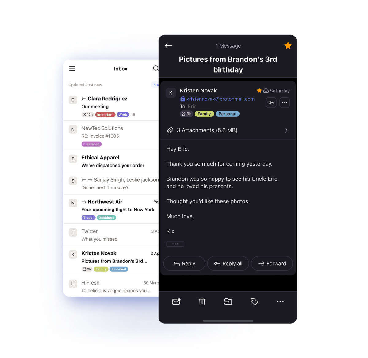
The ProtonMail team has announced that the iOS ProtonMail app has received a new update which introduces dark mode and an easy-to-use interface with conversation view. According to the company, this is the biggest overhaul the app has received since it was launched on iOS seven years ago.

In this update, ProtonMail gives you the ability to switch between a light and dark mode, making it more comfortable to read your emails. To simplify things, the new conversation view groups emails with the same subject line so that you can read the initial email and all subsequent emails like a conversation. Of course, if you don’t like conversation view, you can disable it by going to the hamburger menu > Settings > Account settings > Conversation.
The company also stated that it’s working on a similar redesign for its ProtonMail app on Android. Right now, it’s available as beta software and the company is soliciting feedback through its support form. Once it’s happy with the new Android client, it will be made available for all users on Android devices.
In addition to the new iOS app, ProtonMail has launched an additional email domain that you can use to send and receive emails. The new proton.me domain is shorter so you’ll be able to create addresses that are easier to distribute. It was one of the most requested features in the company’s 2022 survey.
If you’d like to download the new app on your iPhone or iPad, just head to the App Store and do a search for ProtonMail.
ProtonMail for iOS receives its biggest ever redesign with dark mode and an intuitive UI
- Melgas
-

 1
1


3175x175(CURRENT).thumb.jpg.b05acc060982b36f5891ba728e6d953c.jpg)
Recommended Comments
There are no comments to display.
Join the conversation
You can post now and register later. If you have an account, sign in now to post with your account.
Note: Your post will require moderator approval before it will be visible.