In 2021, I made one of the poorest choices of my life, buying the Nokia 3.4. It’s a painfully slow device at times, so not running too many apps and sticking to light-weight ones is always good. Earlier this week, I felt the urge to seek out a minimalistic launcher again to see if I could speed my phone up and came across Olauncher, an open-source launcher that presents you with a nice quiet home screen that somehow makes my device feel a bit snappier.
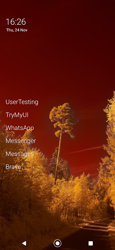
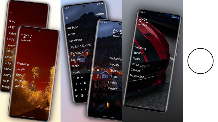
After install, you’re presented with four slots in which you can add your favourite apps. If you need more or less choice than this, you can long press the wallpaper and change the number of favourites to anything from zero to eight – I have six apps pinned at the time of writing, a few messaging apps and a few side-hustle apps I like to check to earn a bit of pocket money.
As it’s a minimalistic launcher, the notification bar fades away, so you don’t get distracted, but you can easily see any notifications that have come through by swiping down to open the full notifications interface. Swiping up will show all the installed apps as a long list, unlike other minimalistic launchers, Olauncher does something pretty special.
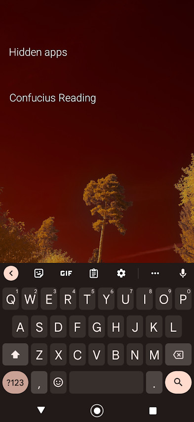
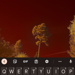
When you swipe up, you’re presented with your keyboard to start searching for the app you want to open. To save time, the launcher will open up your desired app mid-way through typing as soon as it becomes the only option in your app list. For example, if I want to open Facebook, I just type f-a-c and the launcher starts launching Facebook as there are no other apps on my device beginning with ‘fac’.
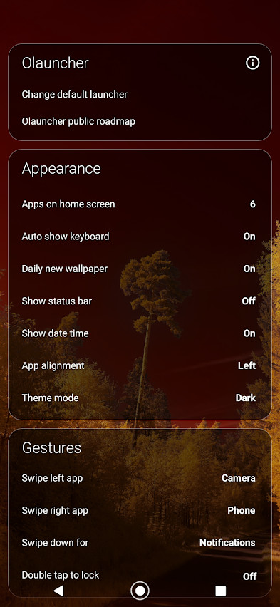
As mentioned earlier, the launcher comes with a limited number of spaces on the home screen for your apps. To save you two slots, there are home screen shortcuts to open the camera and phone. Swiping left to right will open up the phone app, while swiping in the other direction will open up your camera. I haven’t found myself invoking either of these shortcuts accidentally just yet, so that’s promising.
Earlier today, I was reading more about the app in the Play Store and discovered that it has a hidden apps feature. While other users of the launcher will probably know about it, people who don’t use it will never have a clue where to look for your secret apps! To hide an app, you just go to your app list and long press. You’ll see an option to hide it, tapping this will remove it from your app list. To see your hidden apps, you have to long press on the home screen and at the top of the settings menu tap the title ‘Olauncher’, this will show you any hidden apps if there are any.
Speaking of the settings menu, here you can enable features like show the status bar, change the wallpaper daily, and alter the position of your favourites app list. There is also an option to view the Olauncher public roadmap. On the roadmap page, the developer of Olauncher says that adding new features isn’t too difficult, but ensuring everything works across all device form factors is what takes time to get right. Hopefully, this thoughtful approach ensures Olauncher remains a great launcher.
From a development perspective, Olauncher is also good because it’s open source. If you’re a new coder and want to contribute to build your coding experience you’re free to contribute to this project, and if you want to make your own launcher you can fork the Olauncher project and get to work. Its open source nature also means that it’s available to download on the F-Droid app store as well as the Google Play Store – this makes it easier to download and install if your device is missing the Google Play Store.
Olauncher is pretty minimalist, so it’s probably going to appeal more to people who prefer a spartan interface. That said, the experience overall is very good and that could expand its appeal to a wider audience. I have the daily wallpaper option setting enabled on my phone and find that the wallpaper choices are pretty good and make excellent use of all the free space on the home screen, making the device generally nice to look at.
If you do try it out, setup shouldn’t take too long, you just go through the prompts to make it your default launcher and choose your favourite apps, and you’re good to go. Unless I discover something truly annoying in this launcher, I would probably say that it's my favourite launcher on Android.
Gallery: Olauncher


Hands-on: Olauncher is possibly the best launcher on Android today


3175x175(CURRENT).thumb.jpg.b05acc060982b36f5891ba728e6d953c.jpg)
Recommended Comments
There are no comments to display.
Join the conversation
You can post now and register later. If you have an account, sign in now to post with your account.
Note: Your post will require moderator approval before it will be visible.