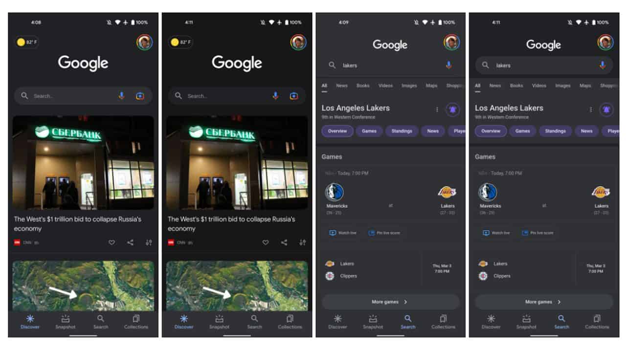
After first launching on desktop devices, Google appears to be bringing its new darker dark mode to its Android search app, albeit with a few differences.
Strangely, the new darker dark mode which is being tested on Google’s Android search app isn’t the same shade of black as the one currently being rolled out on desktops, however, it still looks great if you’re afraid of the blinding brightness of light mode.
As spotted by 9to5Google, this change is most notably being applied to the background of Google’s Discover page, where the new dark mode uses an almost black colour value of #171717, a stark change from the lighter grey #202124 that we’re all used to.
Similarly to the desktop darker dark mode which is steadily being rolled out, this feature should be a great benefit for those with OLED displays, since it should conserve the limited battery life of your mobile device while also making colours pop thanks to the added contrast.

Unlike the desktop darker dark mode, however, this change is not currently widely available as it is not yet being officially rolled out to all users. To access the new dark mode for yourself you’ll need to be in the latest 13.8 beta from the Google Play Store.


3175x175(CURRENT).thumb.jpg.b05acc060982b36f5891ba728e6d953c.jpg)
Recommended Comments
There are no comments to display.
Join the conversation
You can post now and register later. If you have an account, sign in now to post with your account.
Note: Your post will require moderator approval before it will be visible.