The very first Android 13 developer previews won't be out until at least March, but that isn't stopping Android 13 leaks from popping up already. Of course, more features will be revealed in the coming months, but Android 13 is already shaping up to be a solid release.
More Material You color options
The headline feature of Android 12 was "Material You," a top-to-bottom redesign and dynamic theming system that automatically changed the UI colors depending on your wallpaper. Set a primarily yellow background and Material You will apply various yellow hues to your app backgrounds, notifications, buttons, icons, and more. I think it looks great, but it might not be for everyone.
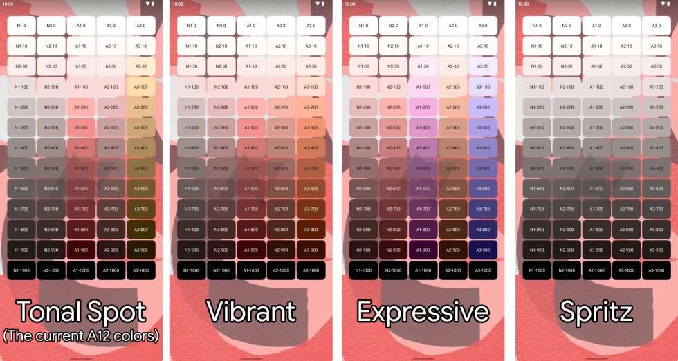
Android 13 looks to be expanding on the color system and giving users more options. Android Police's Ryne Hager has screenshots from a prerelease build that show four different theming algorithms to pick from. There is "Tonal Spot," which just seems to be the current Android 12 color system, and then three new color systems called "Vibrant," "Expressive" and "Spritz."

Example screenshots are provided in the report, but none of the color options looks dramatically different from one another. I wouldn't read too much into the exact color results presented here. In Android 12, Material You's color system was continually tweaked in the run-up to release, and these color results from a pre-alpha version of Android 13 probably aren't finished.
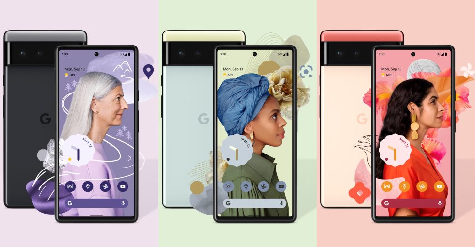
One side effect of Android 12's color system is that almost every wallpaper produces a pastel accent, and it is usually impossible to get stronger accent colors from most wallpapers. On paper, the color option named "Vibrant" would seem like it would be designed to offer an alternative to all the pastels, but the example images are only the slightest bit different from the default colors. I would not call the "Vibrant" option "vibrant" at all, and I think that's because the new color system just isn't finished yet. Google's promotional images for the Pixel 6 show bold, deep hues of purple, orange, red, and gray, which are all impossible to actually get on Android 12. The "Vibrant" color option seems like it would be a fit for colors like these.

Right now, the "Spritz" option spits out a color sheet of all gray tones. Some people have asked to turn off the Material You color system, and this option looks like it's headed in that direction. If completely "off" is out of the question, users who don't want all this color stuff in their phone OS would definitely prefer a muted, less disruptive selection of colors. As a "version 2" update to Material You, this all makes sense to me: one option really leans into the color feature, and another option lets people turn it down.
Opt-in App Notifications
Android has had a permissions system for a long time now, which pops up an "allow" or "deny" dialog whenever an app asks for something sensitive. Before the permission system, every app had access to every permission. It was a free-for-all. That's sort of how Android notifications work now. Every app gets access to the notification panel, and while you can ban an app after it's bothered you with a notification, notification access is on-by-default.
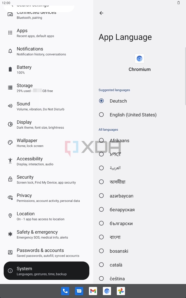
According to XDA Developers Aamir Siddiqui and another Android Police report, this apparently changing in Android 13. Apps will need to pop-up a permission box for notifications now, and users will get to proactively allow or deny an app the ability to bother them. Like all permissions options, this has existed on iOS for a while, but that doesn't make it any less of a good idea. This will be a big improvement for Android users. The vast, vast majority of apps do not need notification access, but since it's an easy way to boost app engagement, it's tempting to abuse.


3175x175(CURRENT).thumb.jpg.b05acc060982b36f5891ba728e6d953c.jpg)

Recommended Comments
There are no comments to display.
Join the conversation
You can post now and register later. If you have an account, sign in now to post with your account.
Note: Your post will require moderator approval before it will be visible.